Data Visualization Workshop
Data do not speak for themselves
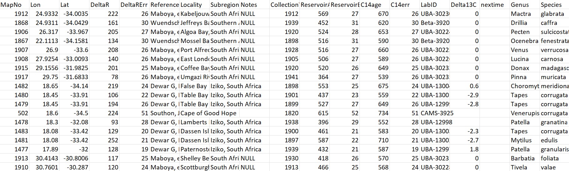
Marine reservoir effect data from calib.org
Why visualize?
Visualization helps to identify patterns and structures in data that are not evident from tables or numerical summaries.
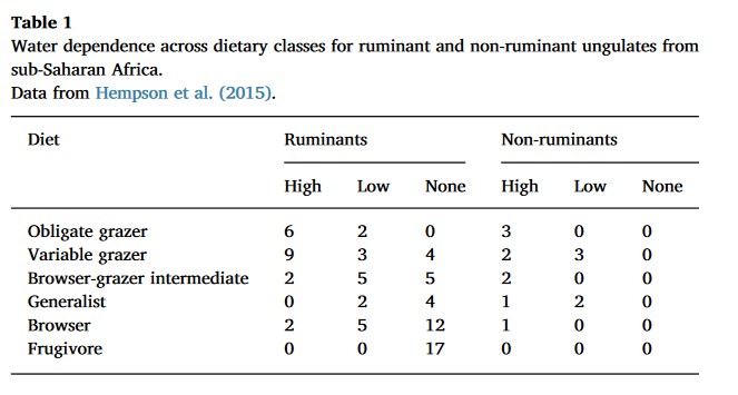
Faith, J. Tyler. 2018. “Paleodietary Change and Its Implications for Aridity Indices Derived from δ18O of Herbivore Tooth Enamel.” https://doi.org/10.1016/j.palaeo.2017.11.045.
Why visualize?
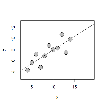
Mean x: 9
Mean y: 7.5
Pearson correlation coefficient (r): 0.816
Coefficient of determination (R2): 0.67
Why visualize?

Avenue, CC BY-SA 3.0 <https://creativecommons.org/licenses/by-sa/3.0>, via Wikimedia Commons
Why visualize?
Matejka and Fitzmaurice, 2017. “Same Stats, Different Graphs: Generating Datasets with Varied Appearance and Identical Statistics through Simulated Annealing.” https://doi.org/10.1145/3025453.3025912.
Making a data visualization
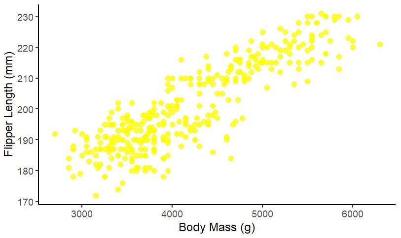
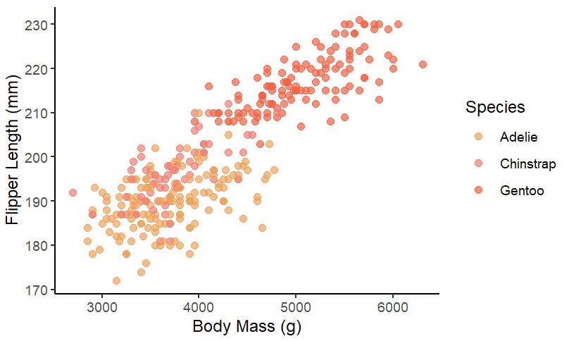
Visualizing data involves aesthetic mapping: connecting variables in data to visual elements within a graphing space.
Wilke, C. 2019. Fundamentals of Data Visualization
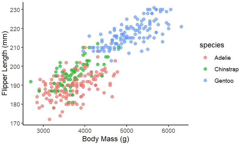
Aesthetic mapping
Aesthetic mapping
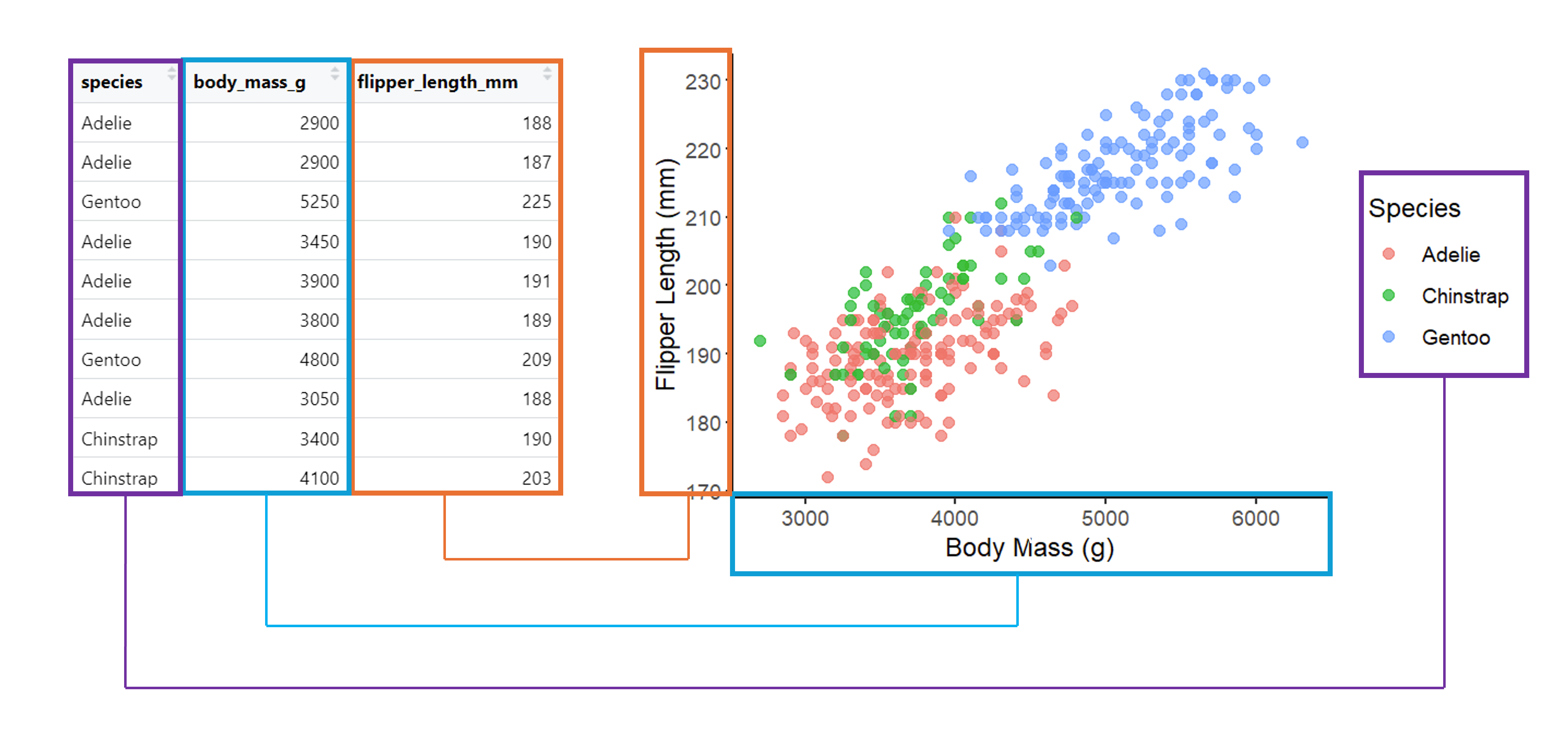
Aesthetic mapping
What kind of visualization?
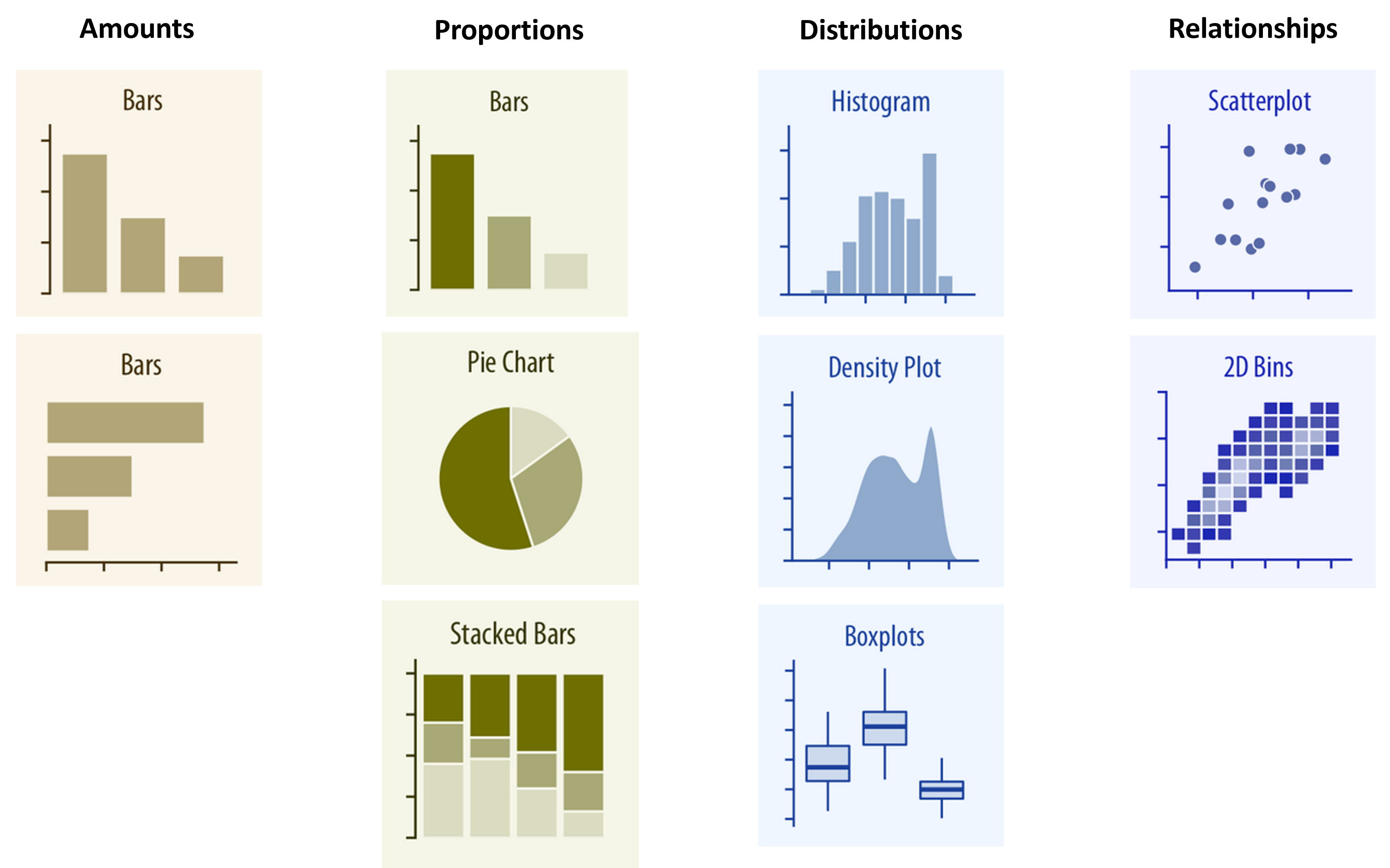
Wilke, Claus. 2019. Fundamentals of Data Visualization
Bar charts and histograms
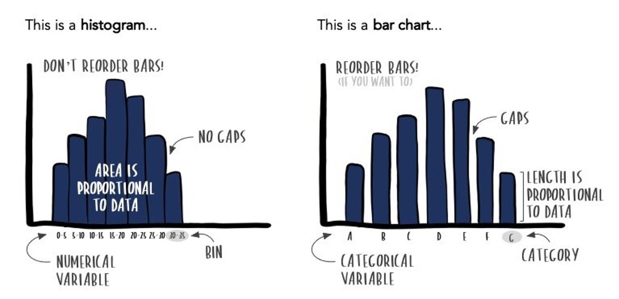
https://www.storytellingwithdata.com/blog/2021/1/28/histograms-and-bar-charts
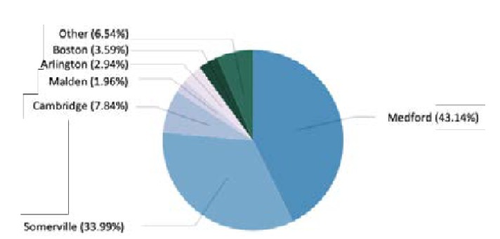
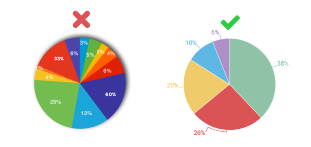
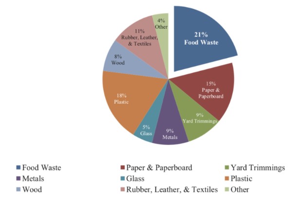
When not to use a pie chart
When you have a large number of categories
When you need to compare more than one chart
Data-ink
Visualization with non-data ink.
Data-ink
Removing some non-data ink.
Data-ink
Removing too much non-data ink?
Activity: To erase or not to erase?
/simplexct/images/image-tfe54.png)
Activity: To erase or not to erase?
Contrast is clarity
Be sure foreground (plotting) colors are sufficiently different from background colors to aid readability.
Contrast is clarity
When using colors, symbols, or line styles, be sure these are sufficiently different to distinguish between categories.
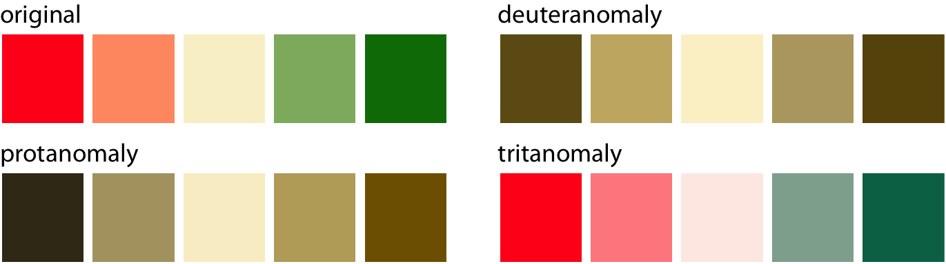
Using color effectively
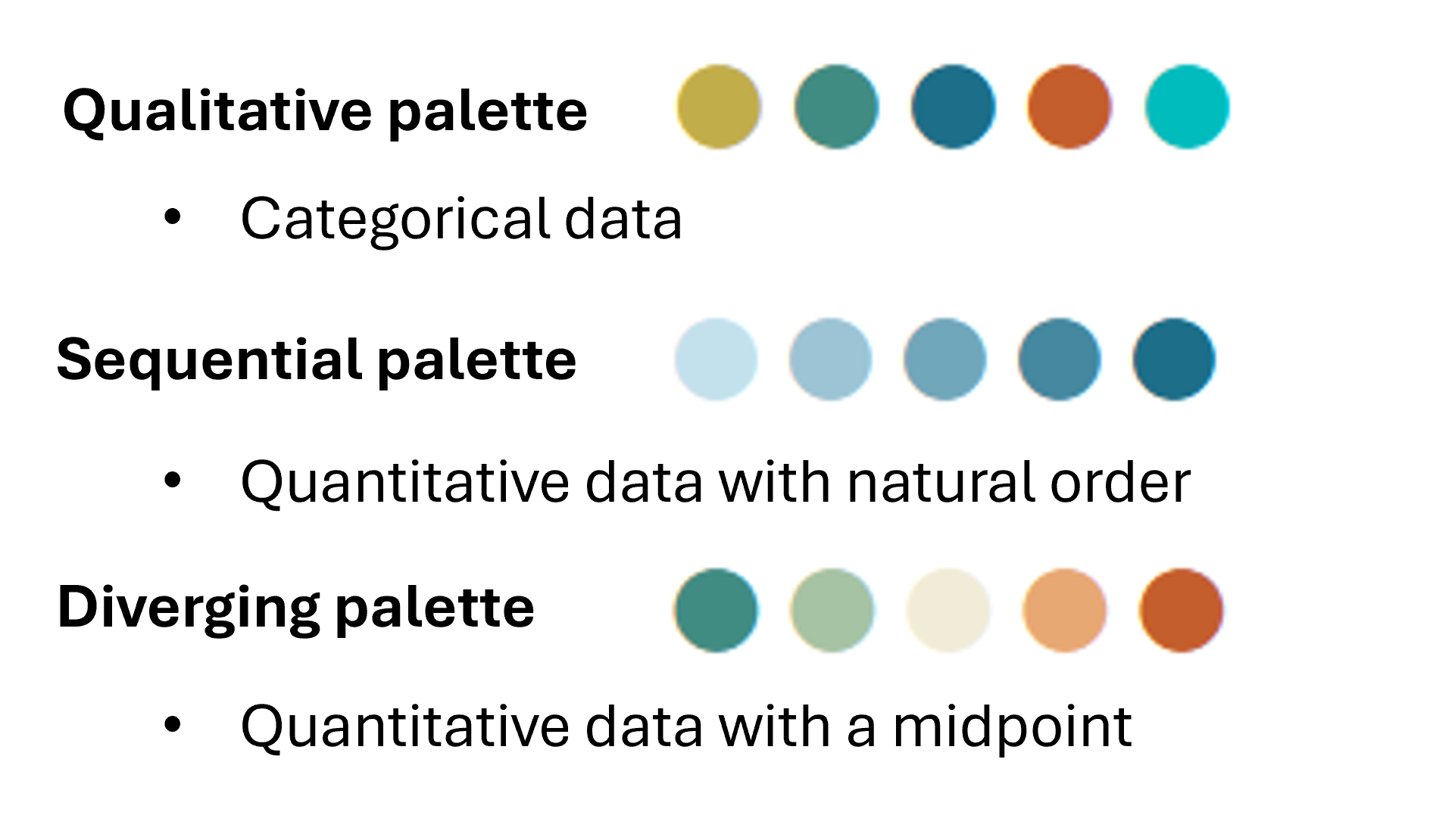
Accessibility considerations
Some design choices affect some audiences more than others
Color palette
Text and symbol sizes
Wilke, Claus. 2019. Fundamentals of Data Visualization
Improving readability
Small symbol and label sizes are difficult to read and leave too much white space
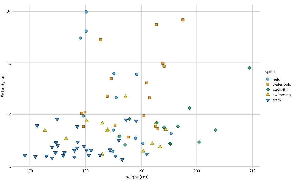
Wilke, Claus. 2019. Fundamentals of Data Visualization
Improving readability
Generally speaking, aim for larger text and point sizes.
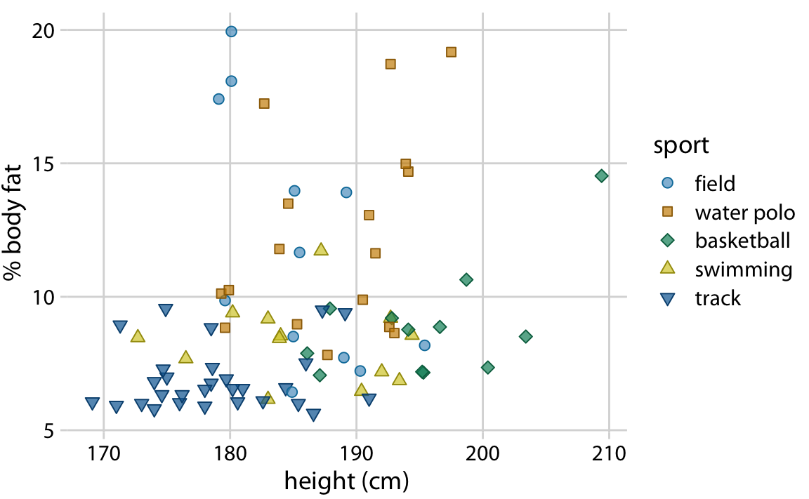
Wilke, Claus. 2019. Fundamentals of Data Visualization
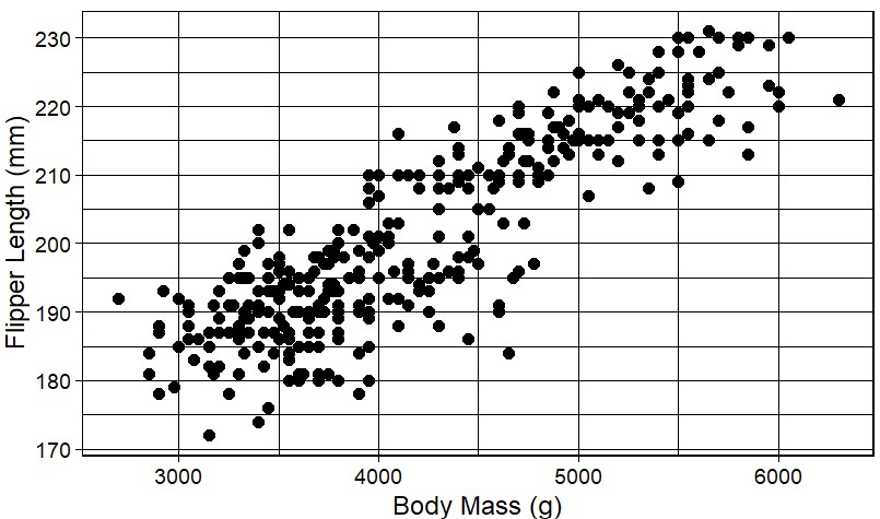
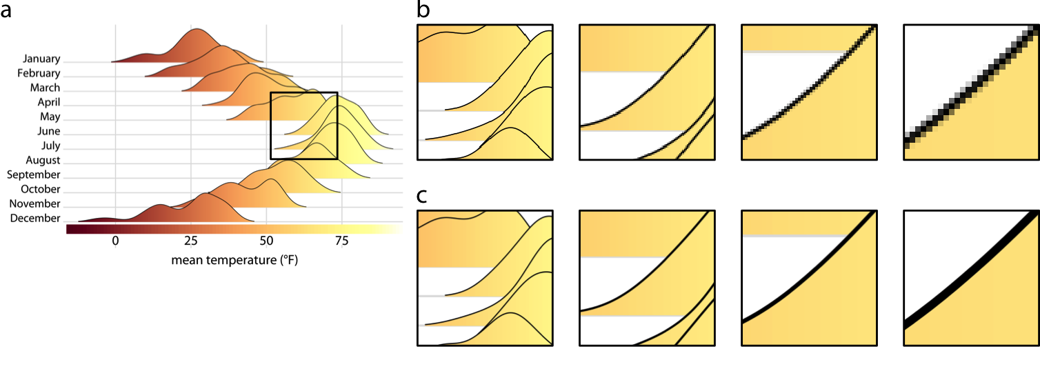
Getting a clearer view
Large datasets pose challenges for representing their structure in two dimensions.
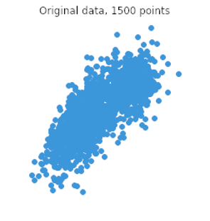
atlassian.com/data/charts/what-is-a-scatter-plot
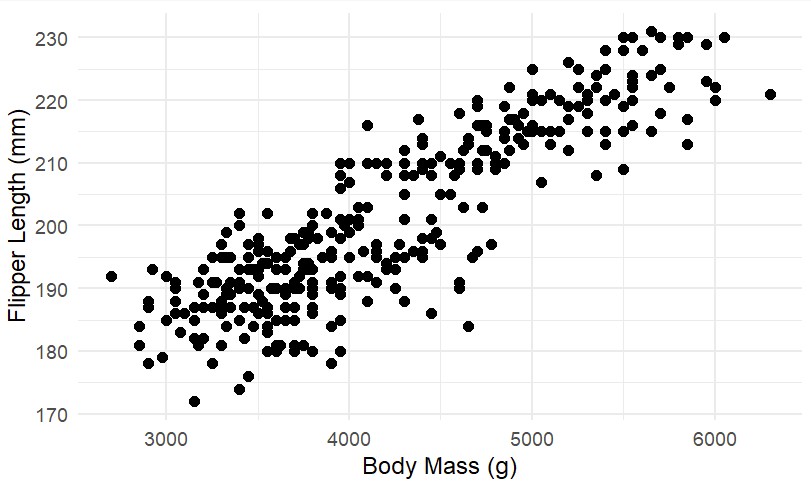
Getting a clearer view
Consider ways to illustrate frequency across the dataset
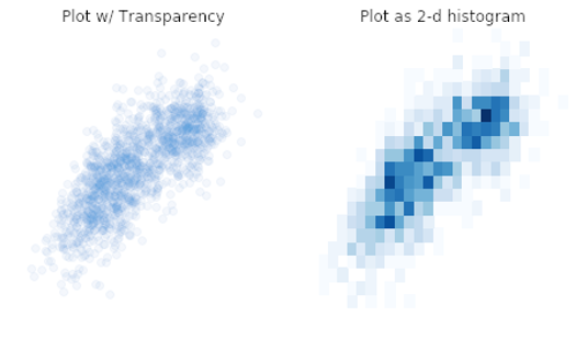
atlassian.com/data/charts/what-is-a-scatter-plot
Drawing the eye to the headline
Knaflic, Cole Nussbaumer. 2019. Storytelling with Data. New York: Wiley.
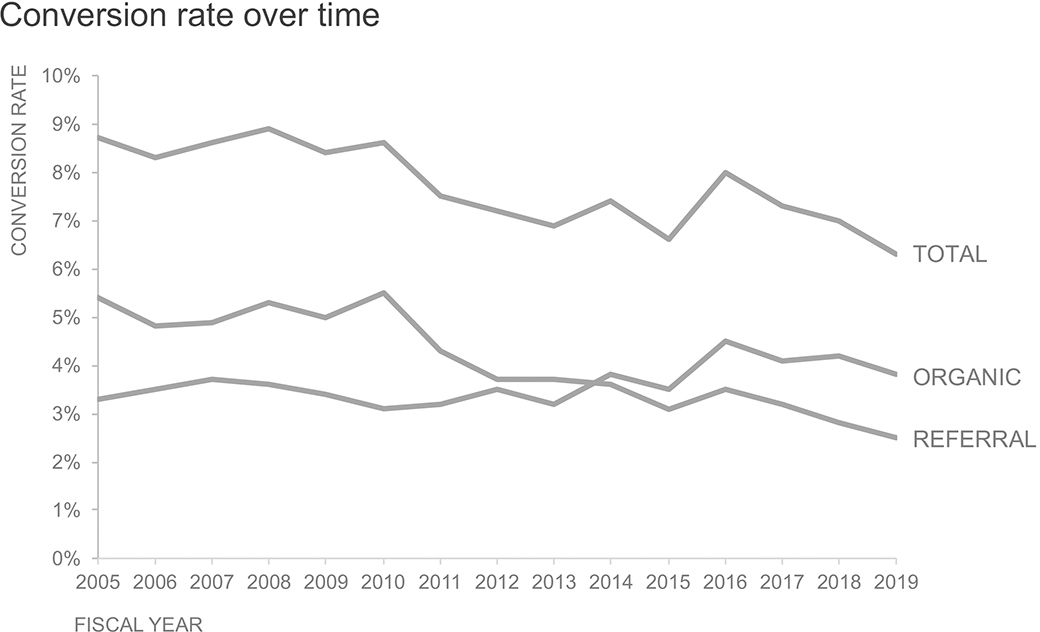
Drawing the eye to the headline
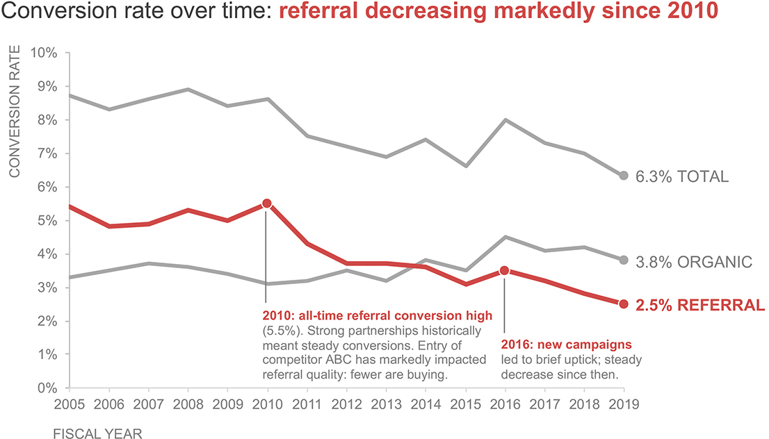
Knaflic, Cole Nussbaumer. 2019. Storytelling with Data. New York: Wiley.
Avoid being deliberately misleading
Changing the aspect ratio of the graphing space can give the impression that a patterns is more or less dramatic than it s.

https://eagereyes.org/blog/2013/banking-45-degrees
Avoid being deliberately misleading
Bar charts are used for comparing amounts; zooming in on the region of interest can exaggerate differences.

https://eagereyes.org/blog/2013/baselines
Avoid being deliberately misleading
What’s wrong here?
https://infolific.com/technology/internet/seo-lie-factor/
Bitmap vs Vector
Wilke, C. 2019. Fundamentals of Data Visualization
Bitmap vs Vector
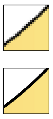
Wilke, C. 2019. Fundamentals of Data Visualization
Helpful resources
Want to learn more?
Example 1
Example 2
Example 3
Example 4