Is it OK if I don’t have a significant relationship?
Do I need to revise my project if I can’t answer my question with the data?
What if my results don’t show anything exciting/interesting?
Science
Science fails
Science fails all
Science fails all the
Science fails all the time
Science fails all the time.
Science fails all the time.
And that’s OK.
Does this mean I asked a bad question?
Does this mean I asked a bad question?
No.
Does this mean I asked a bad question?
No. Developing research questions takes time and practice. But they should never be asked with the expressed aim of getting a “significant” result.
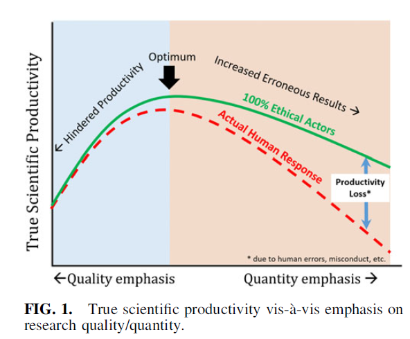
Perverse incentives
Edwards and Roy 2017 Academic Research in the 21st Century DOI: 10.1089/ees.2016.0223
Fail productively
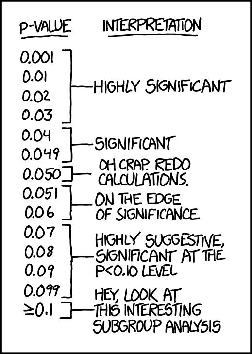
XKCD
A negative result is a result nonetheless.
If your assumptions/predictions didn’t work out, ask why not.
If your results are inconclusive, ask what data might be needed.
How does your result compare with other studies?
Fail productively, fail gloriously
“To fail productively, one has to be aware of the multiple contexts of that fail to find the valuable experience. To fail gloriously is to use the privileges that you have, as you are able, to make it safe for others to fail.” - Shawn Graham, Failing Gloriously
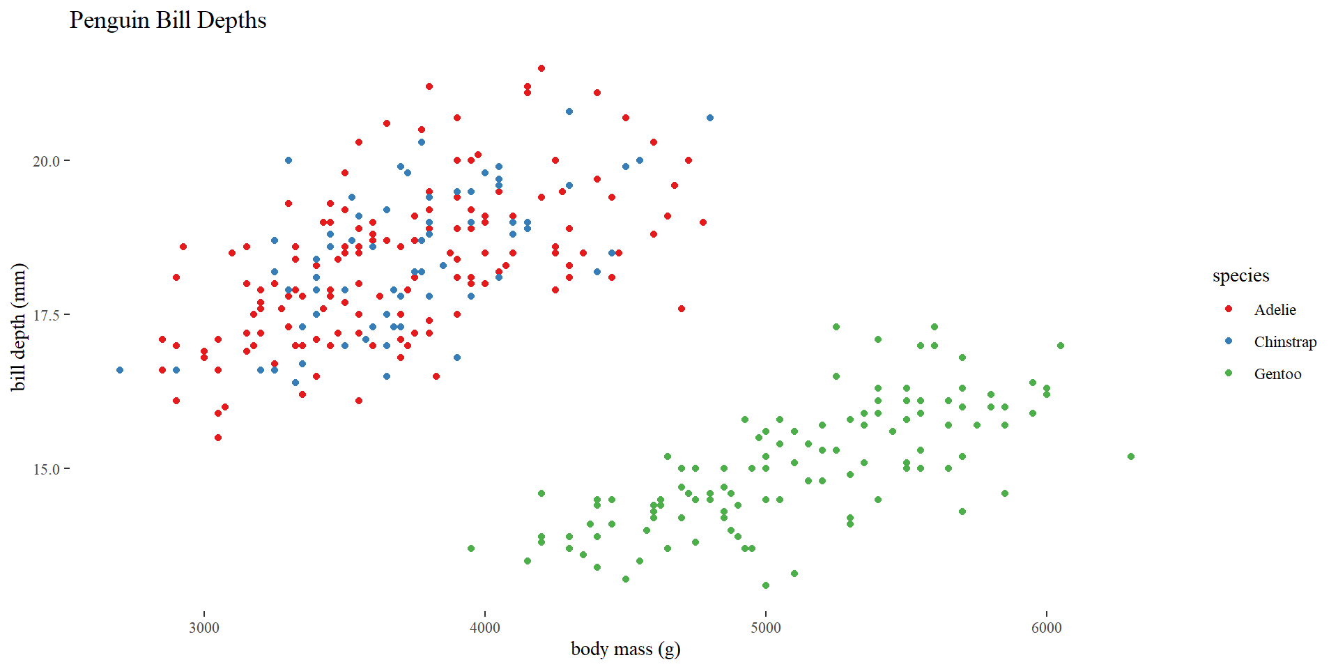
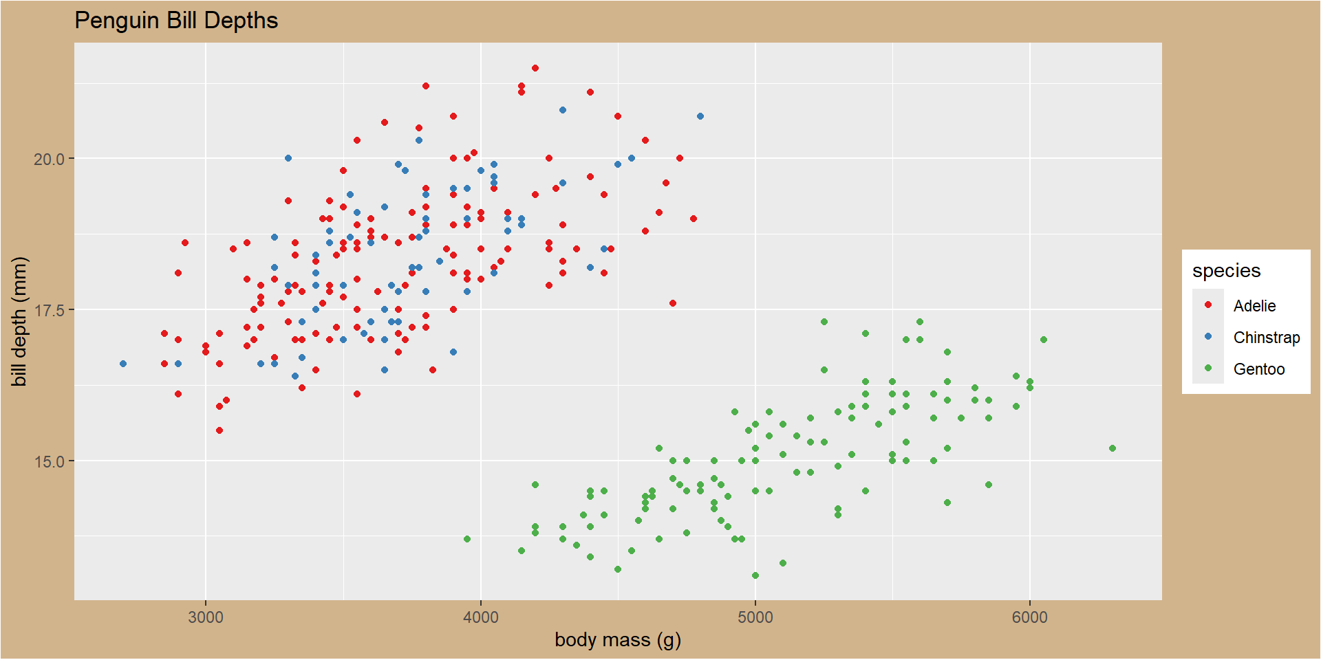
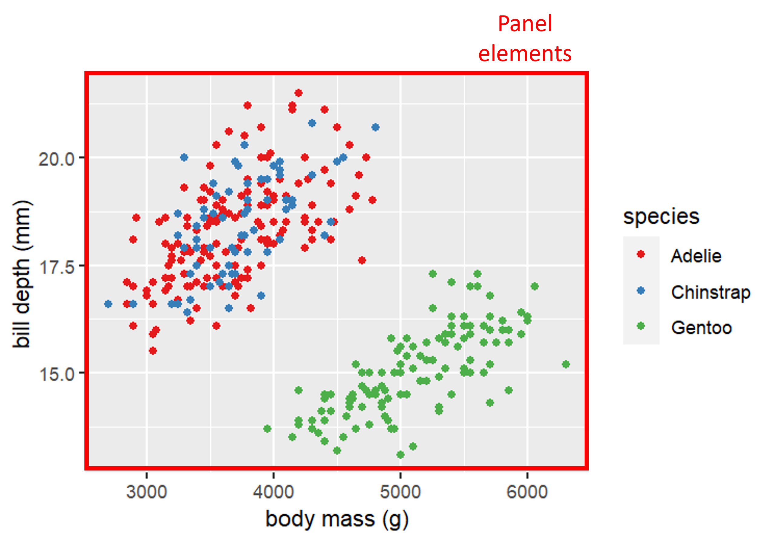
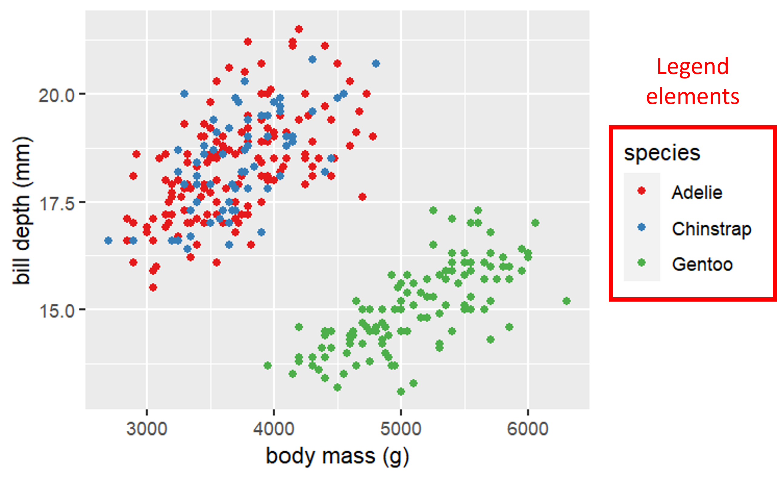
Base plot
library(tidyverse)library(palmerpenguins)basePlot<-ggplot(drop_na(penguins),aes(x=body_mass_g,y=bill_depth_mm,color=species)) +geom_point() +scale_colour_brewer(palette ="Set1") +labs(x="body mass (g)",y="bill depth (mm)",title="Penguin Bill Depths")
Base plot
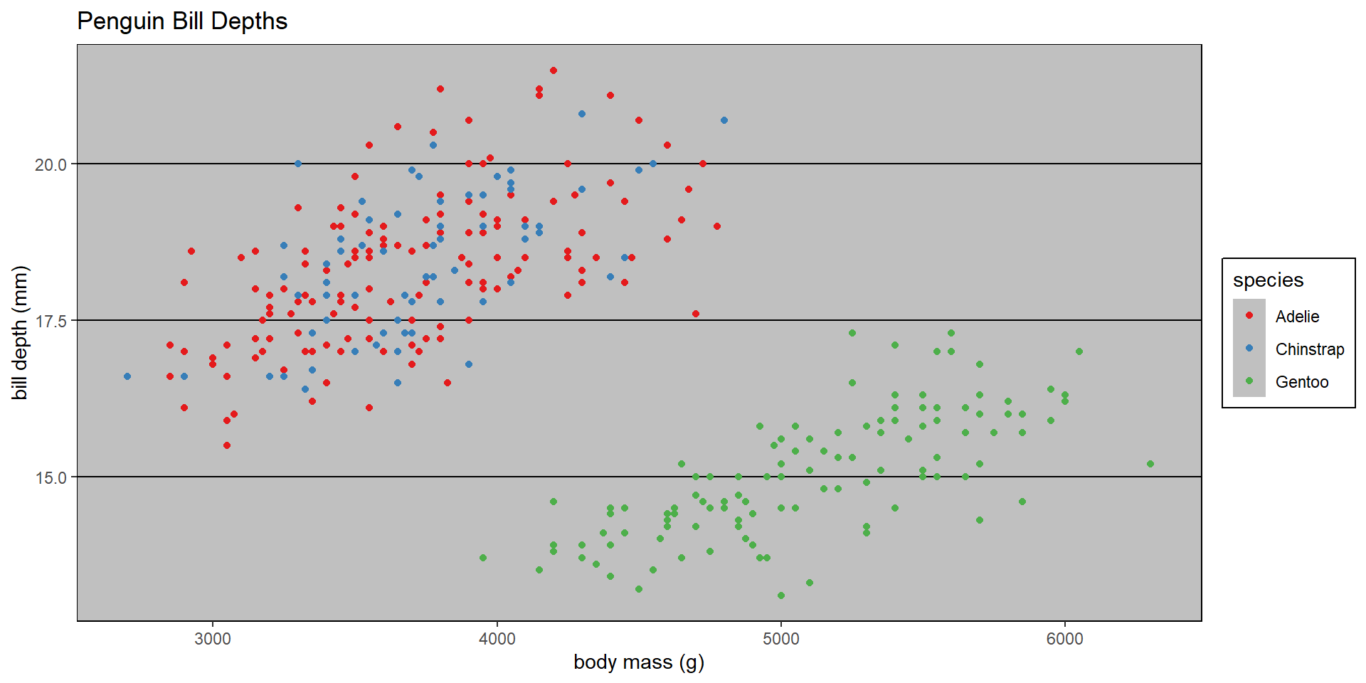
Using complete themes
basePlot +theme_classic()
Using complete themes
basePlot +theme_dark()
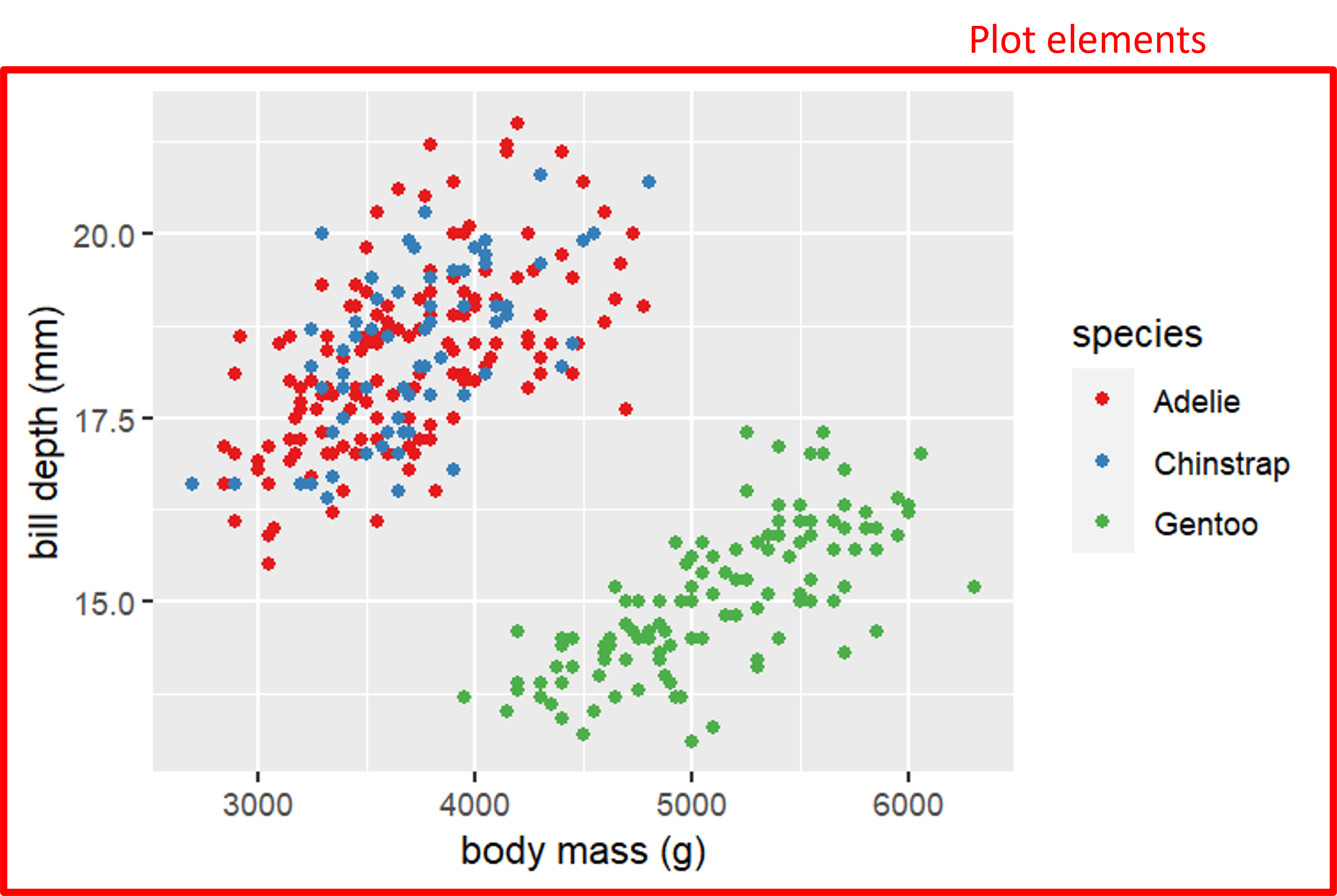
Even more complete themes
library(ggthemes)basePlot +theme_tufte()
Even more complete themes
library(ggthemes)basePlot +theme_excel()
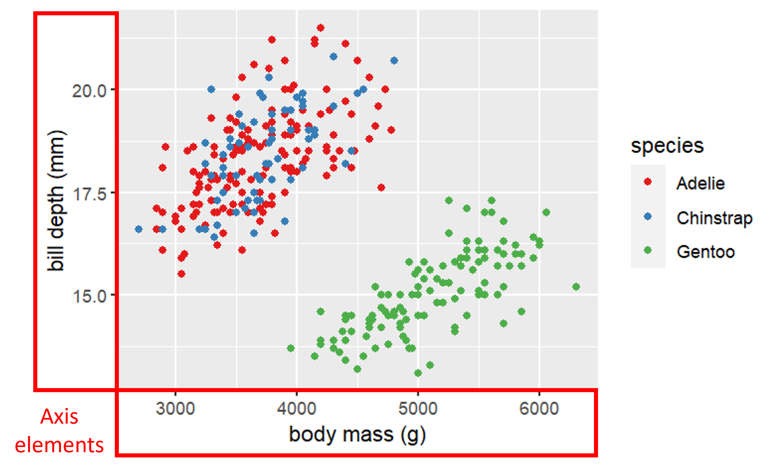
Customizing appearance with theme
Theme elements are the non-data parts of your plot (e.g., text, These can be accessed using the theme function:
Where element.name refers to the element of the graph (e.g., axis.ticks for the tick marks), and the element_function controls what aspect of it is going to be changed (e.g., line width).
Customizing appearance with theme
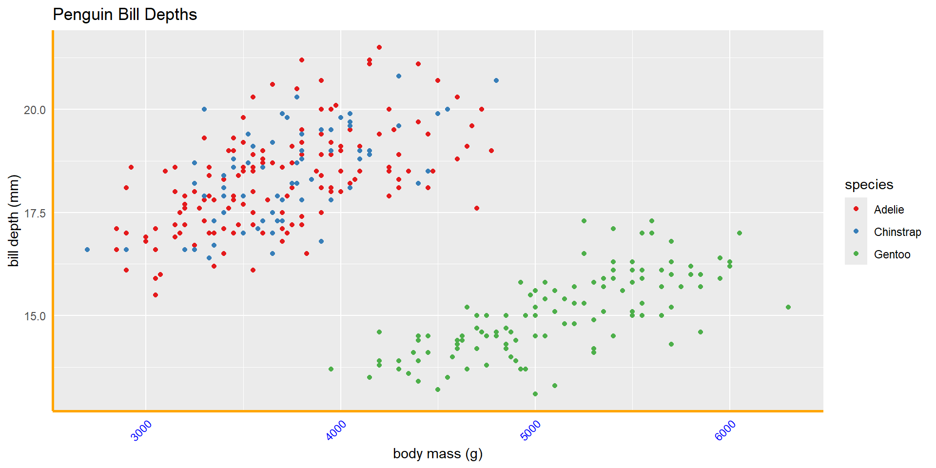
element_text() controls text face, color, size, angle, etc.
element_line() controls line color, linewidth, and linetype
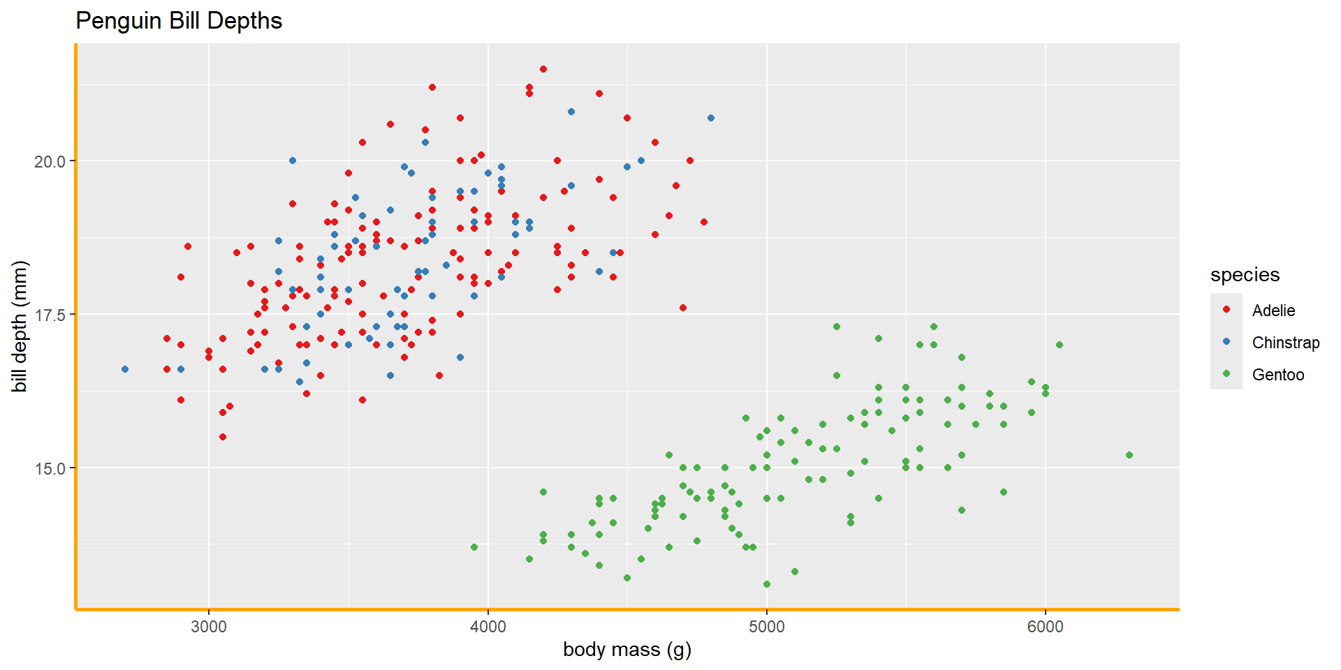
element_rect() controls rectangular areas fill and border line
element_blank() controls whether an element is drawn or not
Note: this will remove a drawing rather than make it invisible!