Environmental Data Analysis and Visualization
Visualization Critique

Visualization Critique

Visualization Critique
Sensor of the week
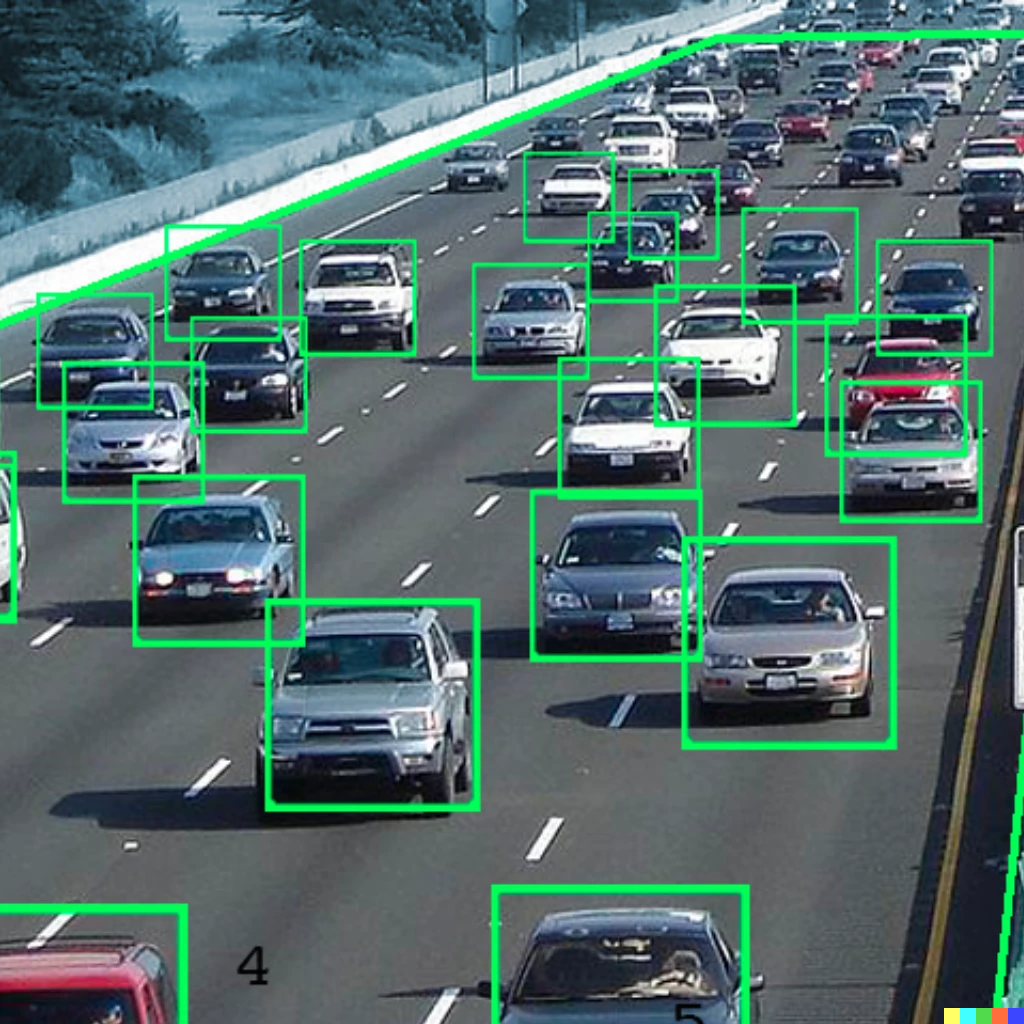
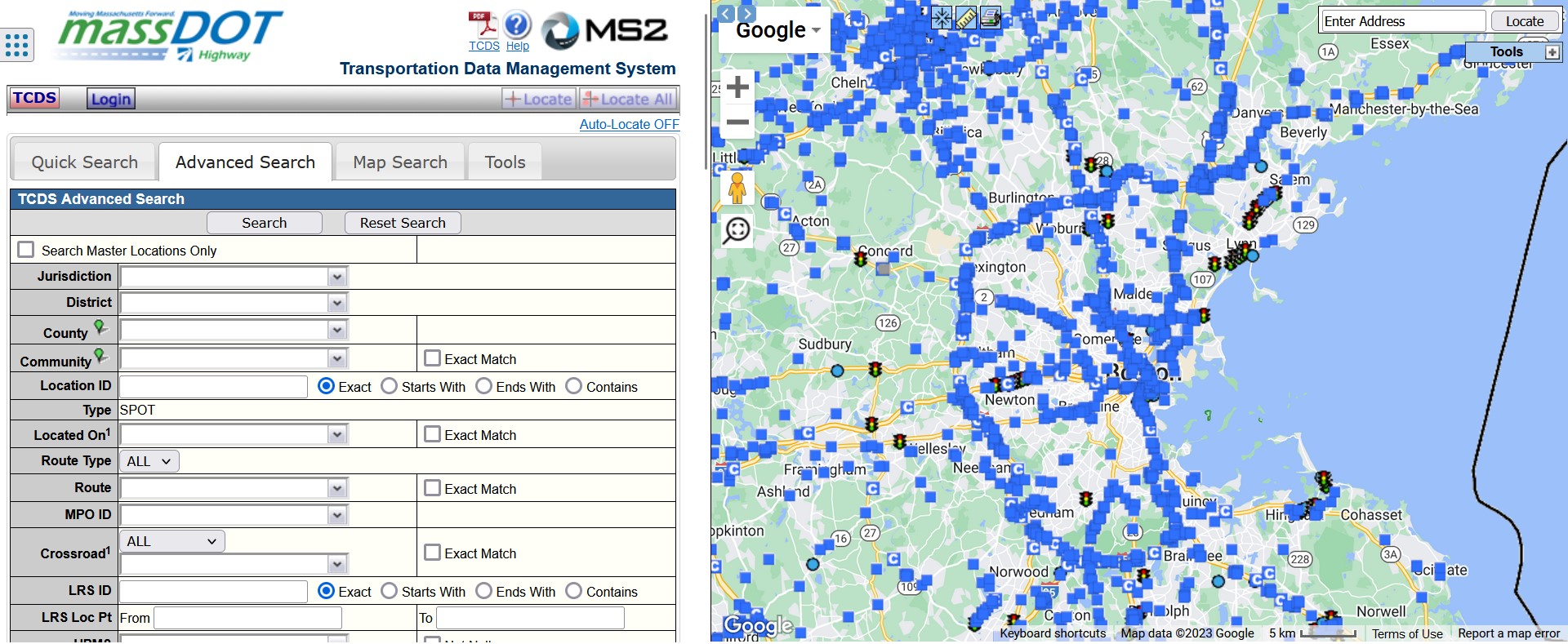
Traffic sensors
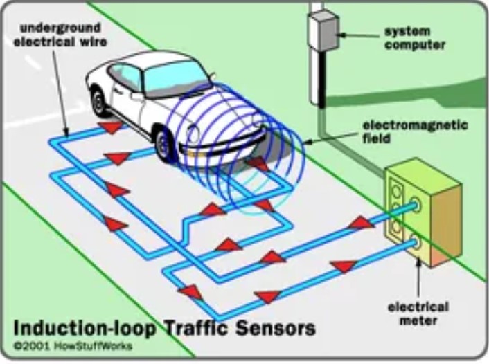
Sensor of the week
Traffic sensors
Learning how to look

University of Wollongong
Getting a clearer view

Getting a clearer view
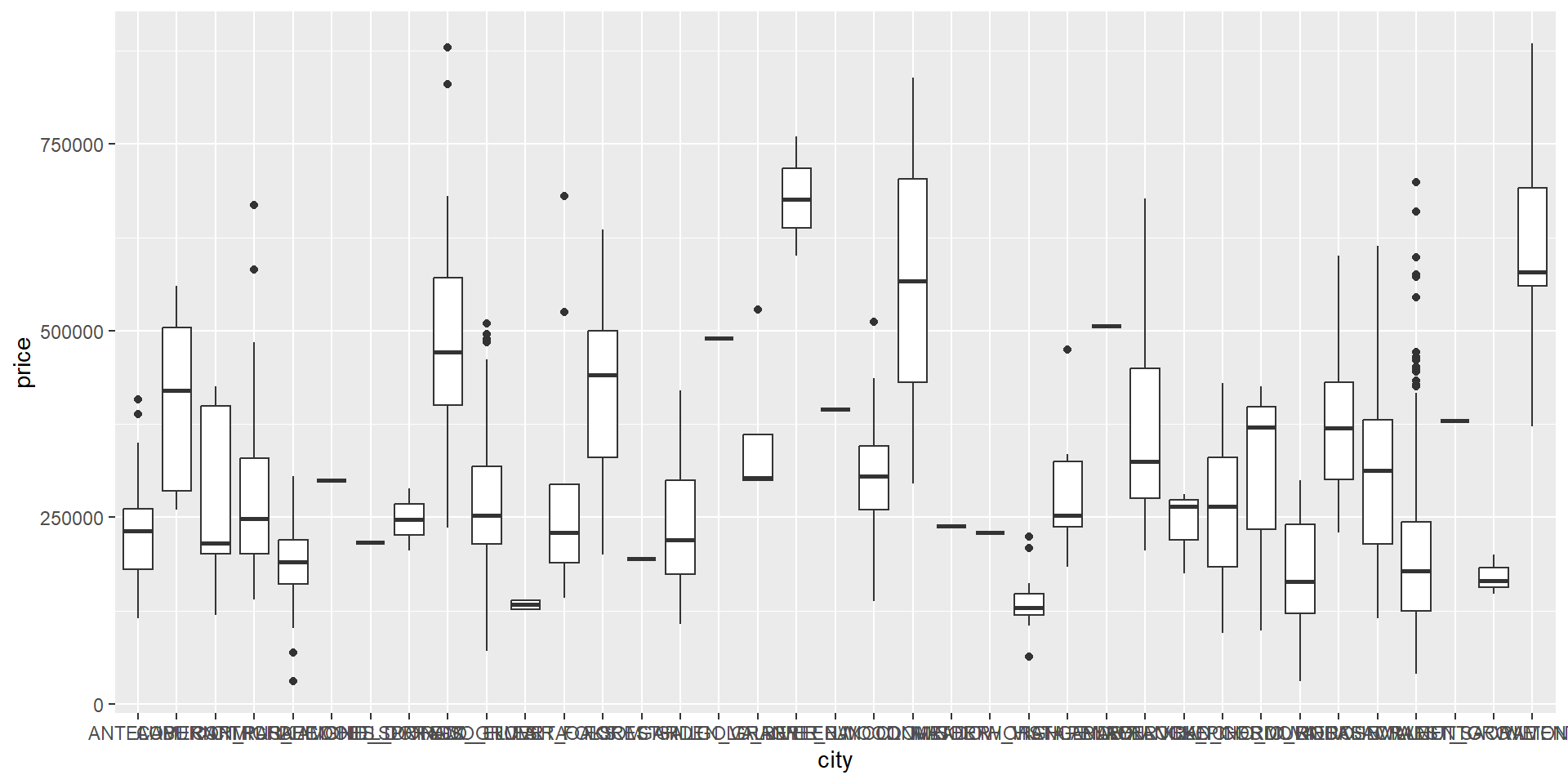
Getting a clearer view
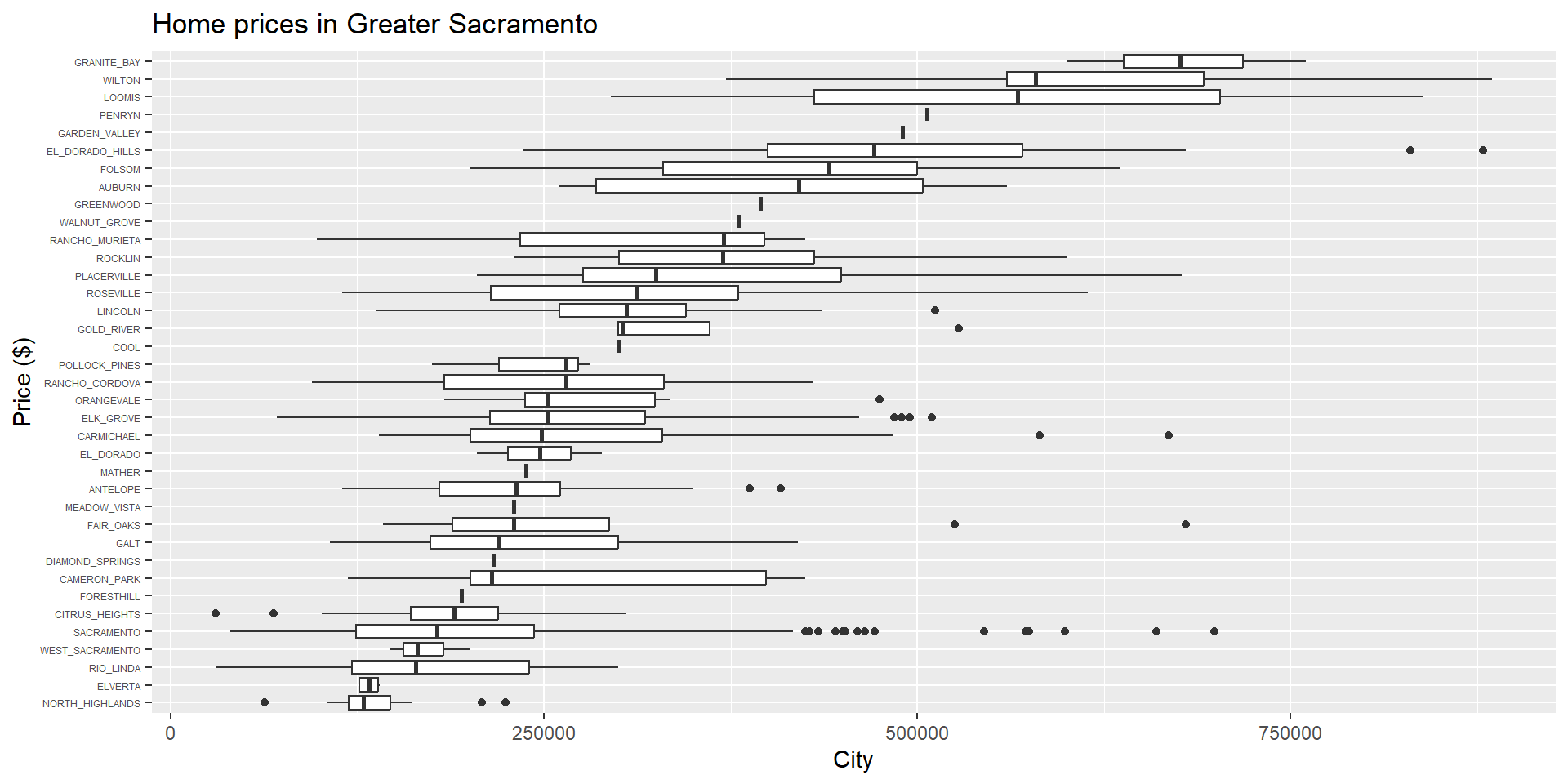
Flip x and y axes
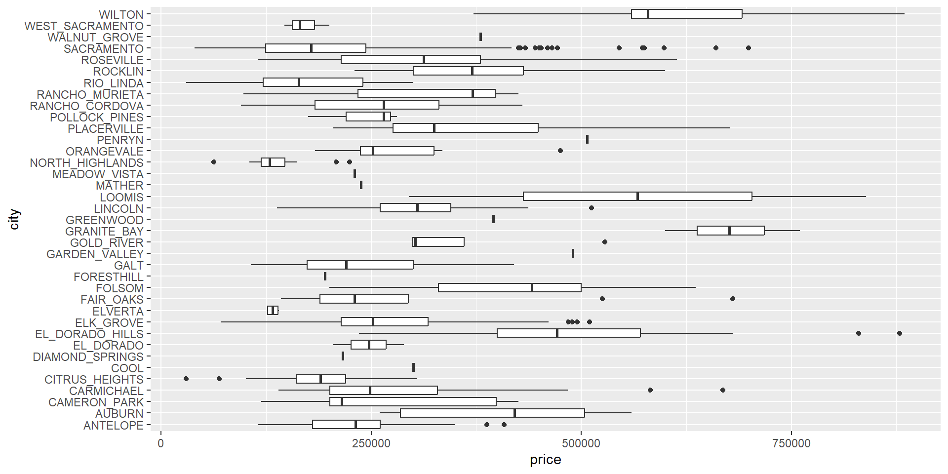
Getting a clearer view
Resize y-axis labels
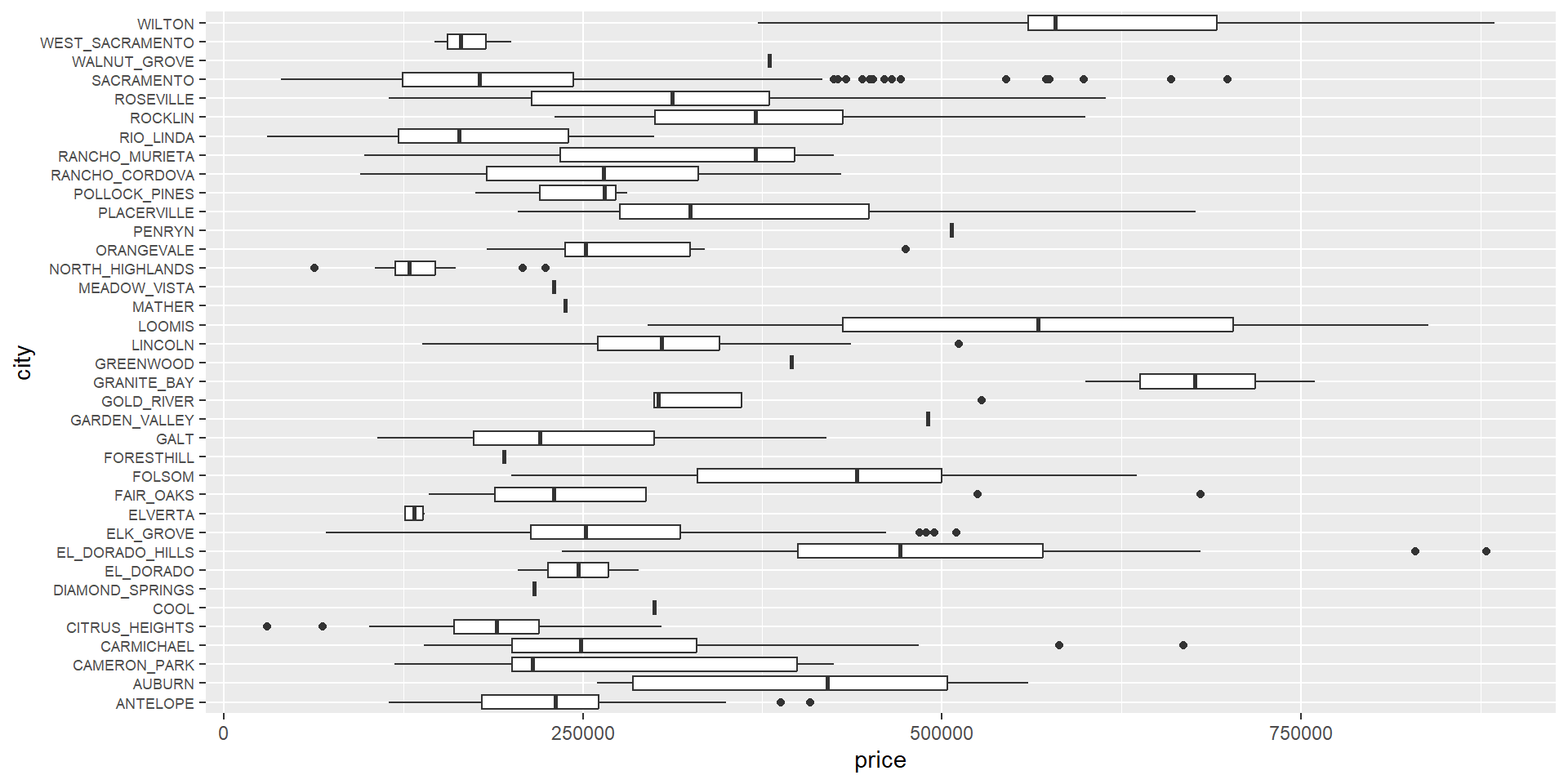
Getting a clearer view
Reorder based on median house prices
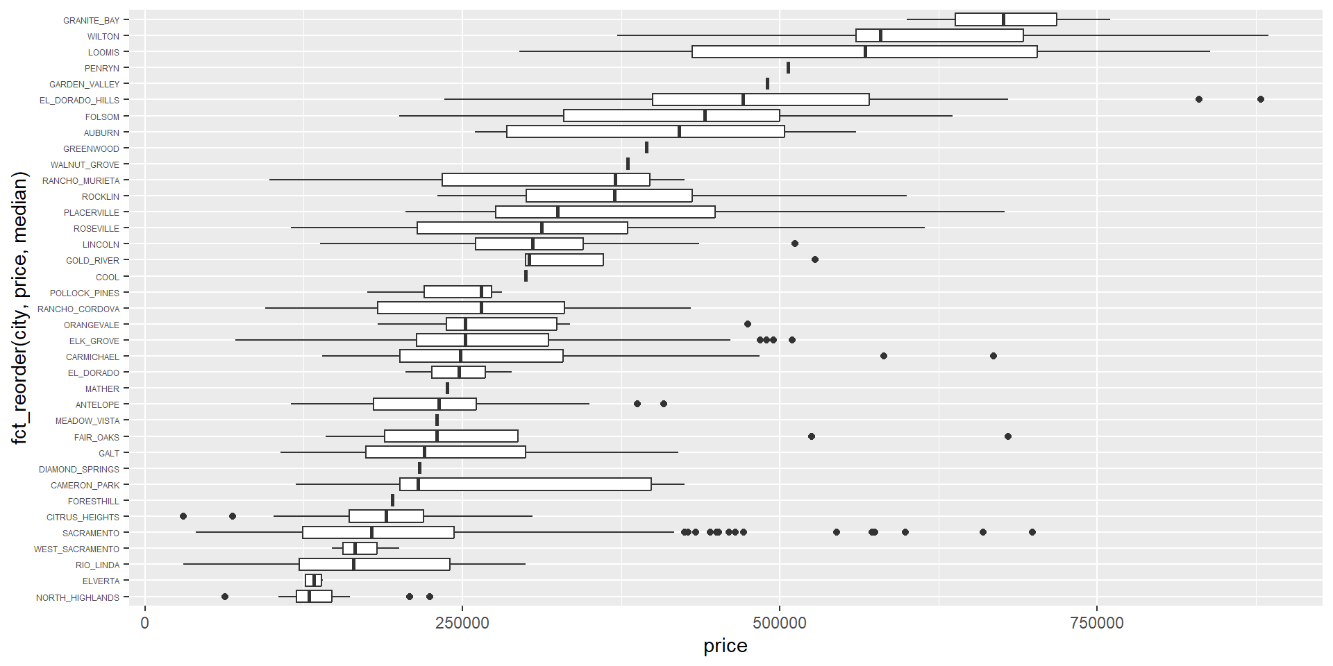
Getting a clearer view
Add some labels
Getting a clearer view
Getting a clearer view
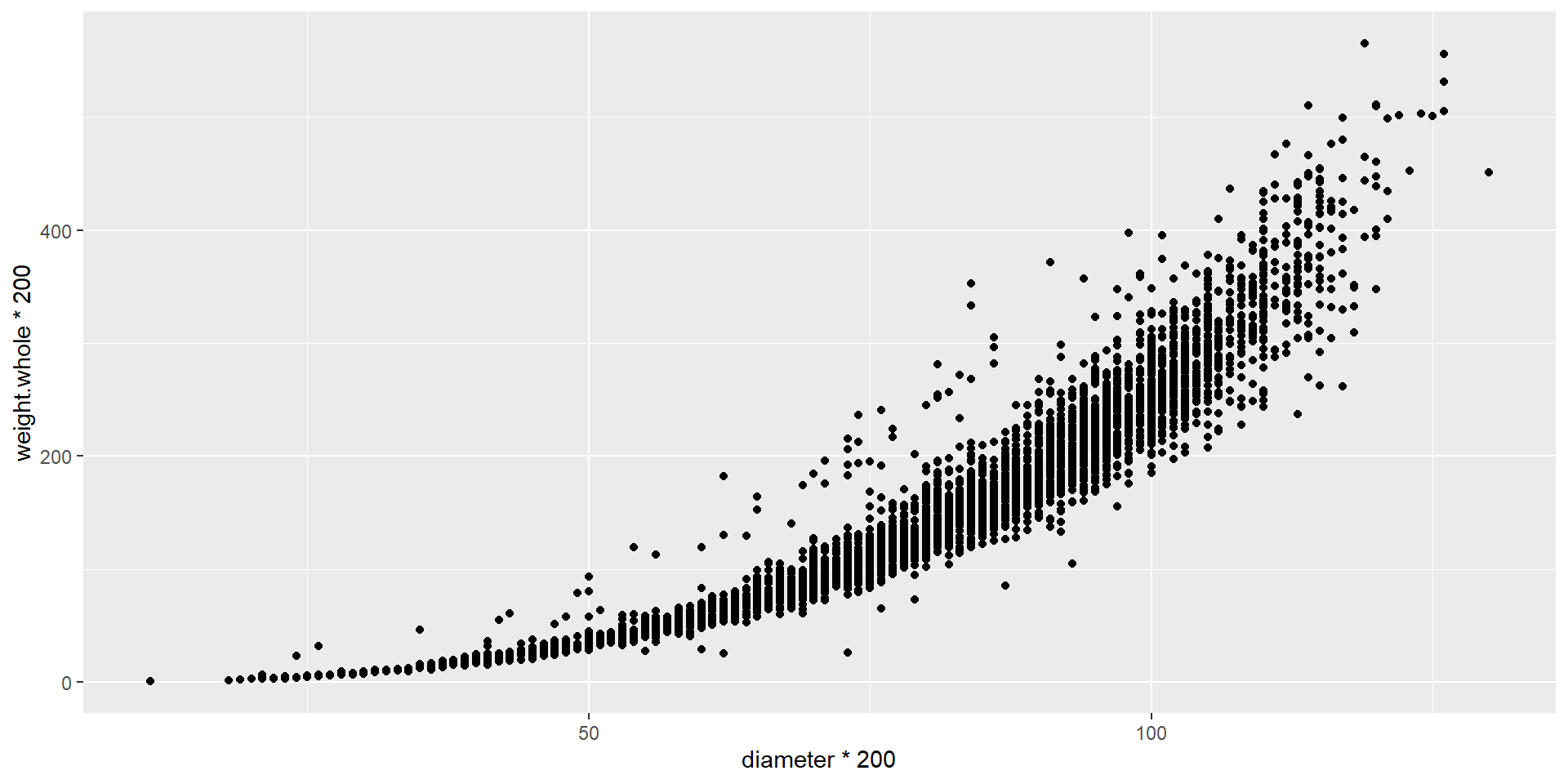
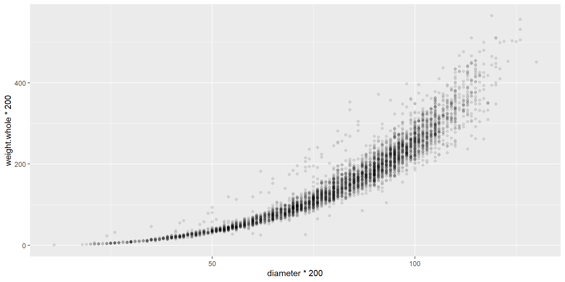
Changing the transparency (alpha)
Getting a clearer view
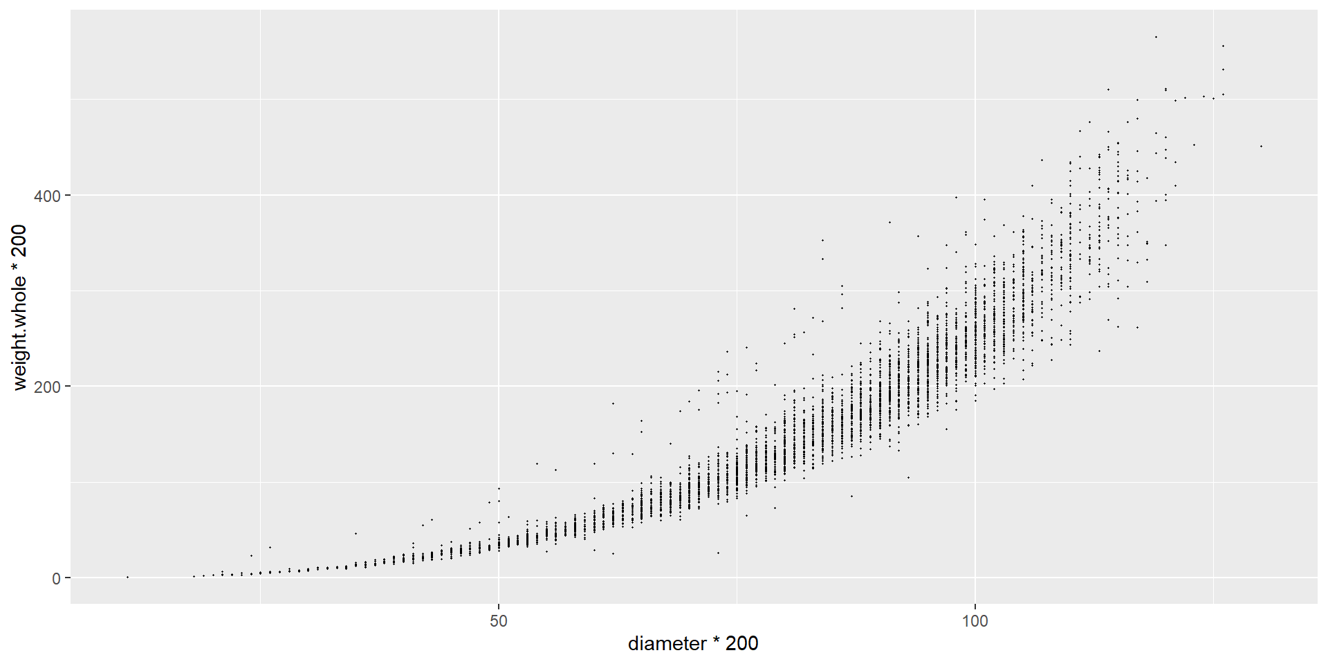
Changing the size
Getting a clearer view
Binning the values (geom_bin2d)
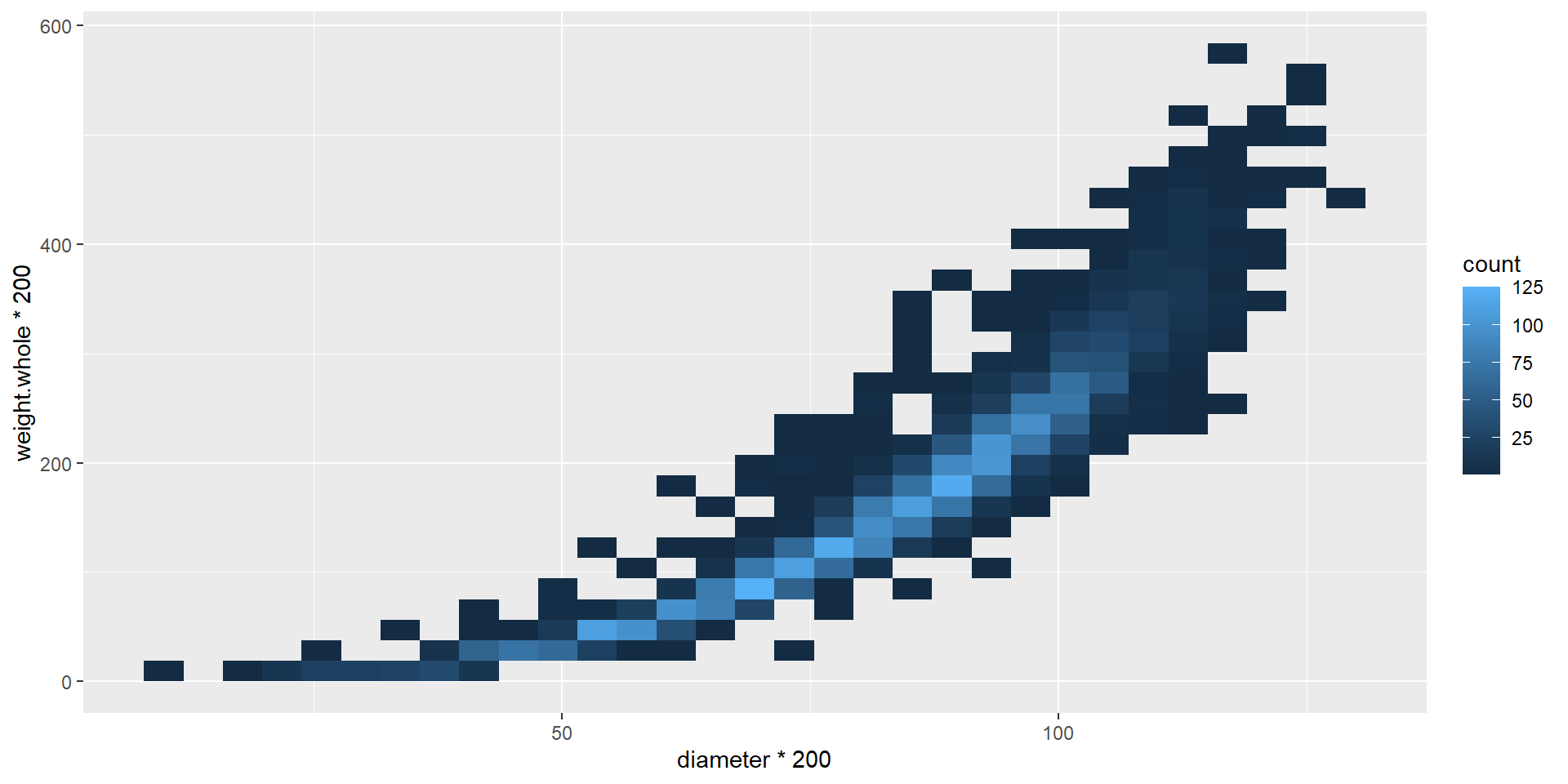
Getting a clearer view
Data: Common bully (Gobiomorphus cotidianus) records from New Zealand Freshwater Fish Database
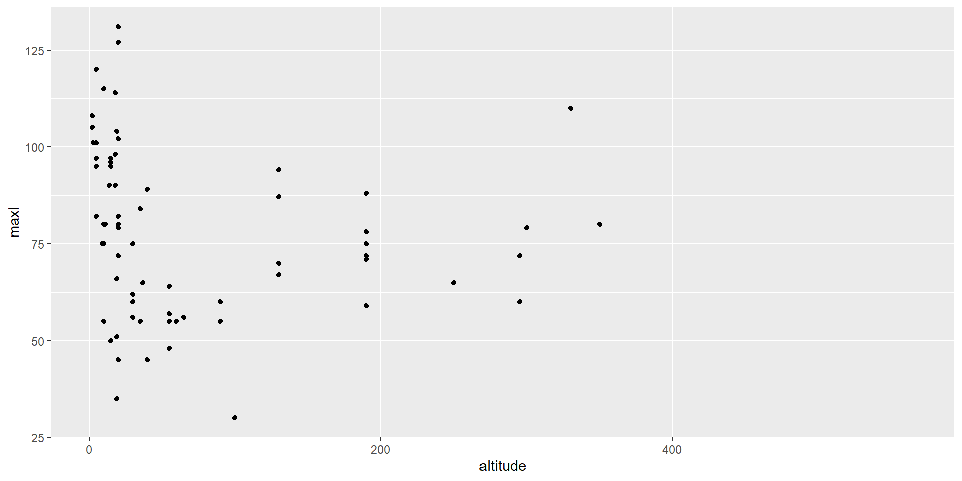
Getting a clearer view
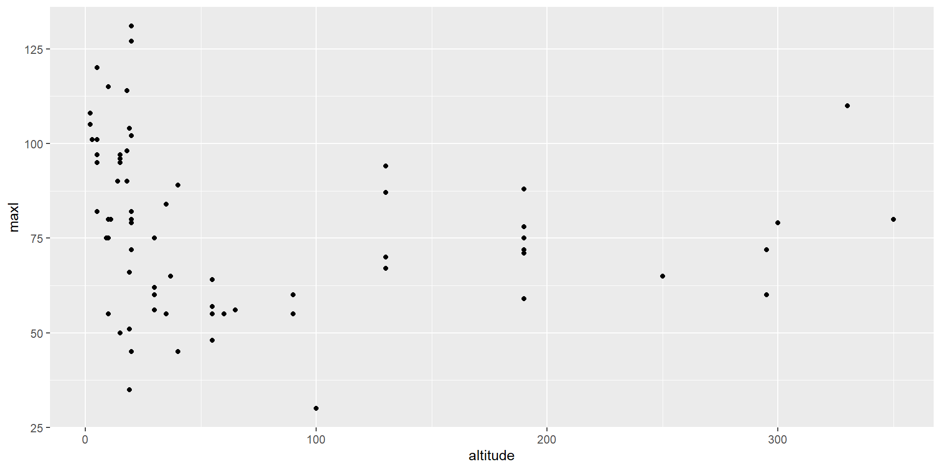
Getting a clearer view
Zooming in
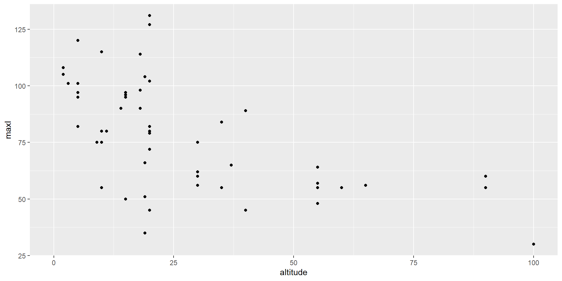
Getting a clearer view

Getting a clearer view
Log-10 transformation on x-axis
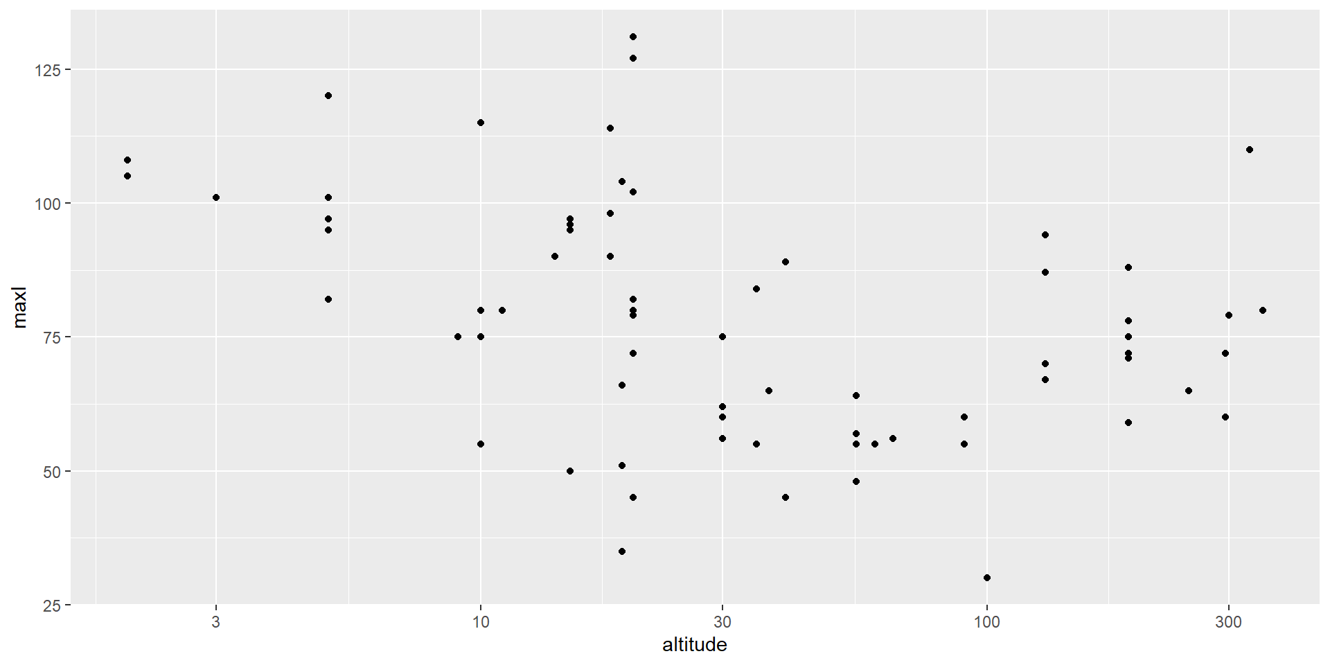
Getting a clearer view
Add a smooth line
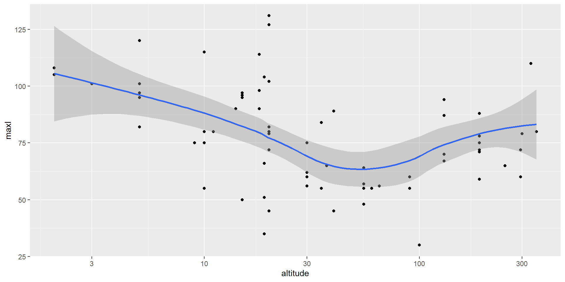
Seeing the bigger picture
Faceted plots can help us view the same pattern across multiple variables.
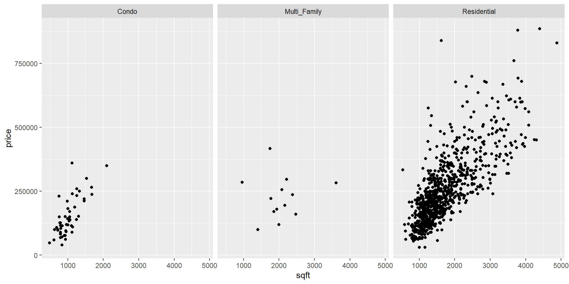
Activity: Looking and comparing
In this exercise, you’ll use the
scatdataset in themodeldatapackage (same data, fewer bobcars)Use the
facet_wrapfunction to look at relationships (remember to use thevarsfunction to identify your aesthetic mapping):length and diameter by species
diameter and mass by species
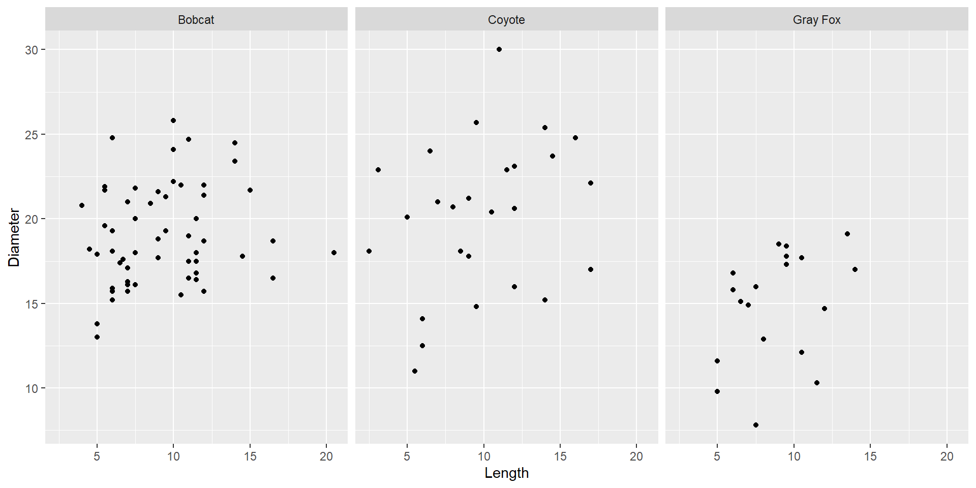
Correlation coefficient

https://online.stat.psu.edu
What to do about outliers?
Just because something is an outlier, doesn’t automatically make it wrong or a mistake.

What to do about outliers?
Just because something is an outlier, doesn’t automatically make it wrong or a mistake.
But some outliers are mistakes.
What to do about outliers?
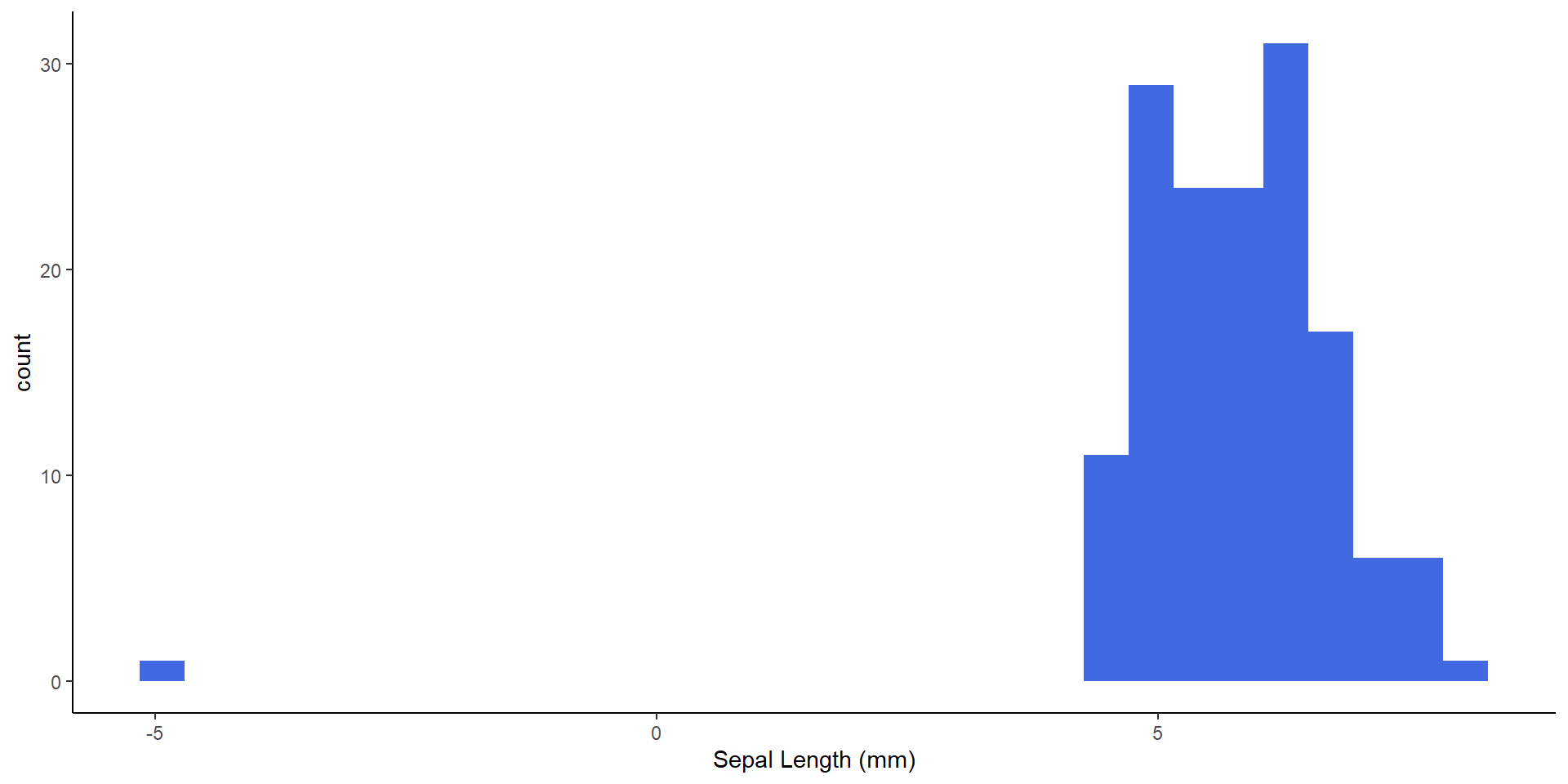
What to do about outliers?
Your job as the data scientist is decide which is which.
If you decide to eliminate an observation, do not modify the original data. Instead, create a new dataset without the observation.
Always detail any decision-making
Next week
Hypothesis testing
Best practices for data documentation
Introducing Quarto
Data ethics and open science models