Environmental Data Analysis and Visualization
Sensor of the day
The Mystic River Water Quality Buoy!
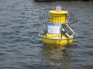
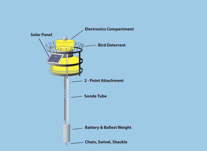
Sensor of the day
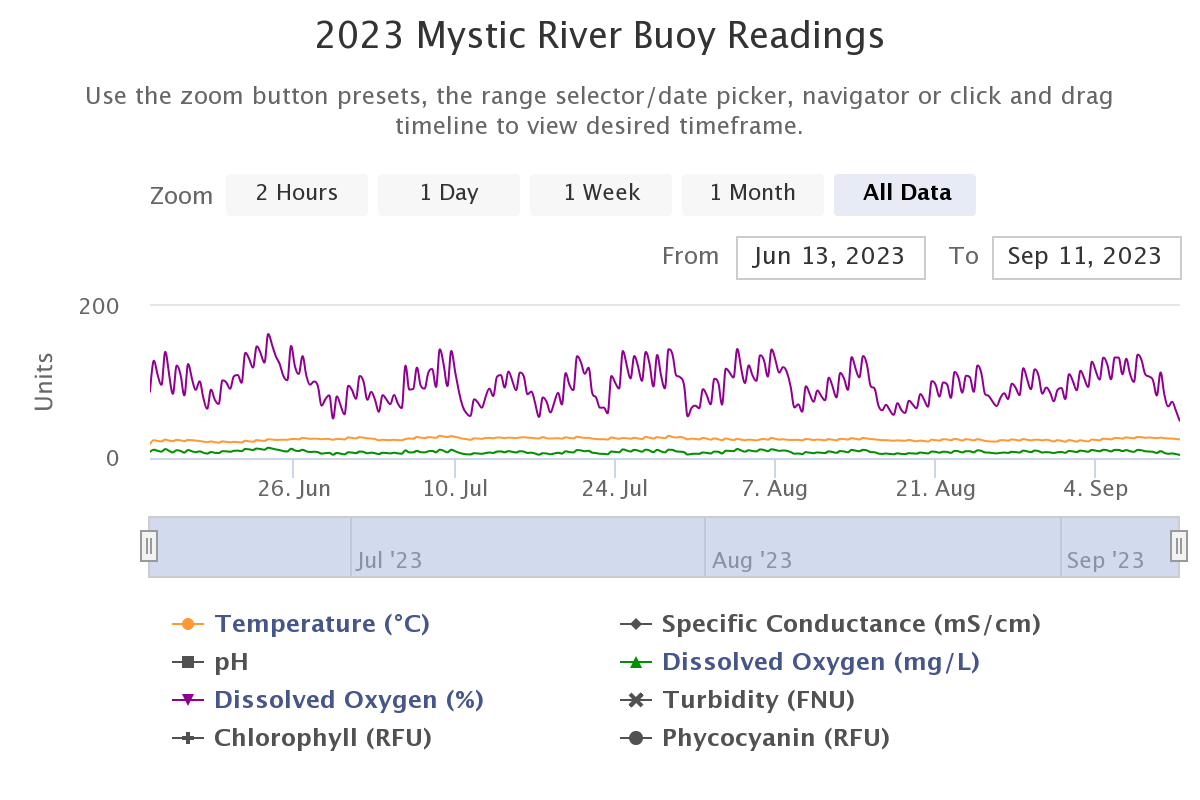
Mystic River Buoy Readings
National Water Quality Monitoring Council
Why visualize?
Visualization helps us to identify patterns and structures in data that are not evident from tables or numerical summaries.
Faith, J. Tyler. 2018. “Paleodietary Change and Its Implications for Aridity Indices Derived from δ18O of Herbivore Tooth Enamel.” https://doi.org/10.1016/j.palaeo.2017.11.045.
Why visualize?
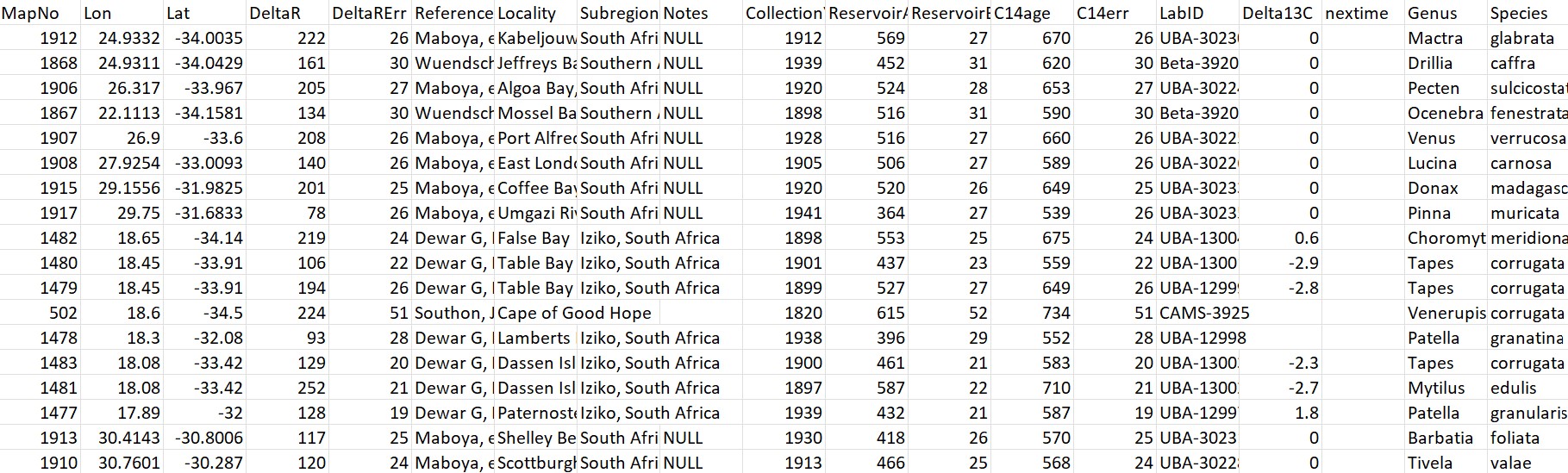
Marine Reservoir Correction data from calib.org
Why visualize?
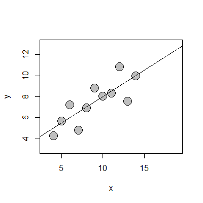
Mean x: 9
Mean y: 7.5
Pearson correlation coefficient (r): 0.816
Coefficient of determination (R2): 0.67
Why visualize?

Avenue, CC BY-SA 3.0 <https://creativecommons.org/licenses/by-sa/3.0>, via Wikimedia Commons
Why visualize?
Matejka and Fitzmaurice, 2017. “Same Stats, Different Graphs: Generating Datasets with Varied Appearance and Identical Statistics through Simulated Annealing.” https://doi.org/10.1145/3025453.3025912.
Also see: datasaurus package
What kind of visualization?
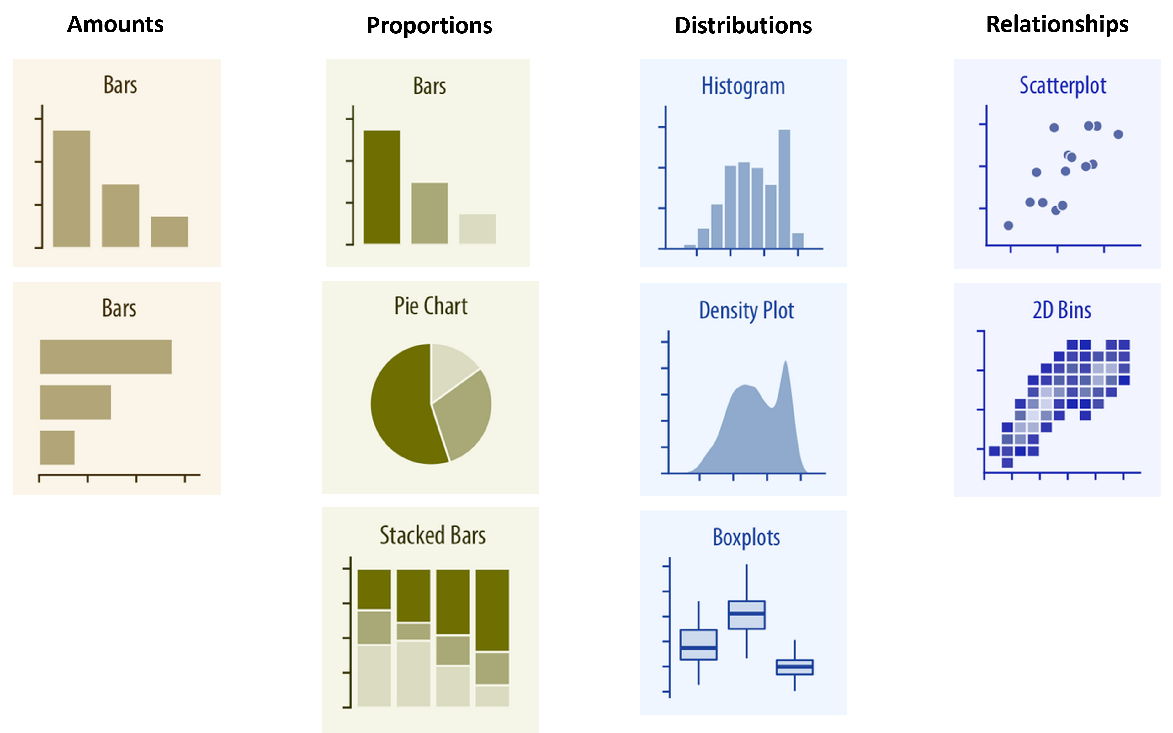
Wilke, Claus. 2019. Fundamentals of Data Visualization
What kind of visualization?
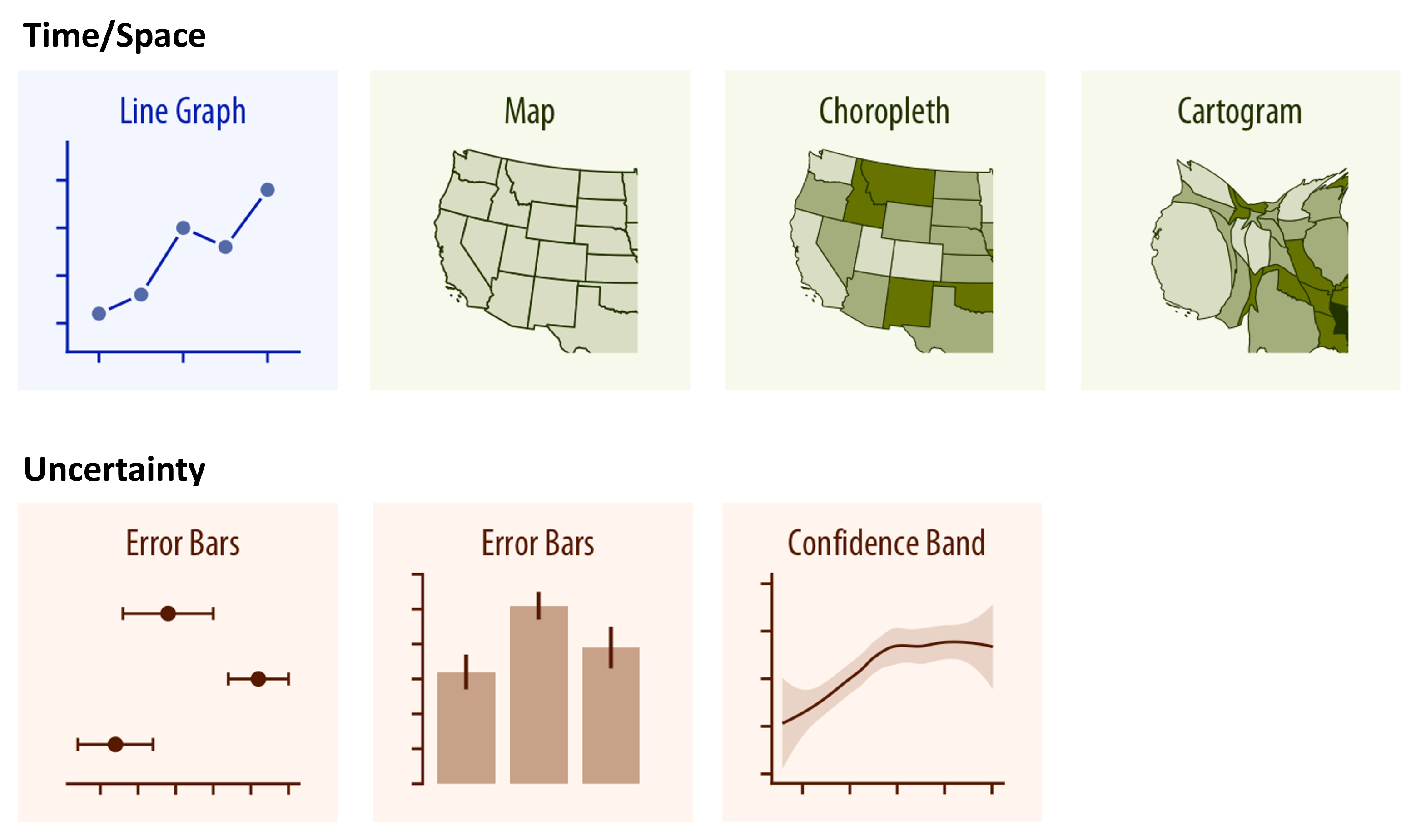
Wilke, Claus. 2019. Fundamentals of Data Visualization
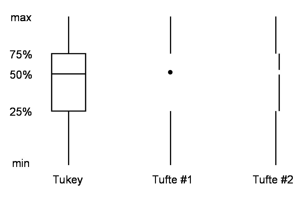
Activity: To erase or not to erase?
/simplexct/images/image-tfe54.png)
Activity: To erase or not to erase?
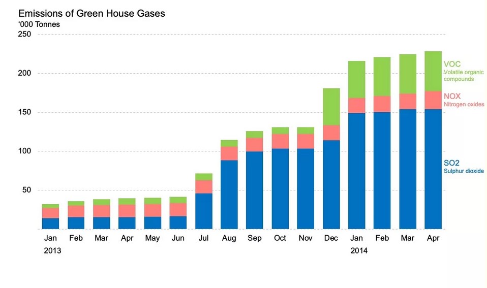
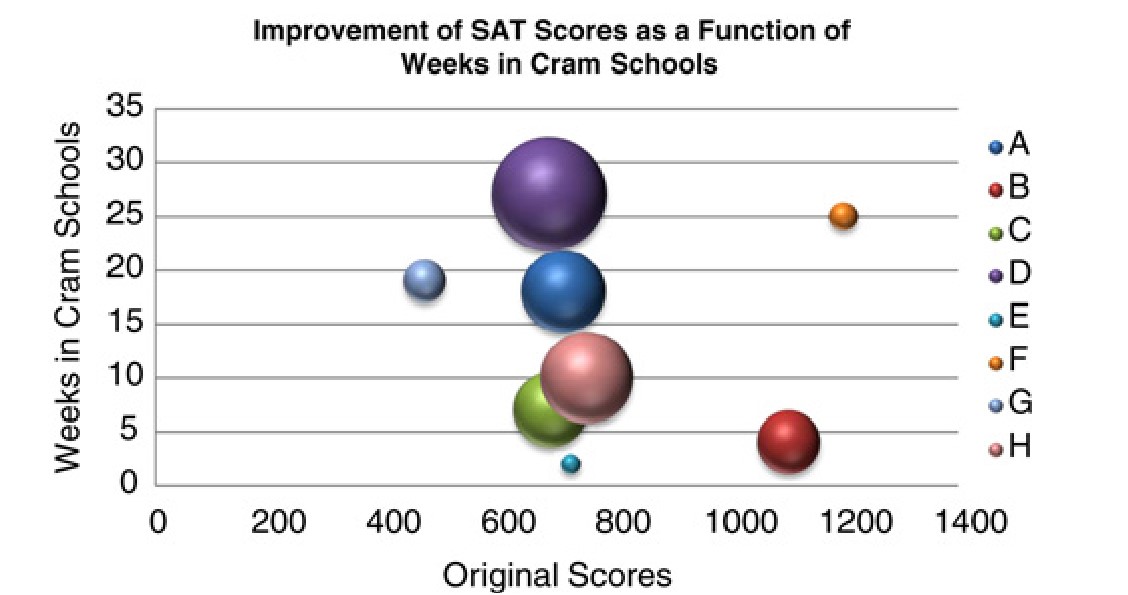
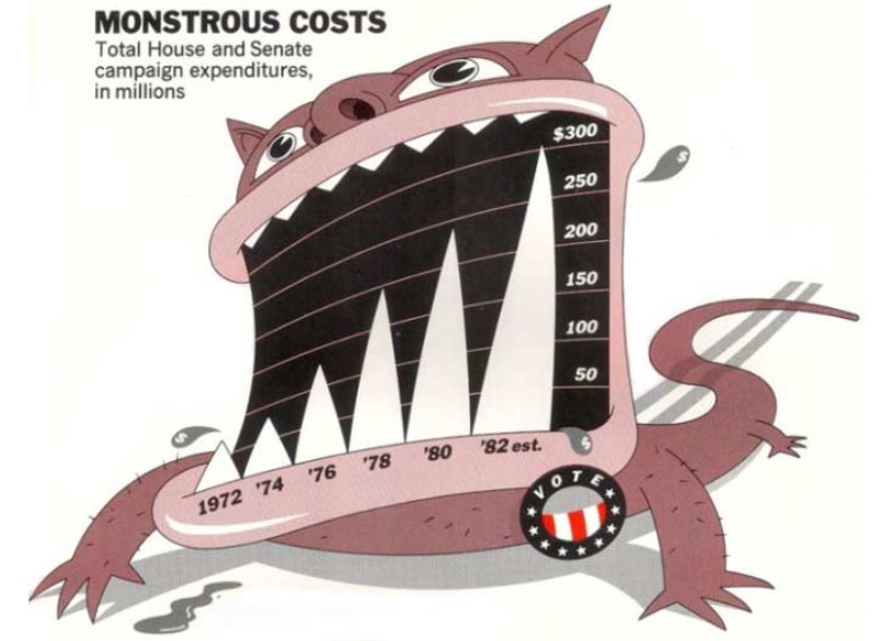
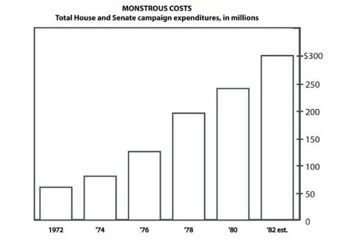
Chartjunk
The most egregious use of non-data ink is often referred to as chartjunk.
Su, Yu-Sung. 2008. "It's Easy to Produce Chartjunk Using Microsoft®Excel 2007 but Hard to Make Good Graphs." https://doi.org/10.1016/j.csda.2008.03.007.
Chartjunk
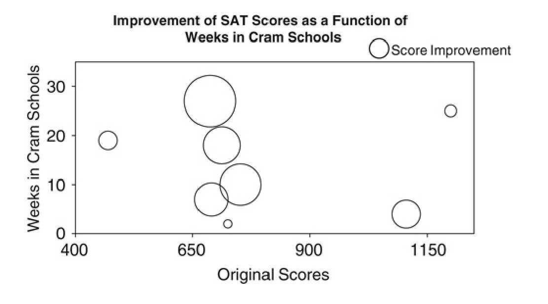
Su, Yu-Sung. 2008. "It's Easy to Produce Chartjunk Using Microsoft®Excel 2007 but Hard to Make Good Graphs." https://doi.org/10.1016/j.csda.2008.03.007.
Data-ink: Can it go too far?
Can chartjunk be useful?
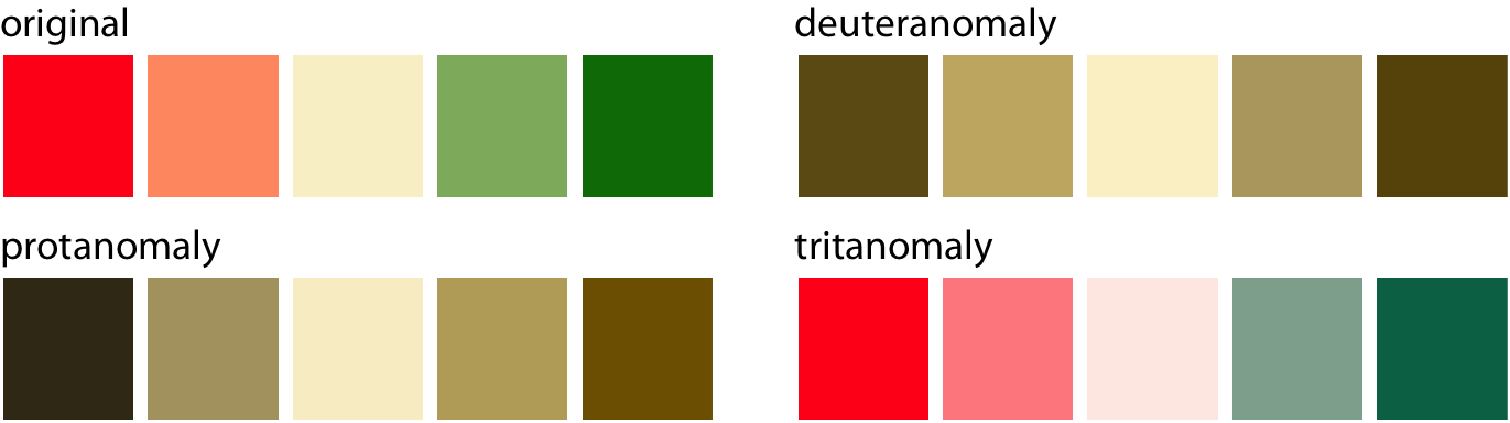
Accessibility
Some design choices affect some audiences more than others
Color palette
Text and symbol sizes
Wilke, Claus. 2019. Fundamentals of Data Visualization
A layered grammar of graphics
A framework (per Wilkinson et al. 2005; Wickham 2010) used to describe the components of a data visualization in terms of a set of layered objects
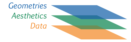
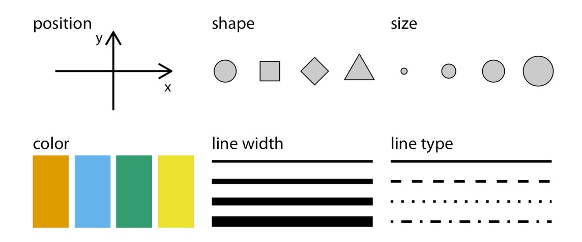
Aesthetic mapping
https://wilkelab.org
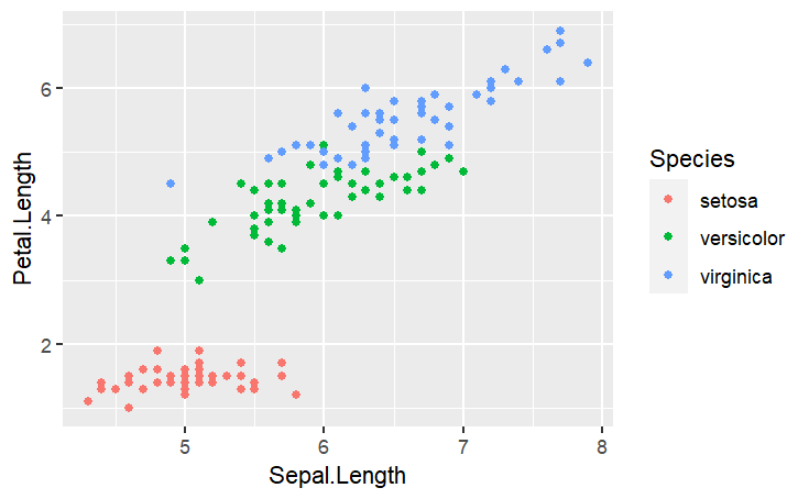
Introducing ggplot2
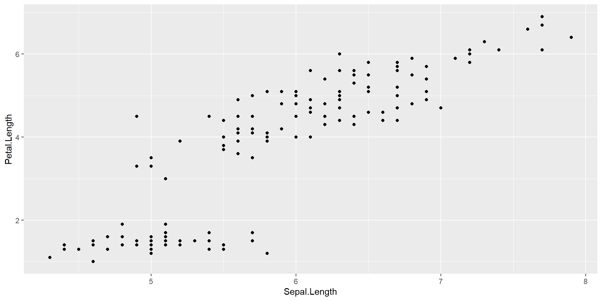
Introducing ggplot2
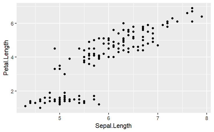
Introducing ggplot2
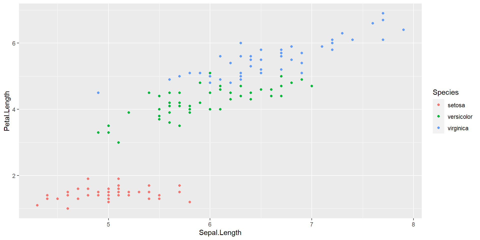
Introducing ggplot2