Environmental Data Analysis and Visualization
Warm-Up Activity
Convert the airquality dataset (from the datasets package) to a tibble and create a scatterplot with a smooth line showing the relationship between temperature and ozone levels for each month in the dataset. You may find the following functions helpful in this process:
facet_wrapto make a faceted plotvarsto define which variable to use for facetsdrop_nato remove rows with NA values in certain columnsas.characterto coerce numbers or other data types to character values
First look
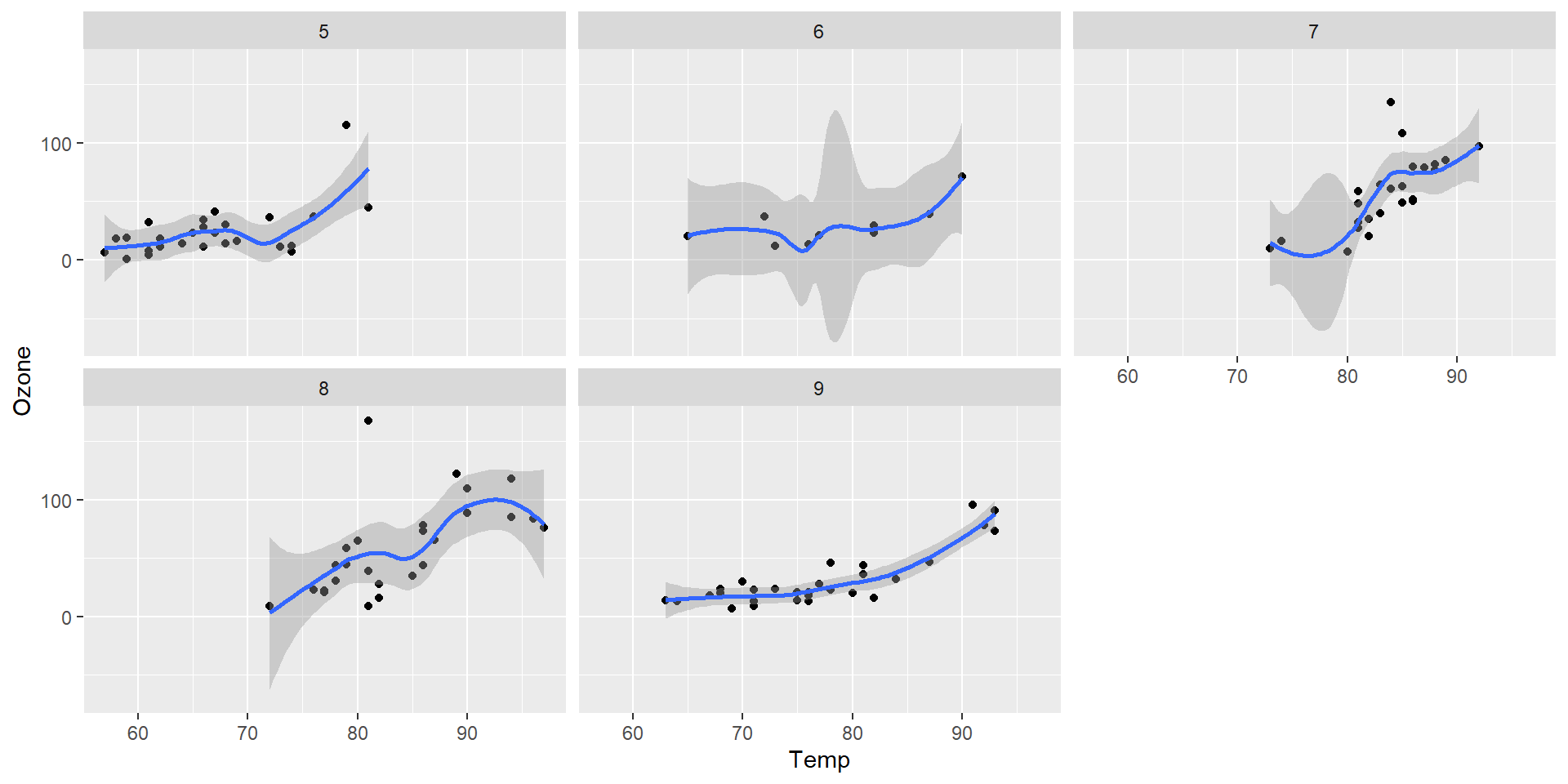
Labeling facets
Facets are not treated as part of the aesthetic mapping in aes. One way to relabel these is to use fct_recode inside the vars function to change the factor names.

Labeling facets

Editing facet axis scales
For the same reason, we can’t access facet axis scales using any scales_* functions. We can modify these in the facet_wrap function with the scales argument.
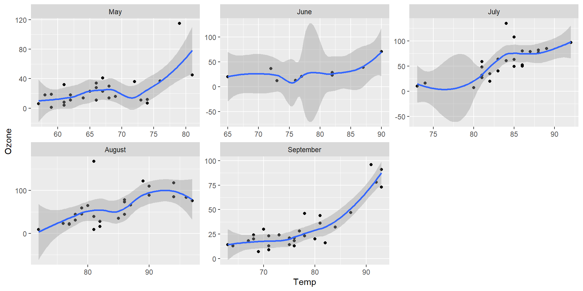
Editing facet axis scales
We can change a single scale with the argument “free_x” or “free_y”.
aq<-as_tibble(airquality)
ggplot(drop_na(aq,Temp,Ozone),aes(x=Temp,y=Ozone)) +
  geom_point() +
  geom_smooth() +
  facet_wrap(vars(fct_recode(as.character(Month),May="5",June="6",July="7",August="8",September="9")),scales="free_x")
Editing facet axis scales

Sensor of the Day
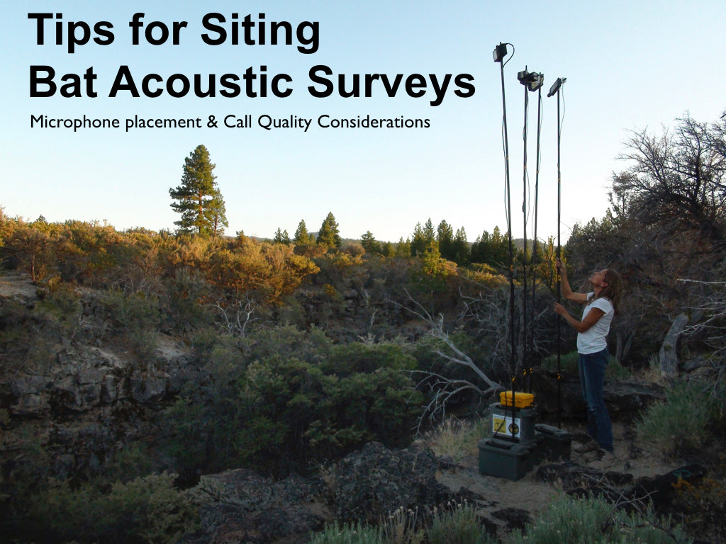
Passive acoustic monitoring
Sensor of the Day
Passive acoustic monitoring

Goulette et al. 2021 “Opportunistic Acoustic Telemetry Platforms” NOAA
Where we’ve been
Navigating R Studio
Data objects and file systems in R
Finding data and getting help
Visualizing different kinds of data with ggplot2
Exploratory data analysis

Coming soon

From data handling to data wrangling with
dplyrFiner control with
ggplot2and friendsSpatial data analysis and visualization
Data modeling
Reproducibility
Why would we want science to be reproducible?
Isn’t code reproducible by default?
Code will do precisely what we want, but it will not necessarily understood by others.
Isn’t code reproducible by default?
Reproducibility in data science
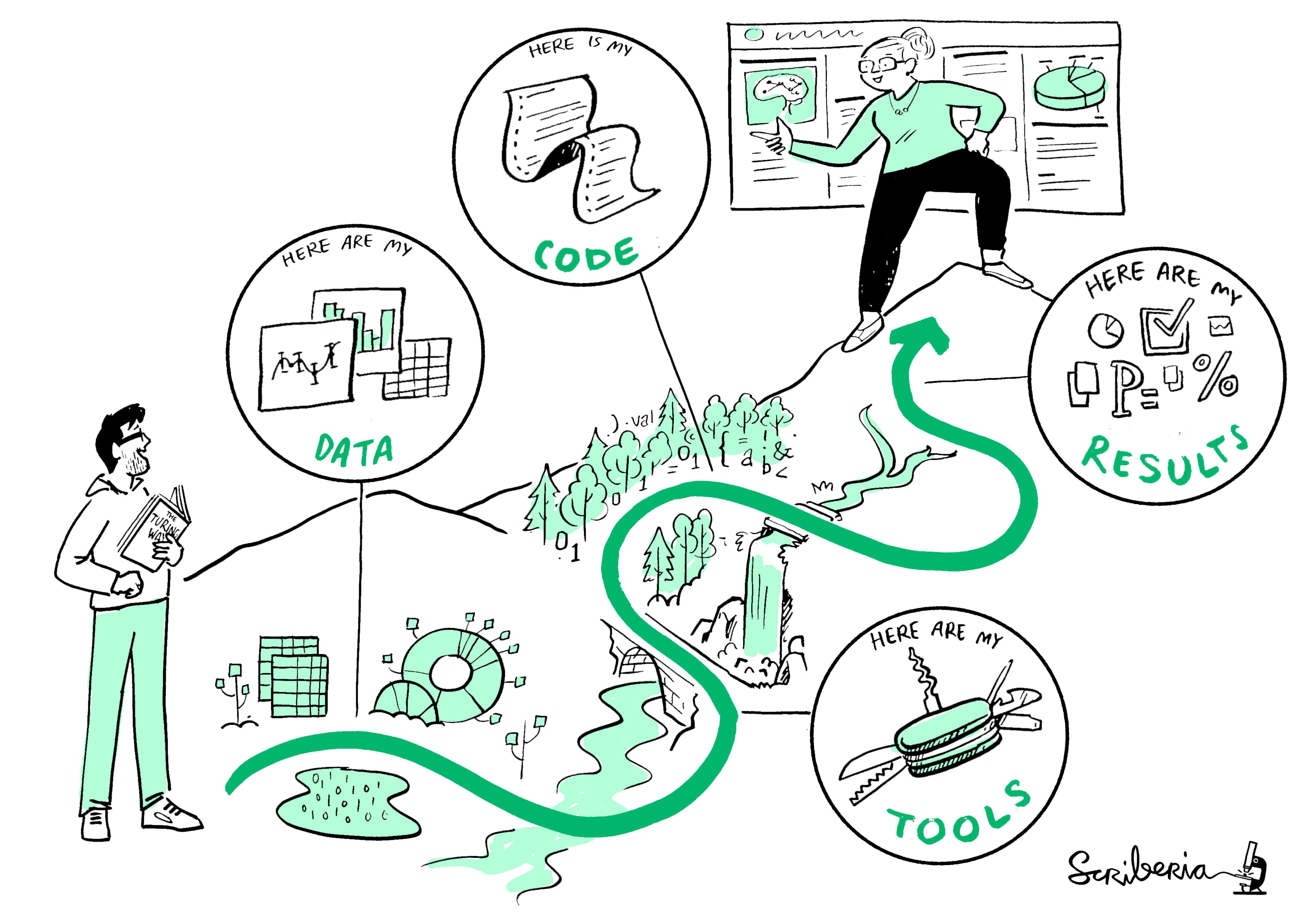
The Turing Way project illustration by Scriberia. CC-BY 4.0 DOI: 10.5281/zenodo.3332807.
Literate programming
An approach to writing software that centers the human user (and re-user) by combining natural language explanations with code.
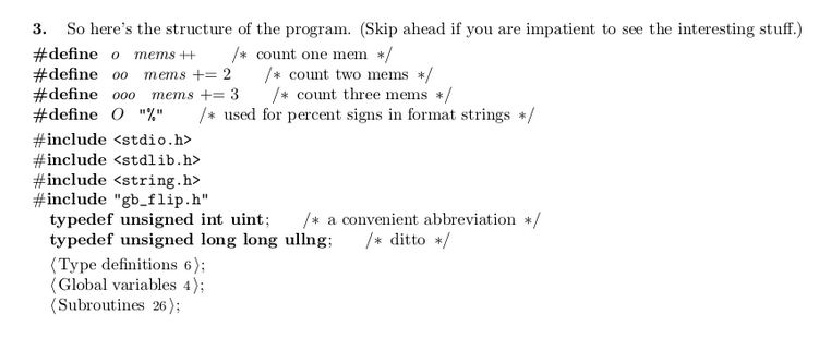
https://akkartik.name/post/literate-programming
Code notebooks
A code notebook is software tool for literate programming.
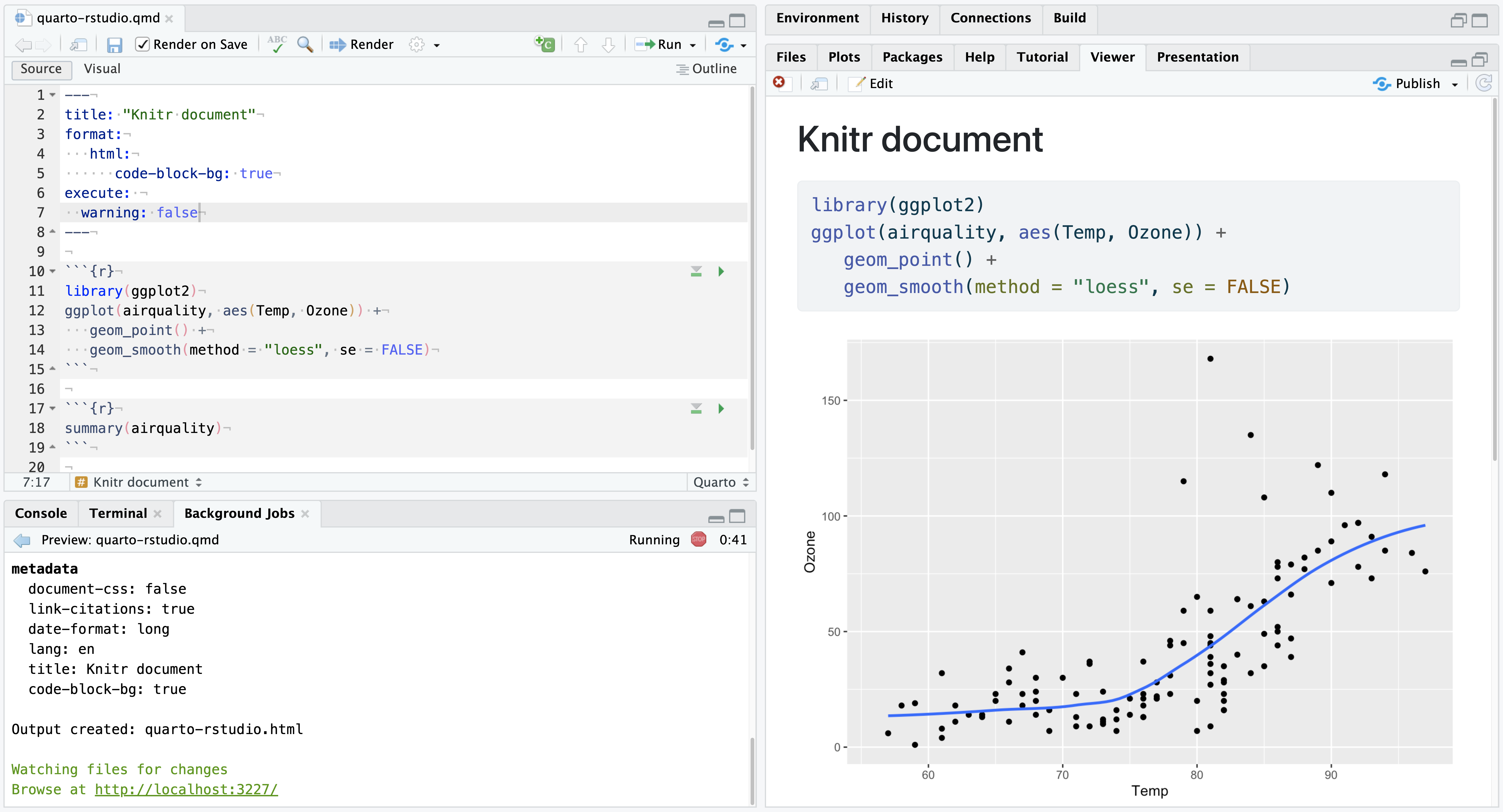
Quarto
Quarto is a data science documentation and publishing system that comes built-in to RStudio.

http://quarto.org
Quarto
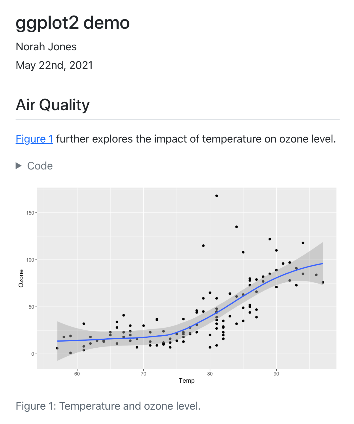
http://quarto.org
Activity: Playing with Quarto notebooks
Download the PalmersPenguins.qmd file from Canvas. Try modifying the code, text, and titles in the document. You can also add your own Code Chunk using the button indicated below:

Communicating beyond the notebook
This week
How to create Quarto documents and integrate them into our process
Revisit Weeks 1 - 4
Brainstorm ideas for final projects