library(modeldata)
library(tidyverse)
── Attaching core tidyverse packages ──────────────────────── tidyverse 2.0.0 ──
✔ dplyr     1.1.2     ✔ readr     2.1.4
✔ forcats   1.0.0     ✔ stringr   1.5.0
✔ ggplot2   3.4.3     ✔ tibble    3.2.1
✔ lubridate 1.9.2     ✔ tidyr     1.3.0
✔ purrr     1.0.2
── Conflicts ────────────────────────────────────────── tidyverse_conflicts() ──
✖ dplyr::filter() masks stats::filter()
✖ dplyr::lag()    masks stats::lag()
ℹ Use the conflicted package (<http://conflicted.r-lib.org/>) to force all conflicts to become errors
When we start looking for patterning in the data, we’
Univariate patterns
Counts
--bar charts
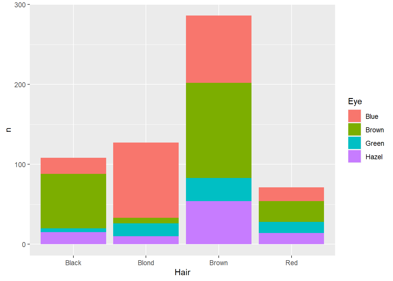
What if the counts are already in the data?
hairEye<-as_tibble(HairEyeColor)
ggplot(data=hairEye,aes(x=Hair,y=n,fill=Eye)) +
  geom_col()
Distributions
-Center
--Mean
--Median
-Spread: Spread refers to how
--Range
--Standard Deviation
-Shape
--Normal
--Bimodal, multimodal
---Density plots
TRY IT YOURSELF: Look at X dataset
Bivariate
Categorical and categorical
hairEye<-as_tibble(HairEyeColor)
ggplot(data=hairEye,aes(x=Hair,y=n,fill=Eye)) +
  geom_col()
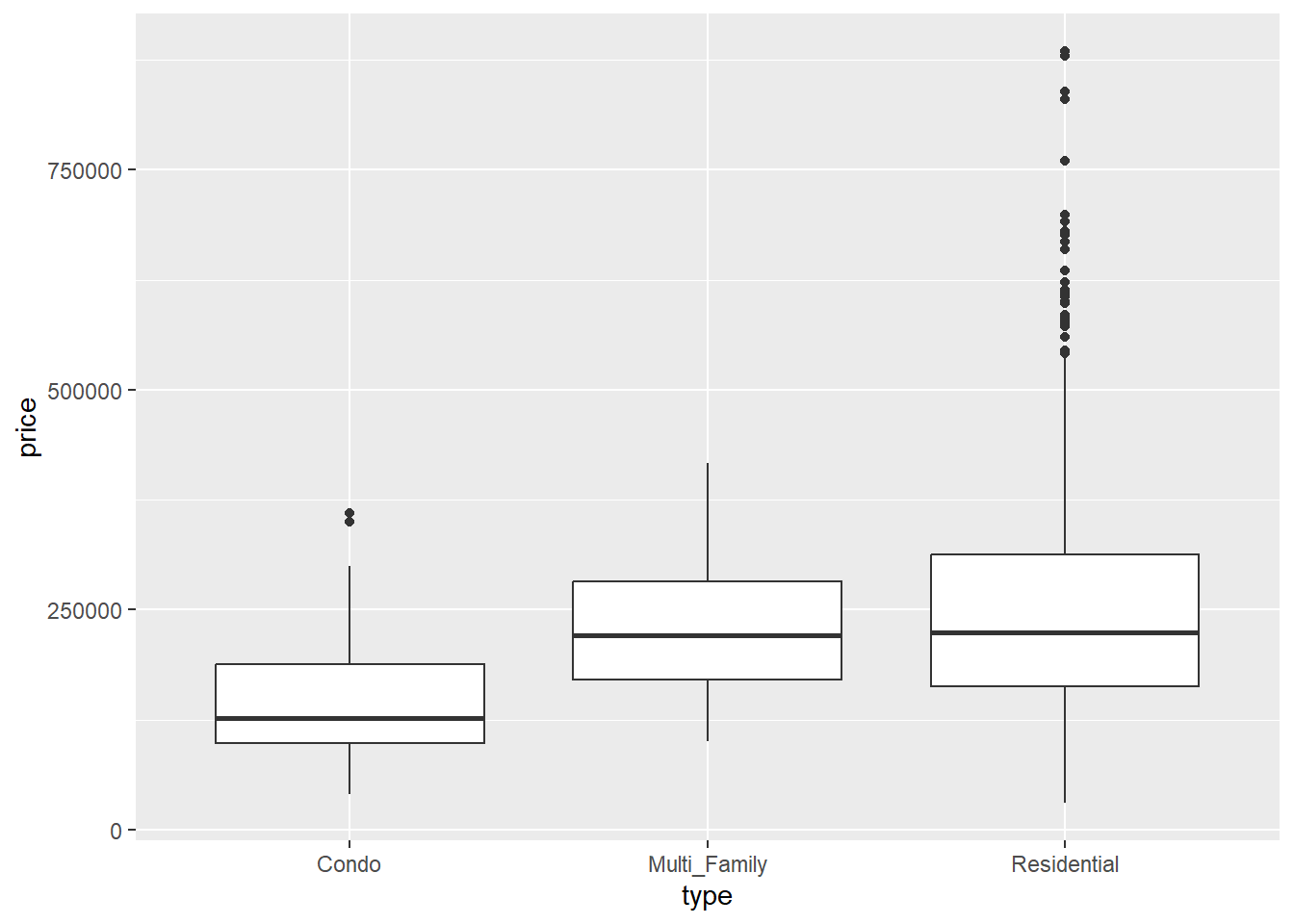
Categorical and numerical
Like histograms, boxplots show the center, spread, and shape of distributions, but these are most useful when comparing more than one group.
Median: the central line of the boxplot is
Interquartile range: The “box” part of the box is an indication of the interquartile range. This is a
Have a look at the Sacramento dataset:
# A tibble: 932 × 9
   city           zip     beds baths  sqft type        price latitude longitude
   <fct>          <fct>  <int> <dbl> <int> <fct>       <int>    <dbl>     <dbl>
 1 SACRAMENTO     z95838     2     1   836 Residential 59222     38.6     -121.
 2 SACRAMENTO     z95823     3     1  1167 Residential 68212     38.5     -121.
 3 SACRAMENTO     z95815     2     1   796 Residential 68880     38.6     -121.
 4 SACRAMENTO     z95815     2     1   852 Residential 69307     38.6     -121.
 5 SACRAMENTO     z95824     2     1   797 Residential 81900     38.5     -121.
 6 SACRAMENTO     z95841     3     1  1122 Condo       89921     38.7     -121.
 7 SACRAMENTO     z95842     3     2  1104 Residential 90895     38.7     -121.
 8 SACRAMENTO     z95820     3     1  1177 Residential 91002     38.5     -121.
 9 RANCHO_CORDOVA z95670     2     2   941 Condo       94905     38.6     -121.
10 RIO_LINDA      z95673     3     2  1146 Residential 98937     38.7     -121.
# ℹ 922 more rows
ggplot(data=Sacramento,aes(x=type,y=price)) +
  geom_boxplot()
Two numerical
-Scatterplots
Form: Is
Direction: If increasing values on one axis correspond with increasing values on the other, then the direction is positive; if increasing values on
Strength:
Multivariate
With more than two variables,
Does my data show signs of clustering?
Does a pattern exist for some categories by not others?