library(gapminder)

ggplot(gapminder,aes(x=continent,y=year,fill=lifeExp)) +
geom_tile() 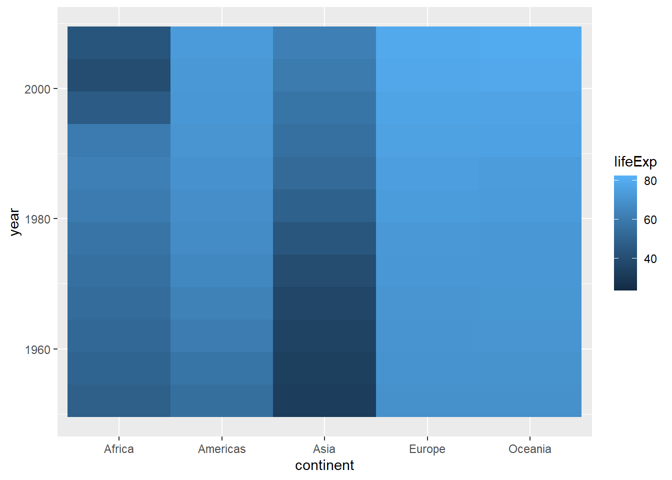
As opposed to discrete color scales, continuous scales are used when the data exist across a range with no meaninfgul gaps between values. For example, you could have an infinite number of unique values even between the interval between 0 and 1. There are no discrete groups, breaks, or categories. From a color perspective, these are usually expressed in terms of a color ramp or gradient, where there is a smooth transition of values across a color spectrum.
To view some options for these kind of scales, we’ll use the gapminder data, but we’ll use the geom_tile function to create a heatmap.
library(gapminder)
ggplot(gapminder,aes(x=continent,y=year,fill=lifeExp)) +
geom_tile()
A heatmap takes values at intersections between the values on the x and y axis and places a tile (polygon) that is colored according to the continuous variable of interest. This can be useful for viewing a lot of data across a space of values. However, it’s usually more readable when the data are organized somehow. The ordering of the years makes sense, let’s reorder the continents based on median life expectancy:
ggplot(gapminder,aes(x=reorder(continent,lifeExp,fun=median),y=year,fill=lifeExp)) +
geom_tile() 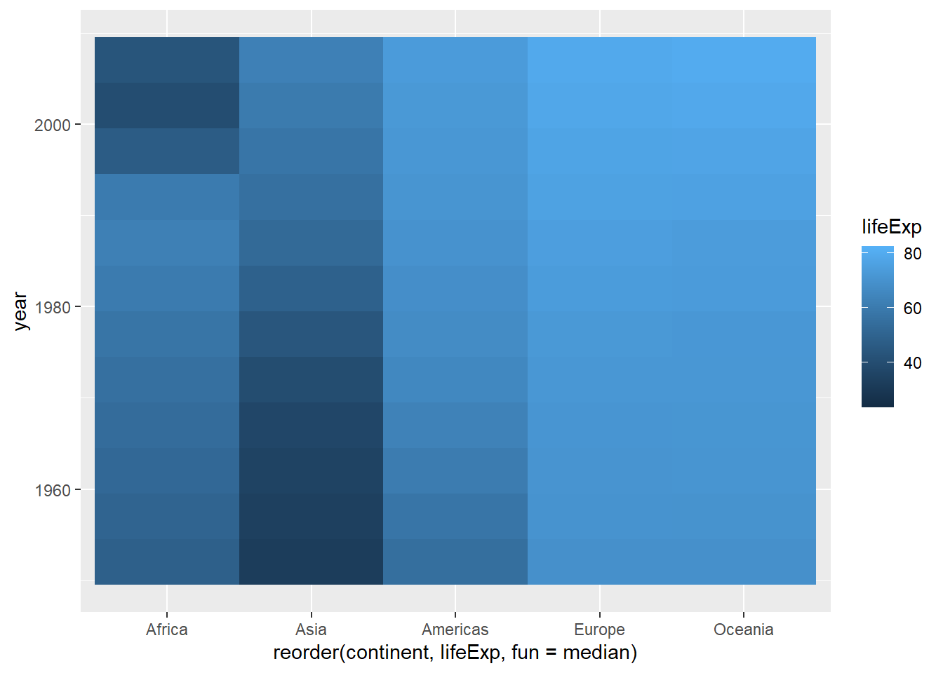
The default gradient runs from dark to light blue (also known as the Blues palette). What if we wanted to look at this using a different color scheme? Let’s start with the old stand-by: temperature colors. If we wanted the scale to go from red to blue, we could use the scale_color_gradient function. This takes two arguments: low defines the color used for the lowest value, and high defines the highest:
ggplot(gapminder,aes(x=reorder(continent,lifeExp,fun=median),y=year,fill=lifeExp)) +
  geom_tile() +
scale_fill_gradient(low="blue",high="red") 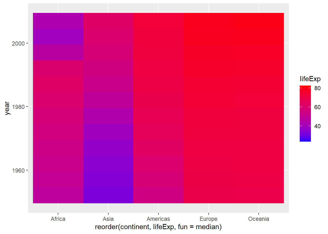
If we wanted to invert them, all we have to do is switch the colors we use for low and high:
ggplot(gapminder,aes(x=reorder(continent,lifeExp,fun=median),y=year,fill=lifeExp)) +
  geom_tile() +
scale_fill_gradient(low="red",high="blue")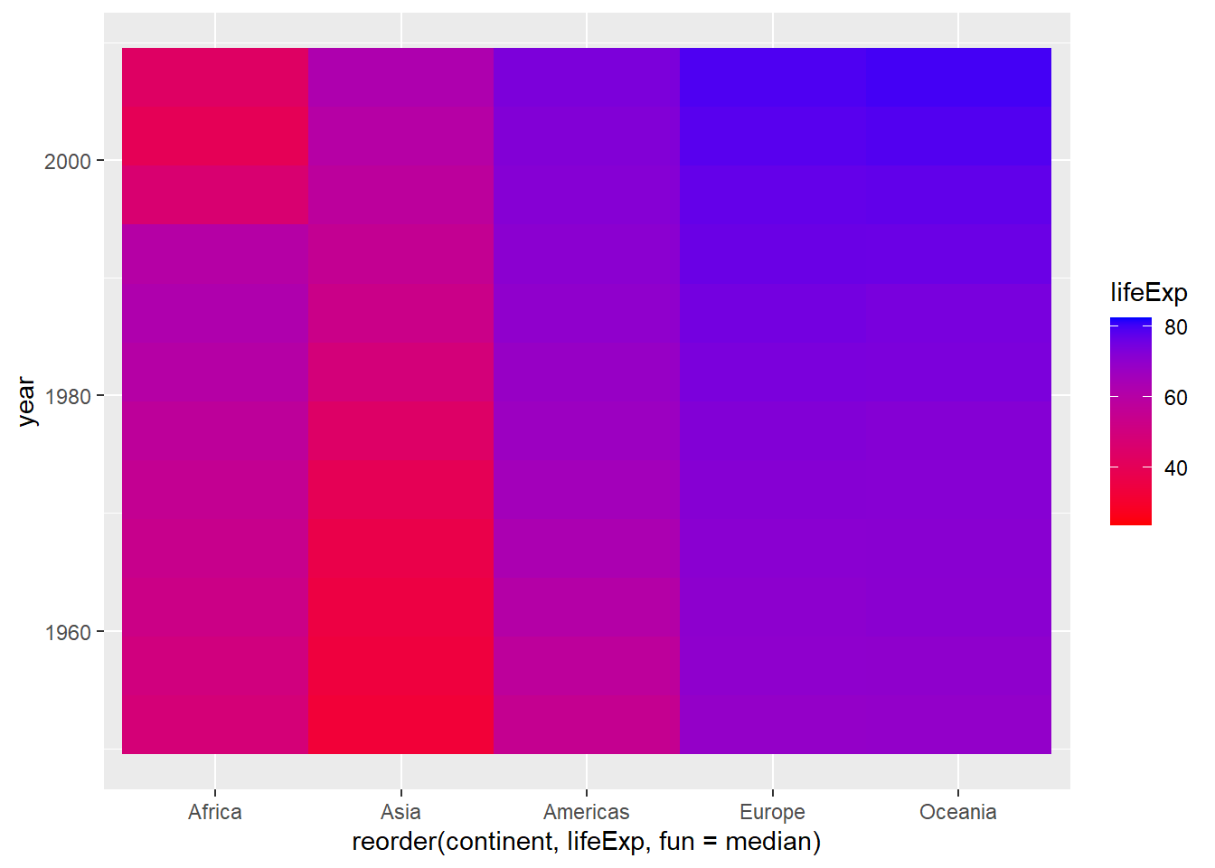
Let’s also fix those labels while we’re at it:
ggplot(gapminder,aes(x=reorder(continent,lifeExp,fun=median),y=year,fill=lifeExp)) +
  geom_tile() +
scale_fill_gradient(low="red",high="blue") +
  labs(x="Continent",y="Year",fill="Life Expectancy")
And we probably don’t even need the grey background, so we can eliminate it with theme_minimal:
ggplot(gapminder,aes(x=reorder(continent,lifeExp,fun=median),y=year,fill=lifeExp)) +
  geom_tile() +
scale_fill_gradient(low="red",high="blue") +
  labs(x="Continent",y="Year",fill="Life Expectancy") +
  theme_minimal()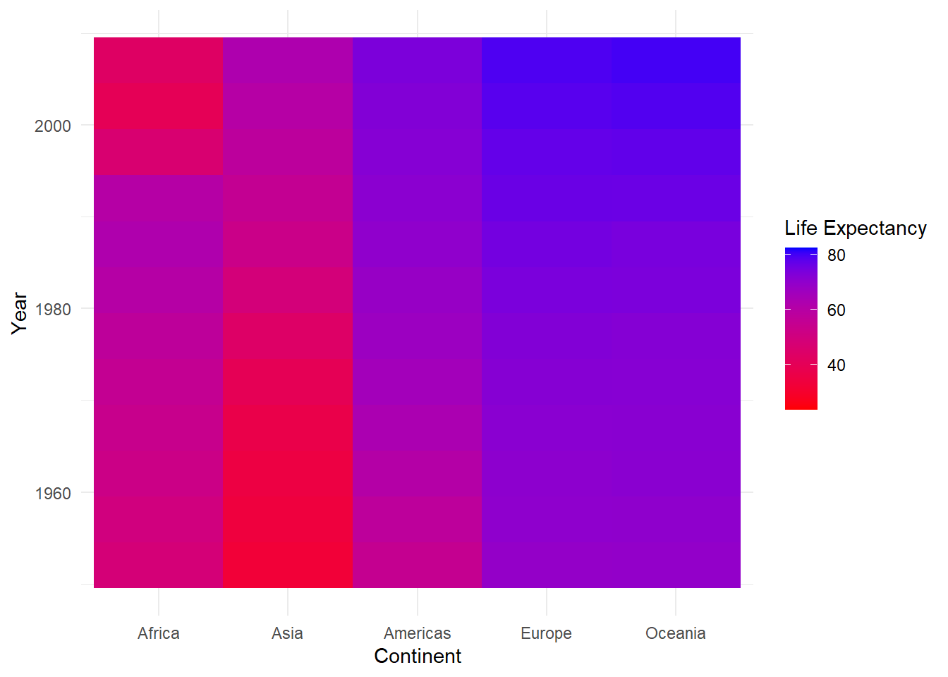
By the way, if you’re wondering about the themes, here is a good directory of the different theme functions.
Try plotting this plot or the density plot from the previous section using some different themes. For example:
theme_linedraw()
theme_dark()
theme_void()
There are even more themes to choose from if you add the ggthemes package. Load this package (install first if you need to), and then explore a few more!
For some data like temperatures, the scheme above seems like it might work well, but for looking at life expectancy data, our color scheme is a little underwhelming. It’s hard to know, for example, how each continent compares to eachother.
We can get a better sense of this by using a diverging palette: one that varies in two directions away from a central value. First, let’s get the overall median value for the lifeExp variable to be a central value:
medLE<-median(gapminder$lifeExp)
medLE
[1] 60.7125We can use gradients that are scaled with a midpoint value using the scale_fill_gradient2 function (the “2” meaning “2-way”). This works pretty much the same way, but we add a midpoint argument to define the value (here we’ll use the medLe object we just created), and a mid argument to represent the color to be used at the midpoint of the gradient:
ggplot(gapminder,aes(x=reorder(continent,lifeExp,fun=median),y=year,fill=lifeExp)) +
  geom_tile() +
scale_fill_gradient2(low="red",mid="yellow",high="darkgreen",midpoint=medLE)  +
  labs(x="Continent",y="Year",fill="Life Expectancy") +
  theme_minimal()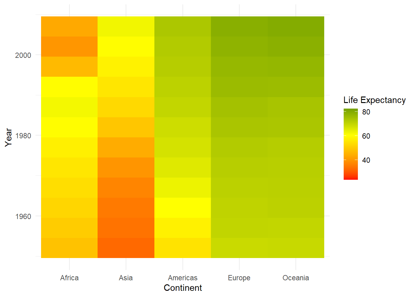
Now our map is getting more visually coherent. We can now see more clearly, for example, the values that each country starts and ends with, which gives us a better sense of the change that’s occurring over time.
Yet another alternative would be to scale between more one midpoint. To do this, we’d use the scale_fill_gradientn function (“n” standing for a number of midpoint breaks to be defined). Let’s say we wanted it done on a spectrum from red to blue, with addition breaks at the intermediate colors (orange, yellow, and green). We can do this by passing the colors argument
ggplot(gapminder,aes(x=reorder(continent,lifeExp,fun=median),y=year,fill=lifeExp)) +
  geom_tile() +
scale_fill_gradientn(colors = c("red","orange","yellow","green","blue")) +
  labs(x="Continent",y="Year",fill="Life Expectancy") +
  theme_minimal()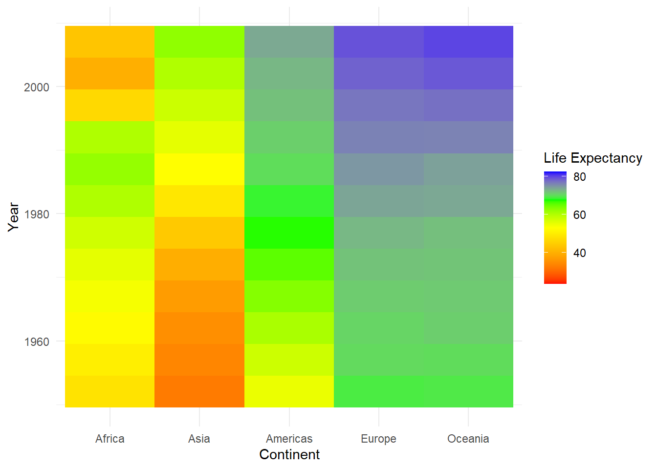
If you don’t want to use equally spaced divisions between the midpoints, you can set custom breaks by adding a values argument, that is expresses the ranges that each color is meant to be mapped on to. For example, let’s say you wanted to weight the color scale so the red end of the spectrum covered a wider range of values. You could do something like this:
ggplot(gapminder,aes(x=reorder(continent,lifeExp,fun=median),y=year,fill=lifeExp)) +
  geom_tile() +
scale_fill_gradientn(colors = c("red","orange","yellow","green","blue"),values=c(0,0.5,0.7,0.8,0.9,1)) +
  labs(x="Continent",y="Year",fill="Life Expectancy") +
  theme_minimal()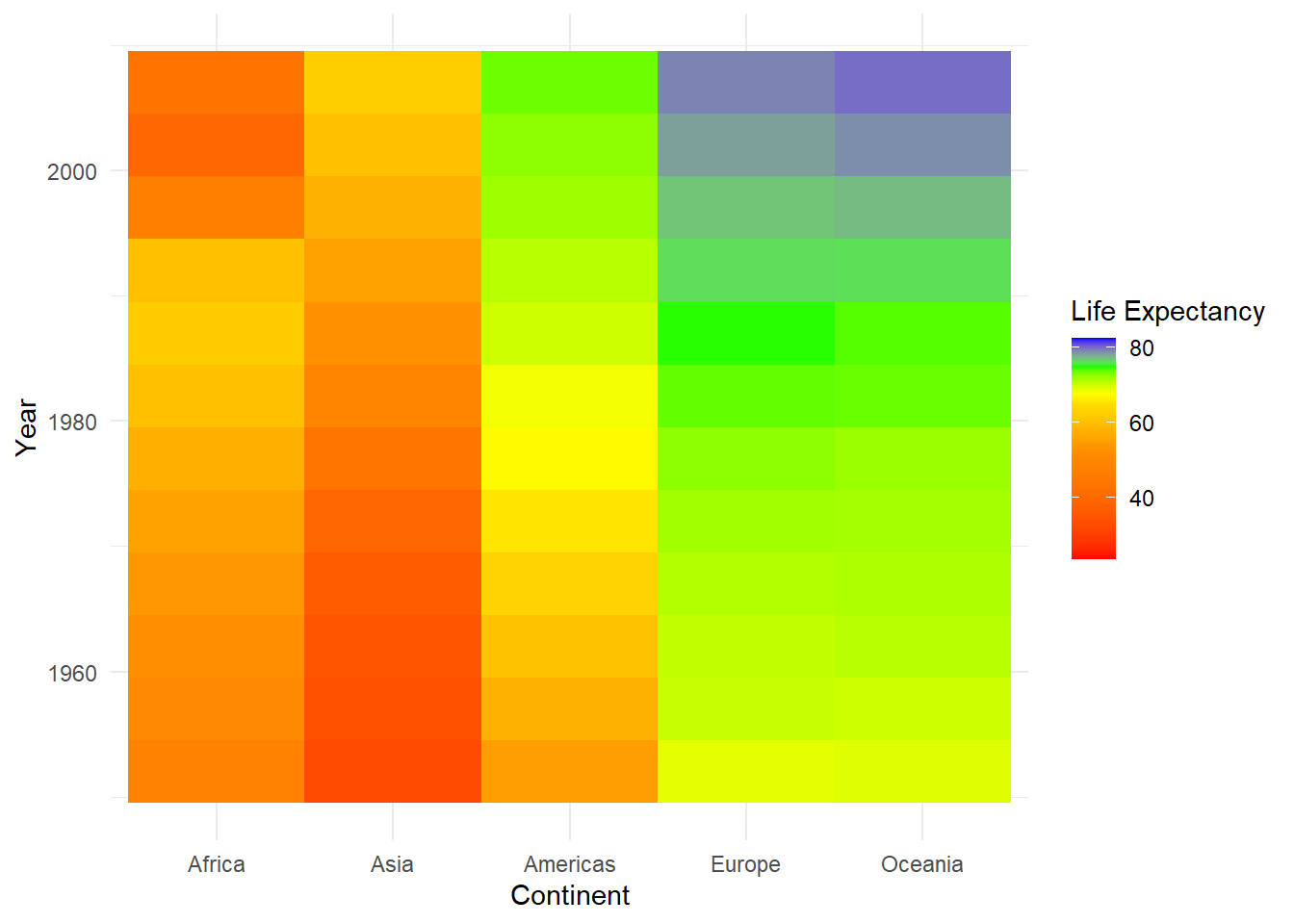
The values argument here is a vector of numbers between 0 and 1 that represent breaks along the space between the minimum and maximum age. By setting wider intervals (like 0 - 0.5) for the red-orange transition, it weights
However, using values like 0 and 0.5 isn’t especially intuitive if you’re thinking about this in terms of people’s ages. A quick way around this is to use the rescale function (part of the scales package), which will take a vector of values and tranform it into values scaled to a range of 0 to 1:
library(scales)
rescaledLE<-rescale(c(30,50,65,70,75,85),to=c(0,1))

ggplot(gapminder,aes(x=reorder(continent,lifeExp,fun=median),y=year,fill=lifeExp)) +
  geom_tile() +
scale_fill_gradientn(colors = c("red","orange","yellow","green","blue"),values=rescaledLE) +
  labs(x="Continent",y="Year",fill="Life Expectancy") +
  theme_minimal()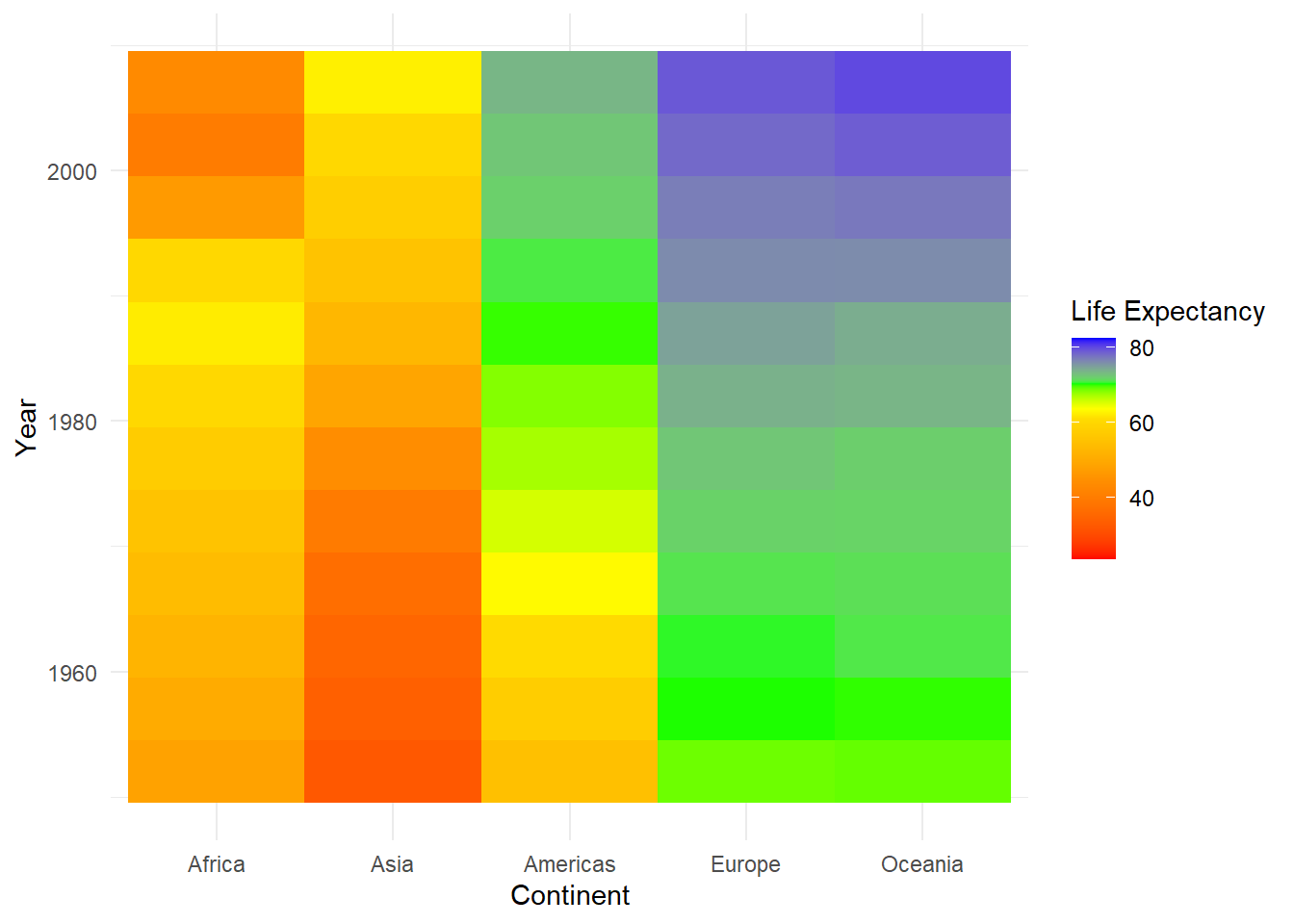
To make use of the ColorBrewer palettes we saw in the previous section, you can use the scale_fill_distiller (“distiller” being a play on the word “brewer”), again defining the palette with the argument palette:
ggplot(gapminder,aes(x=reorder(continent,lifeExp,fun=median),y=year,fill=lifeExp)) +
  geom_tile() +
scale_fill_distiller(palette = "YlOrBr") +
  labs(x="Continent",y="Year",fill="Life Expectancy") +
  theme_minimal()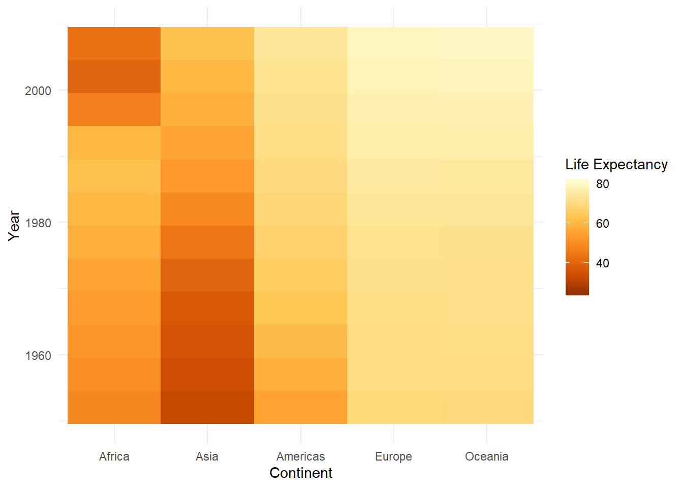
Finally, there are additional packages that have been developed to provide palettes with far less serious agendas. I’ll mention the wesanderson package, which draws inspiration from the color schemes of Wes Anderson films. Here, we’ll draw on a palette from the file The Life Aquatic with Steve Zissou:

To do this, we’ll first load the package, then create a continuous palette object using the wes_palette function:
library(wesanderson)
pal<-wes_palette("Zissou1", n = 100, type = "continuous")
pal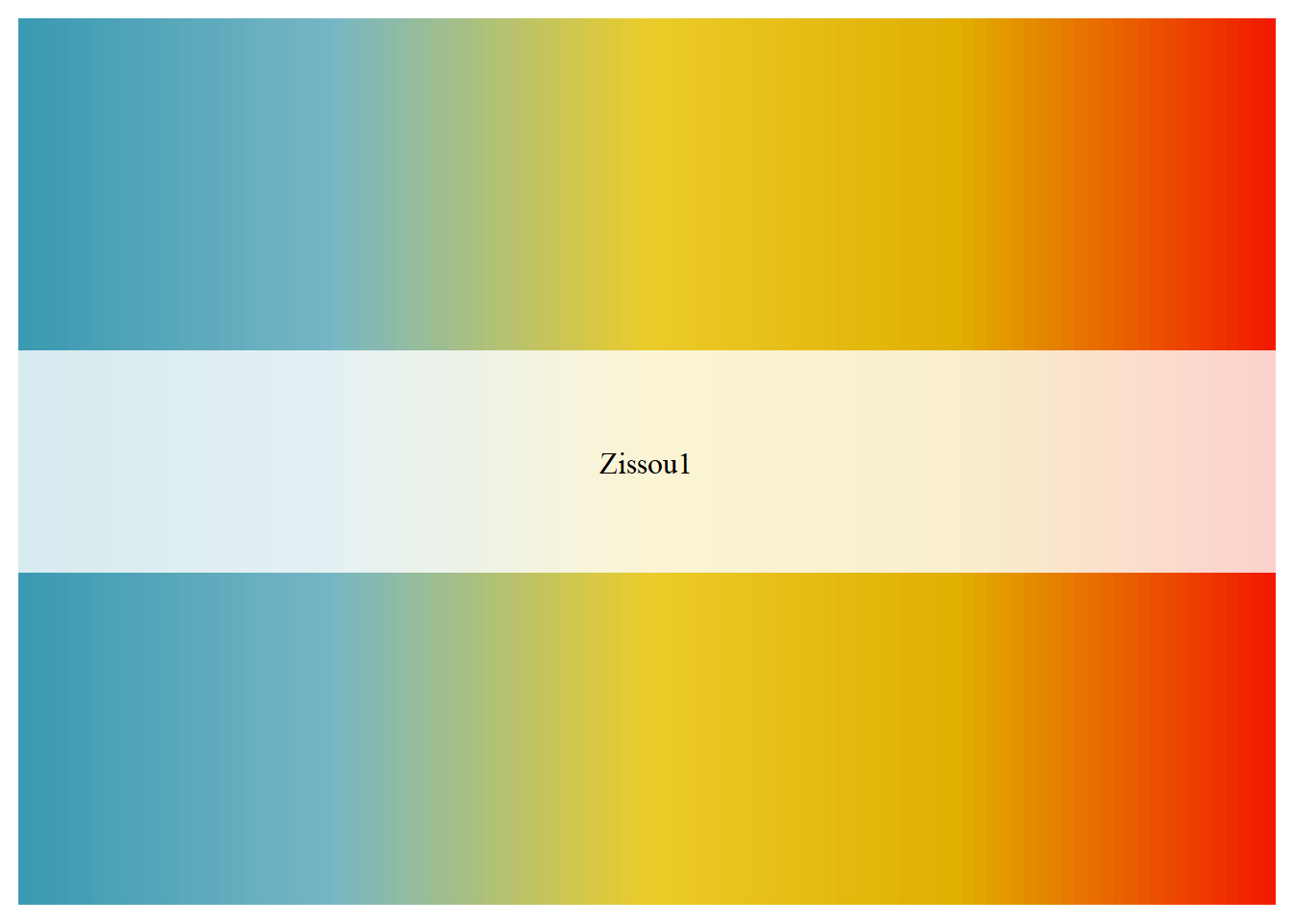
ggplot(gapminder,aes(x=reorder(continent,lifeExp,fun=median),y=year,fill=lifeExp)) +
  geom_tile() +
scale_fill_gradientn(colors = pal) +
  labs(x="Continent",y="Year",fill="Life Expectancy") +
  theme_minimal()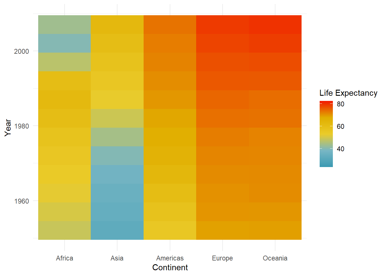
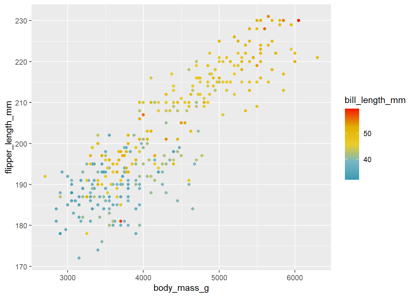
By the way, I know we’ve seen most of these examples using fill as the aesthetic we are scaling. It should hopefully go without saying that we can also do this with any use of the color aesthetic as well. All we need to do in this case would be to choose a geom that uses color and then change the name of the scale function from a scale_fill to a scale. For example, if we wanted to look at our penguin data as a scatterplot using the Zissou1 gradient, we can change the geom to geom_point and switch to the scale_color_gradientn function:
ggplot(drop_na(penguins,body_mass_g,flipper_length_mm, bill_length_mm),aes(x=body_mass_g,y=flipper_length_mm, color=bill_length_mm)) +
  geom_point() +
  scale_color_gradientn(colors=pal)