ggplot() +
  geom_sf(data= saBiomes,aes(fill=BIOME),color=NA) +
  theme_classic() +
  labs(fill="Biome") +
  scale_fill_brewer(palette="Set3") +
  geom_sf(data=saCores)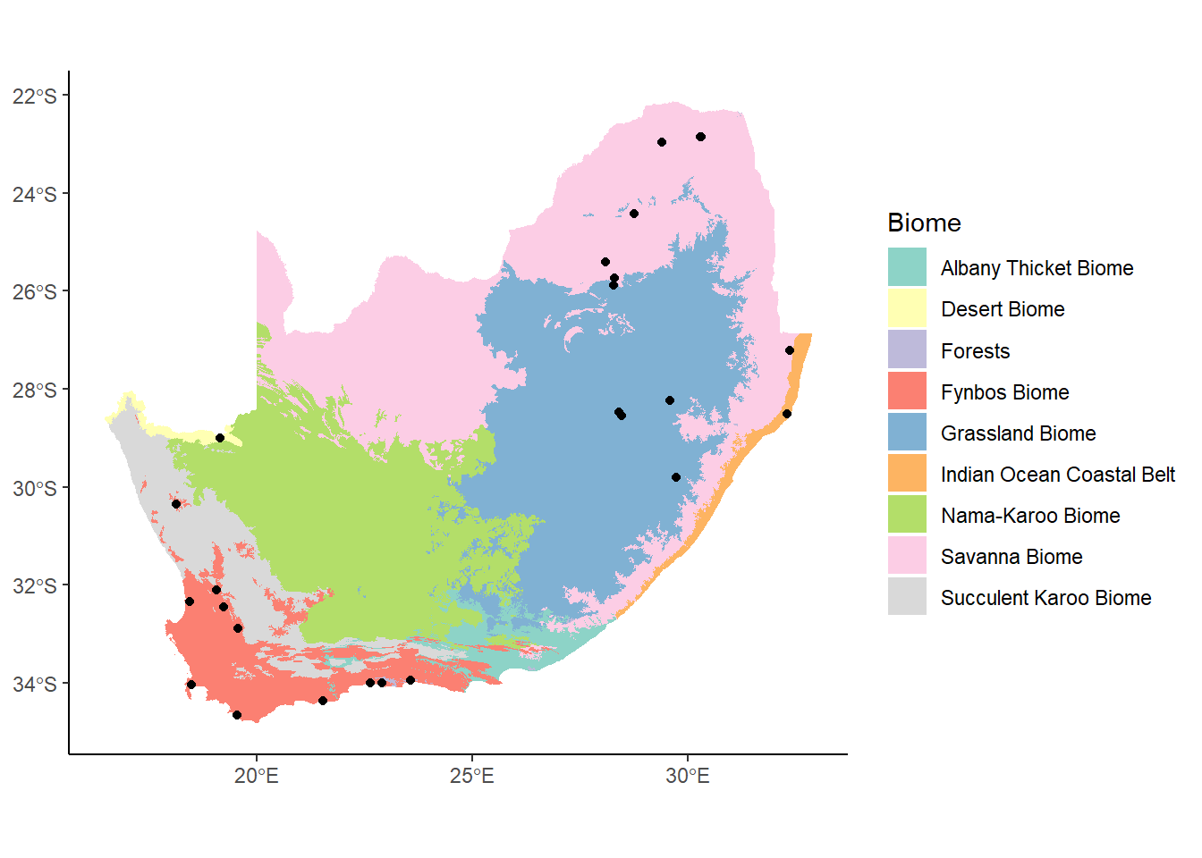
Let’s rebuild our South Africa map of cores and biomes:
ggplot() +
geom_sf(data= saBiomes,aes(fill=BIOME),color=NA) +
theme_classic() +
labs(fill="Biome") +
scale_fill_brewer(palette="Set3") +
geom_sf(data=saCores)
Let’s say that we were just interested in the area around Western Cape (in the southwest part of South Africa). In Week 4, we looked at how we can zoom in on a plot using coord_cartesian to set new limits to the extent being plotted. A similar function, coords_sf, let’s us do this with our spatial data:
ggplot() +
  geom_sf(data= saBiomes,aes(fill=BIOME),color=NA) +
  theme_classic() +
  labs(fill="Biome") +
  scale_fill_brewer(palette="Set3") +
  geom_sf(data=saCores) +
  coord_sf(xlim = c(17, 23), ylim = c(-35, -30), expand = FALSE)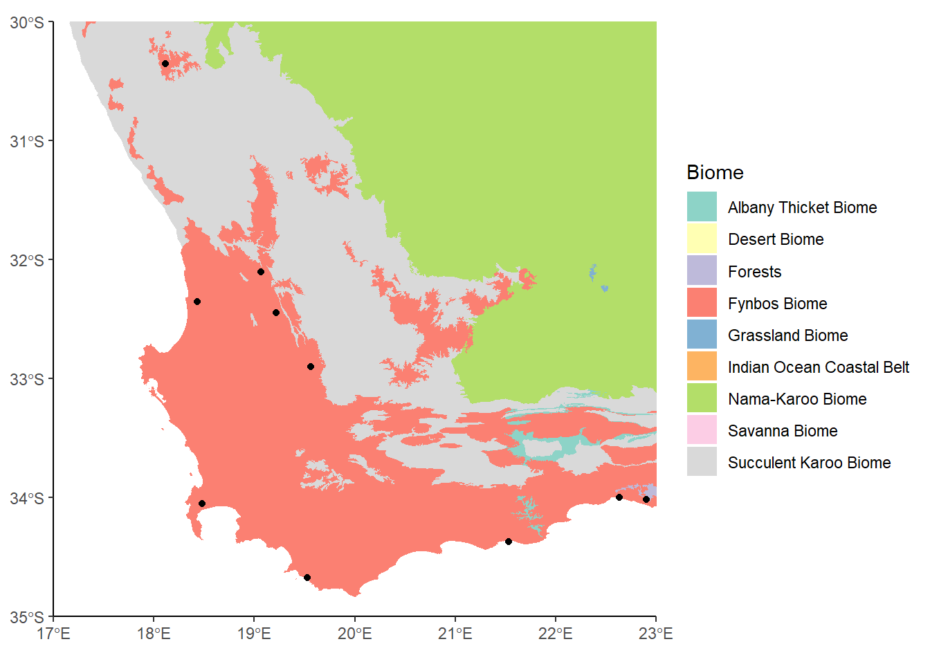
This looks OK, but there’s a whole bunch of colors in the legend now that don’t correspond to anything on the map. The reason is that even though we’ve zoomed in, we haven’t actually subset the data, so this We can use st_crop to crop the data to our new bounding box.
biomesCrop<-st_crop(saBiomes, xmin=17, xmax=23, ymin=-35, ymax=-30)Warning: attribute variables are assumed to be spatially constant throughout
all geometriescoresCrop<-st_crop(saCores, xmin=17, xmax=23, ymin=-35, ymax=-30)Warning: attribute variables are assumed to be spatially constant throughout
all geometriesggplot() +
geom_sf(data= biomesCrop,aes(fill=BIOME),color=NA) +
theme_classic() +
labs(fill="Biome") +
scale_fill_brewer(palette="Set3") +
geom_sf(data=coresCrop) 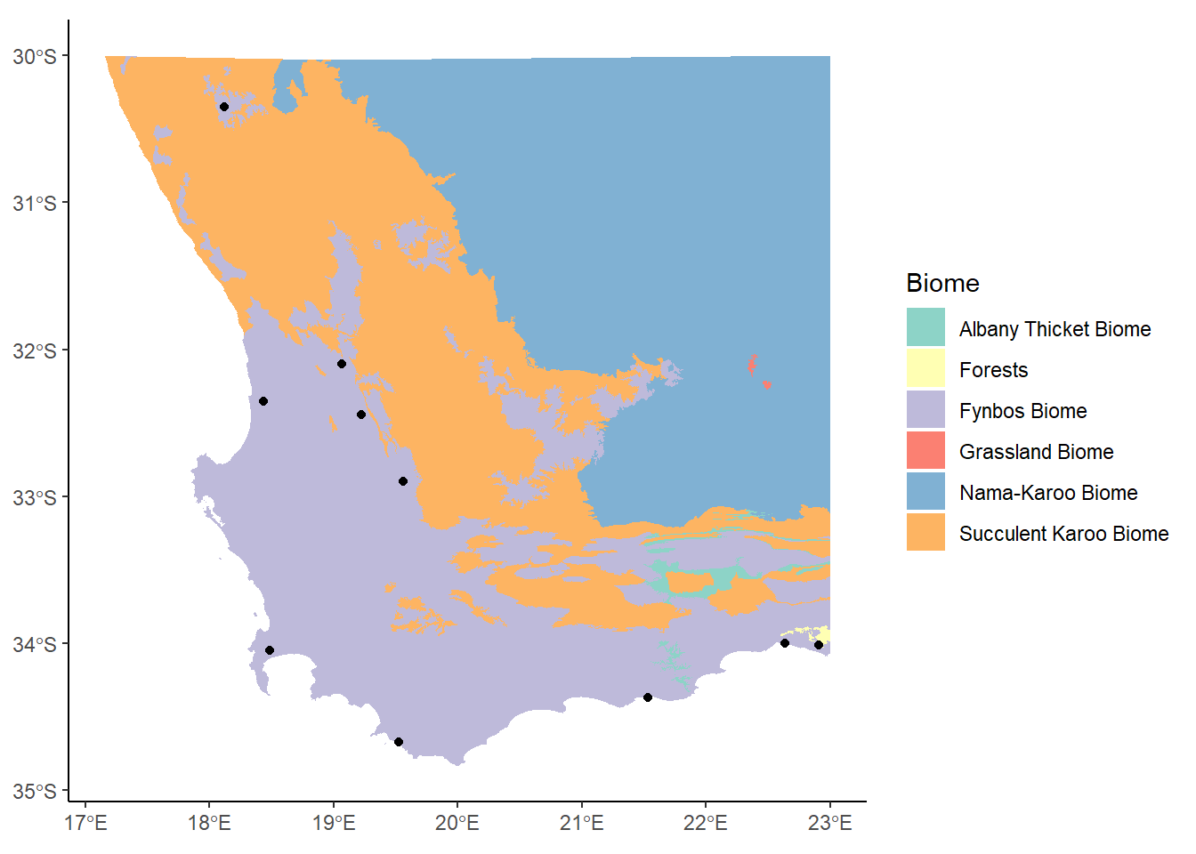
This takes the name of the sf object as the first argument, and then a series of values indicating the minimum and maximum extents along the x and y axes. The color scheme has changed now since we’re not using so many of them, but this is OK.
Let’s add a couple more things to our plot: labels and a scale bar. The easiest way to do this is to call up the ggspatial package:
library(ggspatial)
ggplot() +
  geom_sf(data= biomesCrop,aes(fill=BIOME),color=NA) +
  theme_classic() +
  labs(fill="Biome") +
  scale_fill_brewer(palette="Set3") +
geom_sf(data=coresCrop) +
annotation_north_arrow()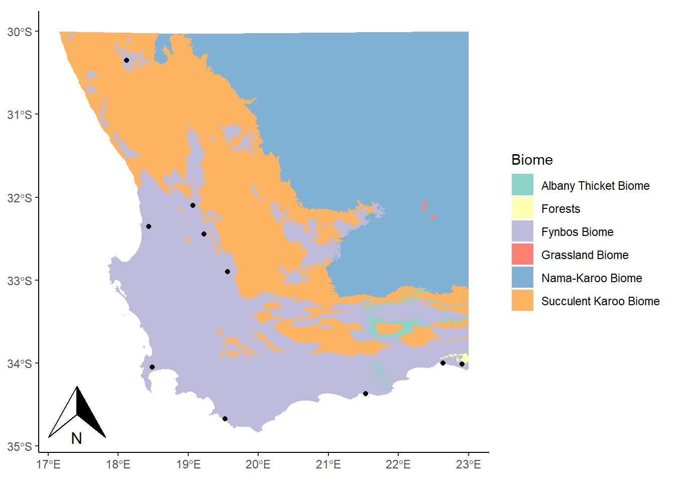
Here we used the annotation_north_arrow() function to get our arrow, but eek! It’s gigantic! We can play around with some settings, like height and width, to get it into a more reasonable shape:
library(ggspatial)

ggplot() +
  geom_sf(data= biomesCrop,aes(fill=BIOME),color=NA) +
  theme_classic() +
  labs(fill="Biome") +
  scale_fill_brewer(palette="Set3") +
  geom_sf(data=coresCrop) +
   annotation_north_arrow(height = unit(0.75, "cm"), width = unit(0.5, "cm"))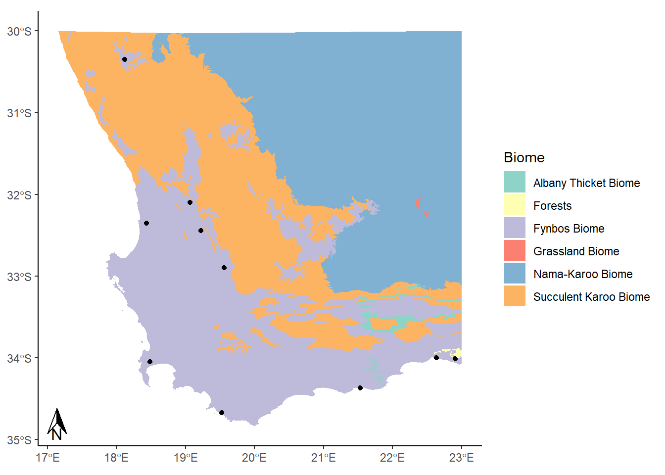
This looks alright. Now for a scale bar using annotation_scale:
library(ggspatial)

ggplot() +
  geom_sf(data= biomesCrop,aes(fill=BIOME),color=NA) +
  theme_classic() +
  labs(fill="Biome") +
  scale_fill_brewer(palette="Set3") +
  geom_sf(data=coresCrop) +
   annotation_north_arrow(height = unit(0.75, "cm"), width = unit(0.5, "cm")) +
annotation_scale(location = "br") 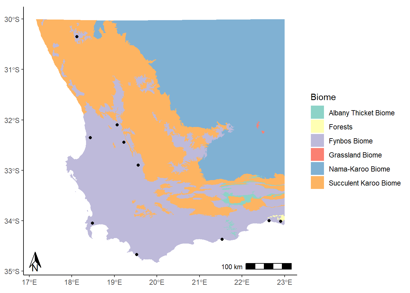
The location argument that is used here ("br") indicates that we want to put it in the bottom right corner. We could use "tr" for top right, or "bl" for bottom left. It’s entirely up to you!
There are lots of different options for changing the look and feel of these map elements, such as the size, location, and style. Have a look at the help documentation for these two functions to get a better sense.