In this section, we’ll explore how to use bar plot to illustrate
Mapping to geom_bar
In addition to loading the necessary packages, let’s get a new dataset. We can access the data from the Gapminder plot as a package in R:
library(datasets)library(tidyverse)
── Attaching core tidyverse packages ──────────────────────── tidyverse 2.0.0 ──
✔ dplyr     1.1.2     ✔ readr     2.1.4
✔ forcats   1.0.0     ✔ stringr   1.5.0
✔ ggplot2   3.4.3     ✔ tibble    3.2.1
✔ lubridate 1.9.2     ✔ tidyr     1.3.0
✔ purrr     1.0.2
── Conflicts ────────────────────────────────────────── tidyverse_conflicts() ──
✖ dplyr::filter() masks stats::filter()
✖ dplyr::lag()    masks stats::lag()
ℹ Use the conflicted package (<http://conflicted.r-lib.org/>) to force all conflicts to become errors
#install.packages("gapminder")library(gapminder)
Removing the # at the front will allow you to install this package (I have it here because I already have it installed). This will add the dataset as a tibble called gapminder:
gapminder
# A tibble: 1,704 × 6
   country     continent  year lifeExp      pop gdpPercap
   <fct>       <fct>     <int>   <dbl>    <int>     <dbl>
 1 Afghanistan Asia       1952    28.8  8425333      779.
 2 Afghanistan Asia       1957    30.3  9240934      821.
 3 Afghanistan Asia       1962    32.0 10267083      853.
 4 Afghanistan Asia       1967    34.0 11537966      836.
 5 Afghanistan Asia       1972    36.1 13079460      740.
 6 Afghanistan Asia       1977    38.4 14880372      786.
 7 Afghanistan Asia       1982    39.9 12881816      978.
 8 Afghanistan Asia       1987    40.8 13867957      852.
 9 Afghanistan Asia       1992    41.7 16317921      649.
10 Afghanistan Asia       1997    41.8 22227415      635.
# ℹ 1,694 more rows
We have a few different variables to work with in this dataset, including:
Country
Continent
Year of recording
Life expectancy (in years)
Population
Per capita Gross Domestic Product (in USD)
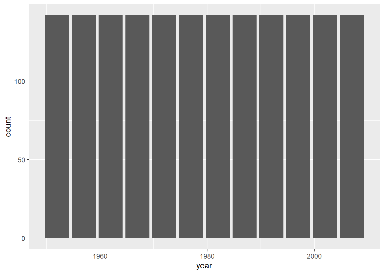
Let’s use some of this to make a bar plot. First, we can try using the year of recording as a categorical variable:
Hmmm… all of the bars are exactly the same. This is because the function is counting the number of instances of each year in the dataset. Since the same number of countries are recorded for each year, for each year this will just be the number of countries (142). What if we used country?
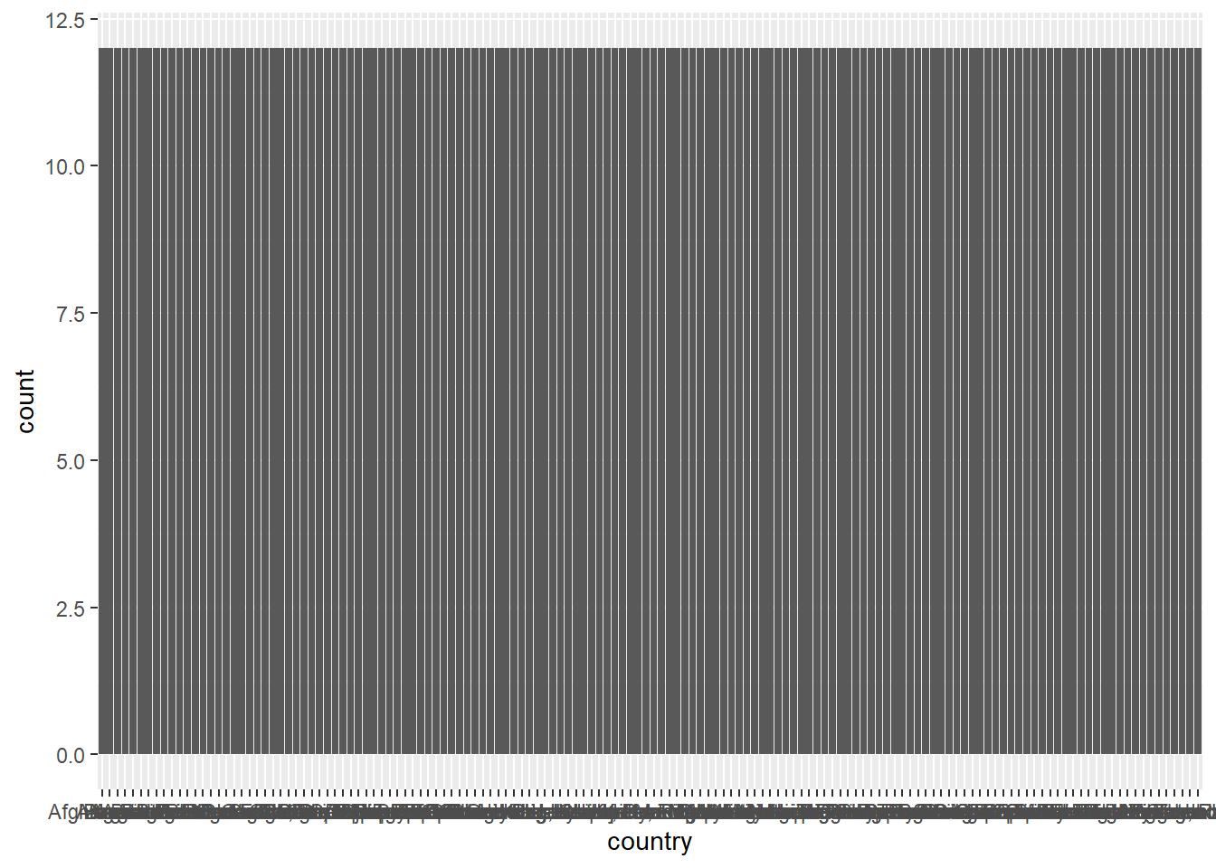
Ack! Not only is this uninformative (countries are recorded over the same 12 years), but there’s too many countries to plot on the x-axis. Let’s try again but with continents:
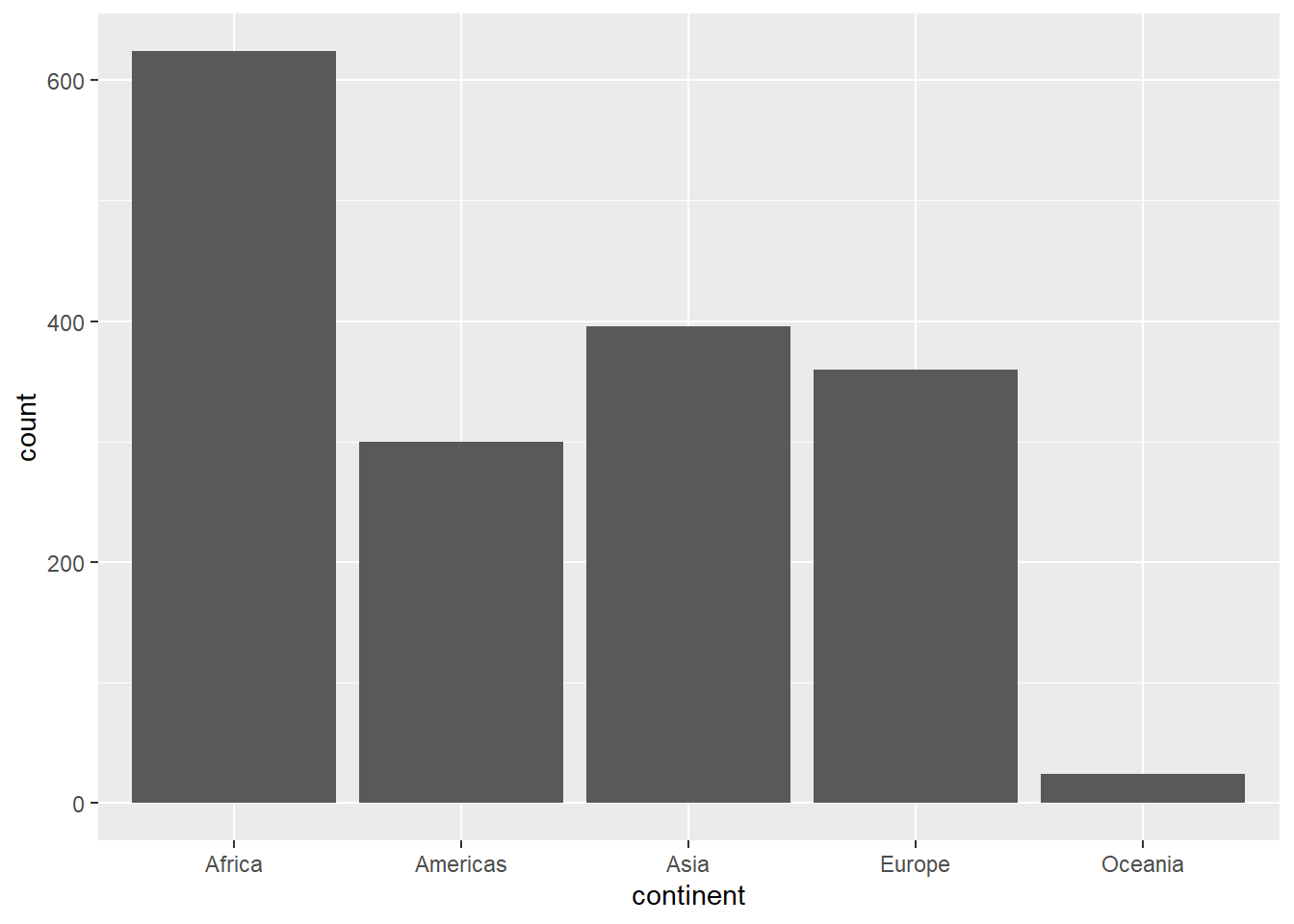
This makes a bit more sense. We can see there are more instances of “Africa” than, say, “Americas”, which makes sense: there are more countries in the former. However, if we look at the left, the counts are a pretty high estimate for number of countries. This is because for each continent, it is counting each country for each year (12) in the dataset.
Let’s say we just wanted to look at the data from the most recent year in the dataset. First, we need to figure out what that year was. We can use the max function to get this information:
max(gapminder$year)
[1] 2007
This function just takes a vector and gives the maximum value. So the most recent data here is from 2007. If we just want the data from that year, we can use the square brackets ([]) to subset the data to just the rows from 2007. We’ll create a new variable called gm2007:
gm2007<-gapminder[gapminder$year==2007,]
Remember that inside the square brackets, what comes left of the comma refers to rows, and what comes right refers to columns. So this code is effectively saying “give me all the rows in the gapminder tibble where the value in the year column is equal to 2007.” We’ve assigned it to a new object called gm2007. Now, when we look:
gm2007
# A tibble: 142 × 6
   country     continent  year lifeExp       pop gdpPercap
   <fct>       <fct>     <int>   <dbl>     <int>     <dbl>
 1 Afghanistan Asia       2007    43.8  31889923      975.
 2 Albania     Europe     2007    76.4   3600523     5937.
 3 Algeria     Africa     2007    72.3  33333216     6223.
 4 Angola      Africa     2007    42.7  12420476     4797.
 5 Argentina   Americas   2007    75.3  40301927    12779.
 6 Australia   Oceania    2007    81.2  20434176    34435.
 7 Austria     Europe     2007    79.8   8199783    36126.
 8 Bahrain     Asia       2007    75.6    708573    29796.
 9 Bangladesh  Asia       2007    64.1 150448339     1391.
10 Belgium     Europe     2007    79.4  10392226    33693.
# ℹ 132 more rows
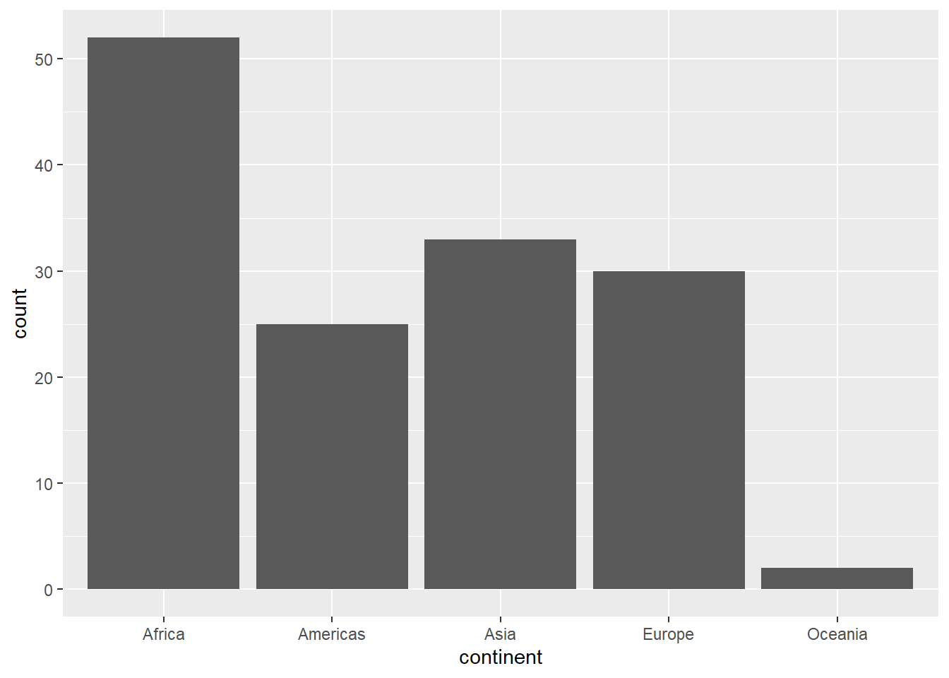
Great, now we just have one year’s worth of data. When we make a bar plot:
This looks a lot more reasonable. Now each bar is reflecting the number of countries in each continental grouping.
Try it yourself!
You can look at all the years in this dataset using the unique function. It works like this
unique(gapminder$year)
Choose another year from this data, create a subset, and then make a barplot of the number of countries by continent.
Reordering the categories
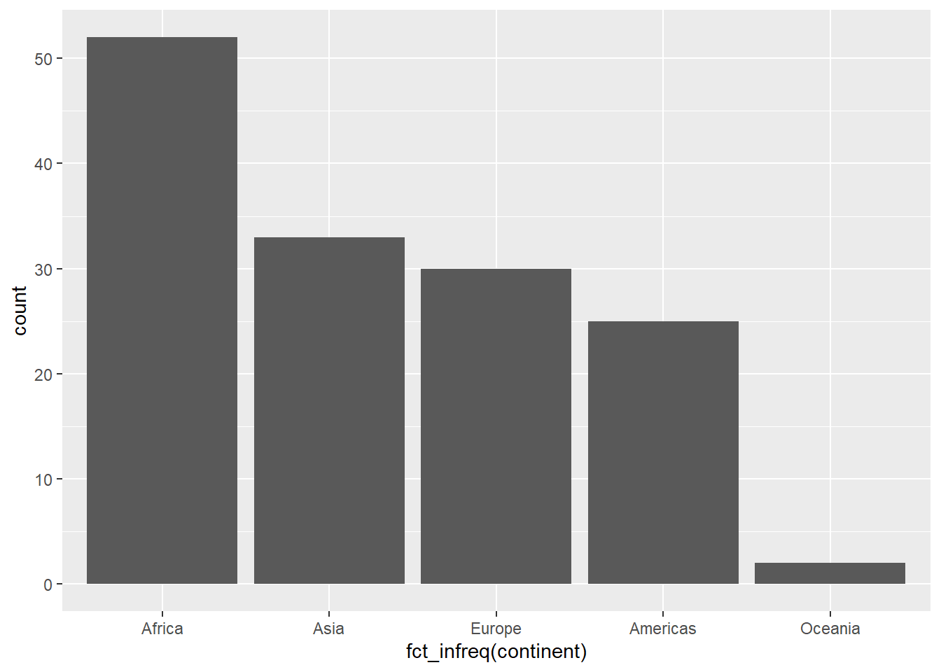
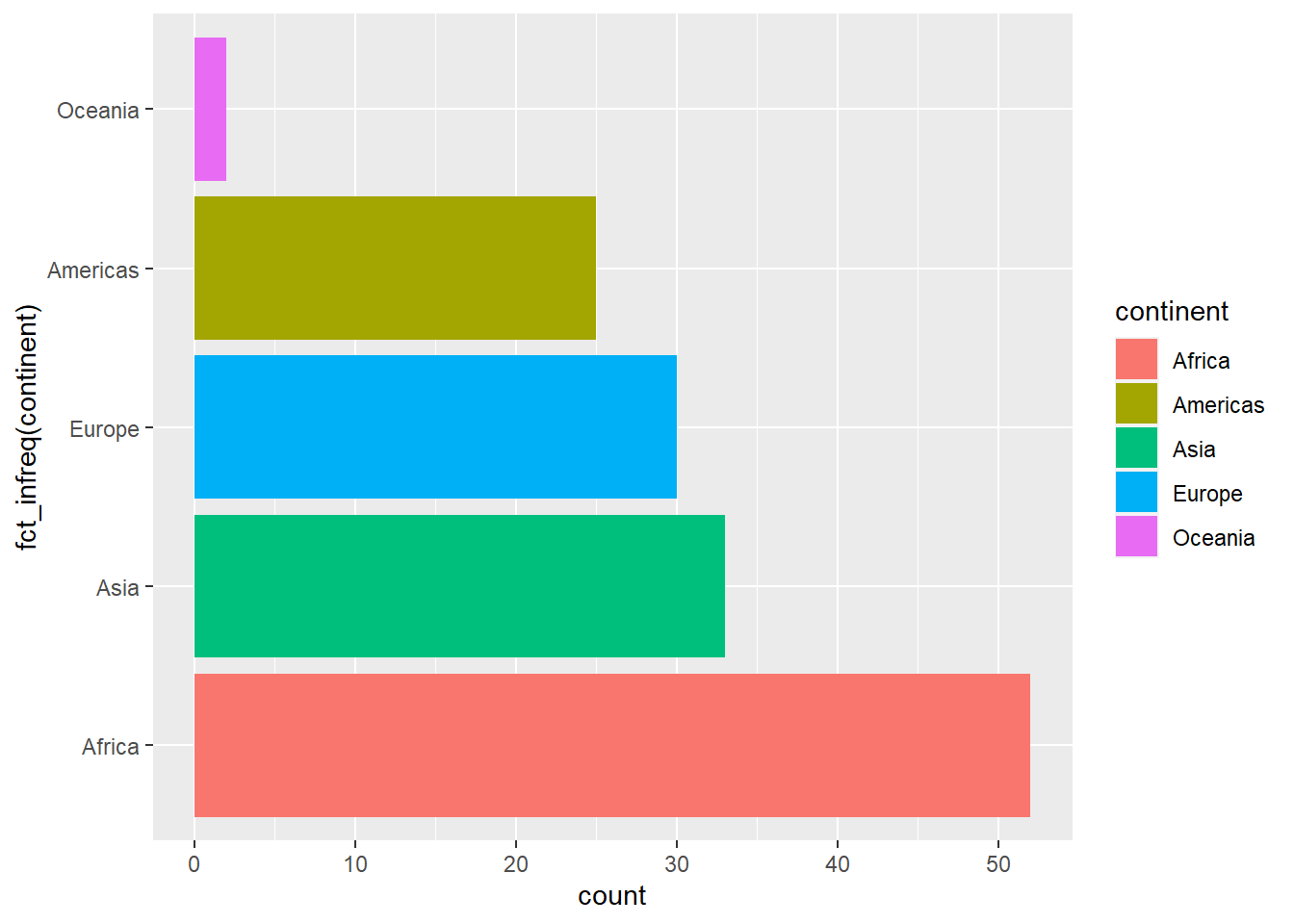
Right now our plot is presenting these groupings from left to right in alphabetical order. We might instead want to order them based on their position in the data. To do this, we need to let R know that the continent category isn’t just a , but a factor (an ordered set of categories). We won’t dive into this too deeply here, but we can apply the fct_infreq function to the continent vector to order them based on their frequency in the data:
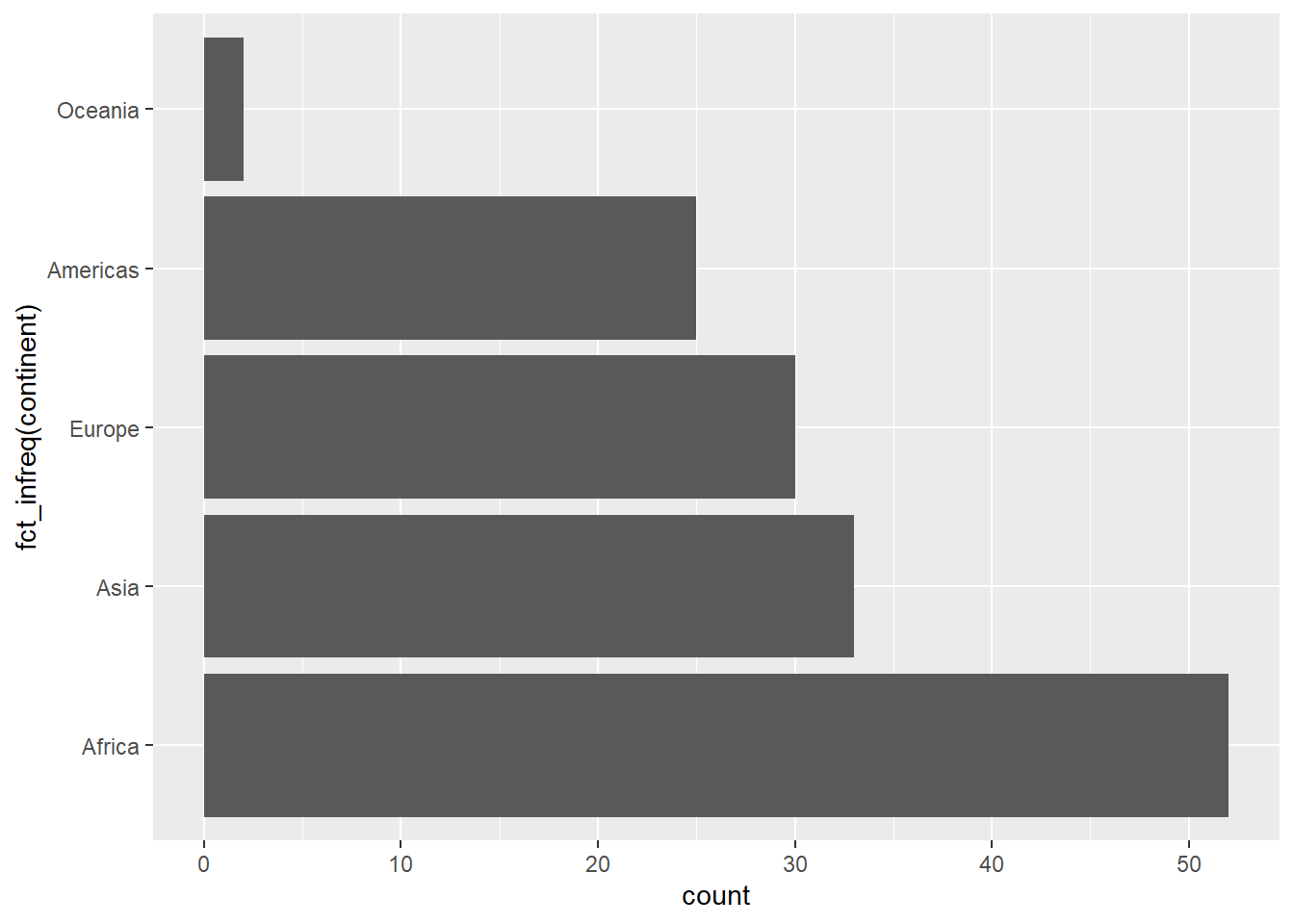
Oftentimes, our categorical labels at the bottom will overlap. We saw an extreme case of this when we tried to plot bars by country. If you have a milder case of this, it can often be advantageous to plot horizontally rather than vertically. We can do this by adding another layer with a function, coord_flip, related to the coordinate space:
This is data recorded on different penguin populations from three Antarctic islands. Let’s look:
penguins
# A tibble: 344 × 8
   species island    bill_length_mm bill_depth_mm flipper_length_mm body_mass_g
   <fct>   <fct>              <dbl>         <dbl>             <int>       <int>
 1 Adelie  Torgersen           39.1          18.7               181        3750
 2 Adelie  Torgersen           39.5          17.4               186        3800
 3 Adelie  Torgersen           40.3          18                 195        3250
 4 Adelie  Torgersen           NA            NA                  NA          NA
 5 Adelie  Torgersen           36.7          19.3               193        3450
 6 Adelie  Torgersen           39.3          20.6               190        3650
 7 Adelie  Torgersen           38.9          17.8               181        3625
 8 Adelie  Torgersen           39.2          19.6               195        4675
 9 Adelie  Torgersen           34.1          18.1               193        3475
10 Adelie  Torgersen           42            20.2               190        4250
# ℹ 334 more rows
# ℹ 2 more variables: sex <fct>, year <int>
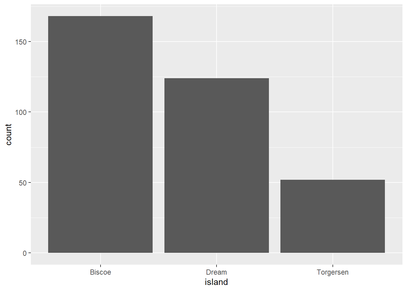
So we have some categories (species, island, sex) as well as some numerical data (bill_length, flipper_length, etc.). Let’s look at penguin counts per island:
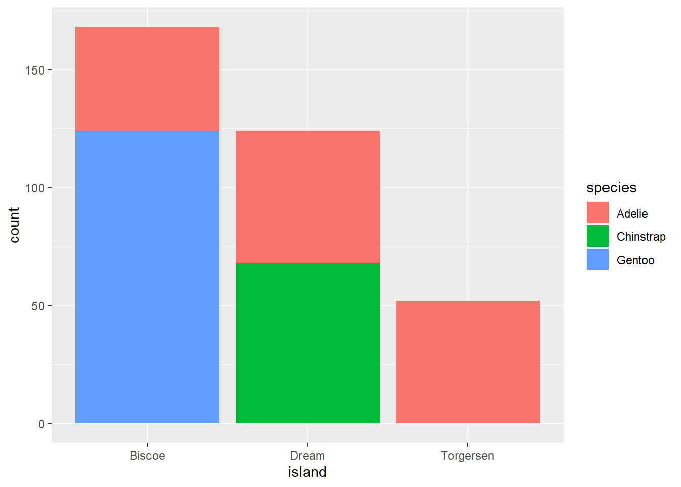
Great. But what if we wanted to see how these break down in terms of species? We can use a stacked bar by telling R to map this on to the aesthetic fill for the bars:
The fill argument connects to the fill color used in the bars. Now, we’re getting counts of each penguin species for each island, as well as the breakdown by species as determined by color.
We can also map colors on to our gapminder data from 2007:
While this illustrates how to add an additional aesthetic mapping, this relates back to our discussion about deliberate design: is this something that would be needed?
Try it yourself!
With the penguin data, try the following:
Plot the counts per island broken down by sex
Plot the counts per species, broken down by island
Plot the counts per island, broken down by year of observation