4  Scatterplots

Scatterplots are used to visualize relationships between two numerical variables, mapped to the x-position and y-position.

library(tidyverse)
── Attaching core tidyverse packages ──────────────────────── tidyverse 2.0.0 ──
✔ dplyr     1.1.2     ✔ readr     2.1.4
✔ forcats   1.0.0     ✔ stringr   1.5.0
✔ ggplot2   3.4.3     ✔ tibble    3.2.1
✔ lubridate 1.9.2     ✔ tidyr     1.3.0
✔ purrr     1.0.2     
── Conflicts ────────────────────────────────────────── tidyverse_conflicts() ──
✖ dplyr::filter() masks stats::filter()
✖ dplyr::lag()    masks stats::lag()
ℹ Use the conflicted package (<http://conflicted.r-lib.org/>) to force all conflicts to become errors
library(palmerpenguins)
library(gapminder)
gm2007<-gapminder[gapminder$year==2007,]

We’ve seen scatterplots before in both Base R and ggplot2. You’ll remember that we use the geom_point function to create one:

ggplot(data=gm2007,aes(x=gdpPercap,y=lifeExp))+
  geom_point()

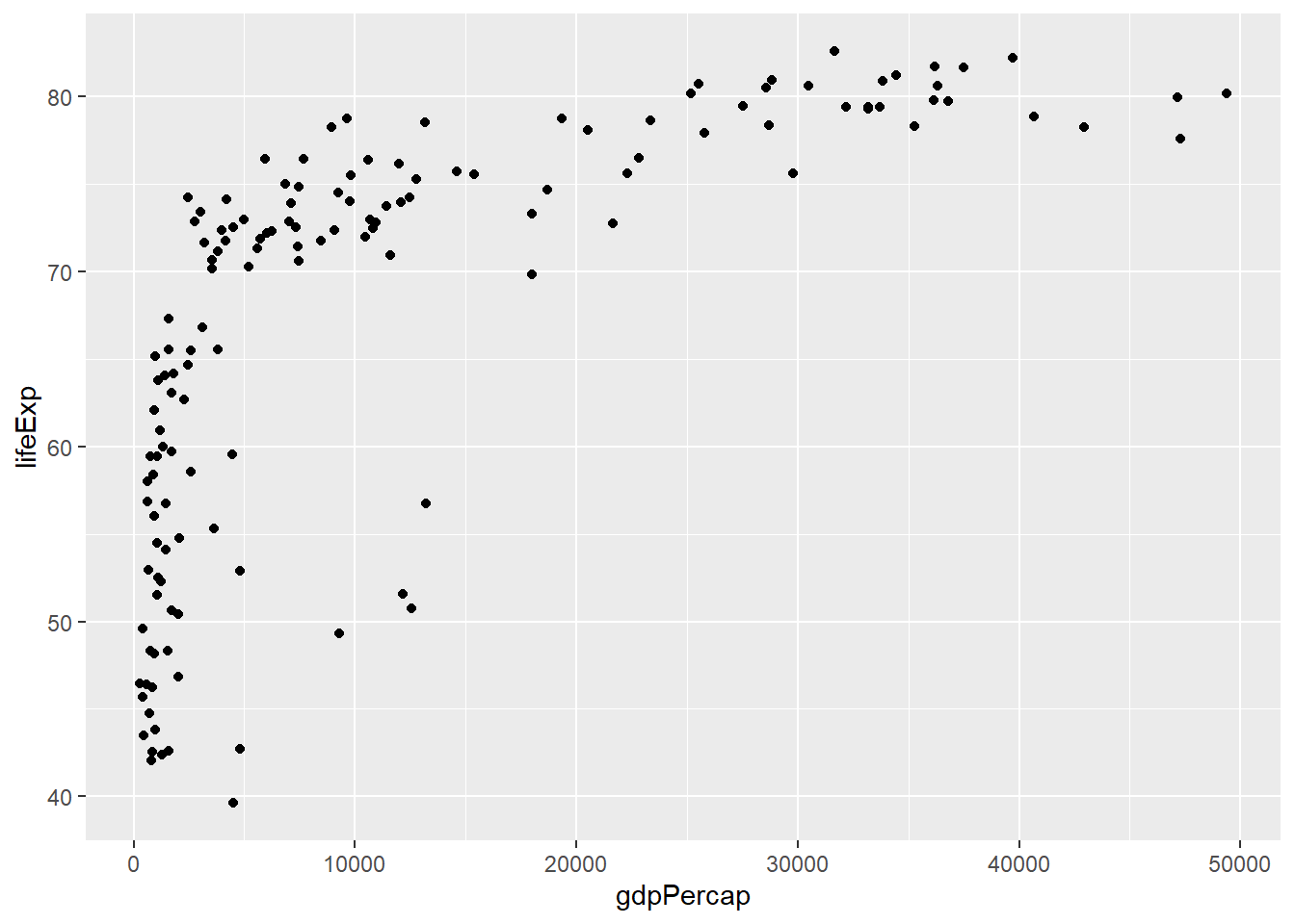
This is an interesting distribution, and aligns with what we saw in the first Gapminder plot. Most of the countries with lower life expectancy are at the lower end of the GDP spectrum, while higher GDP is associated exclusively with higher life expectancy.

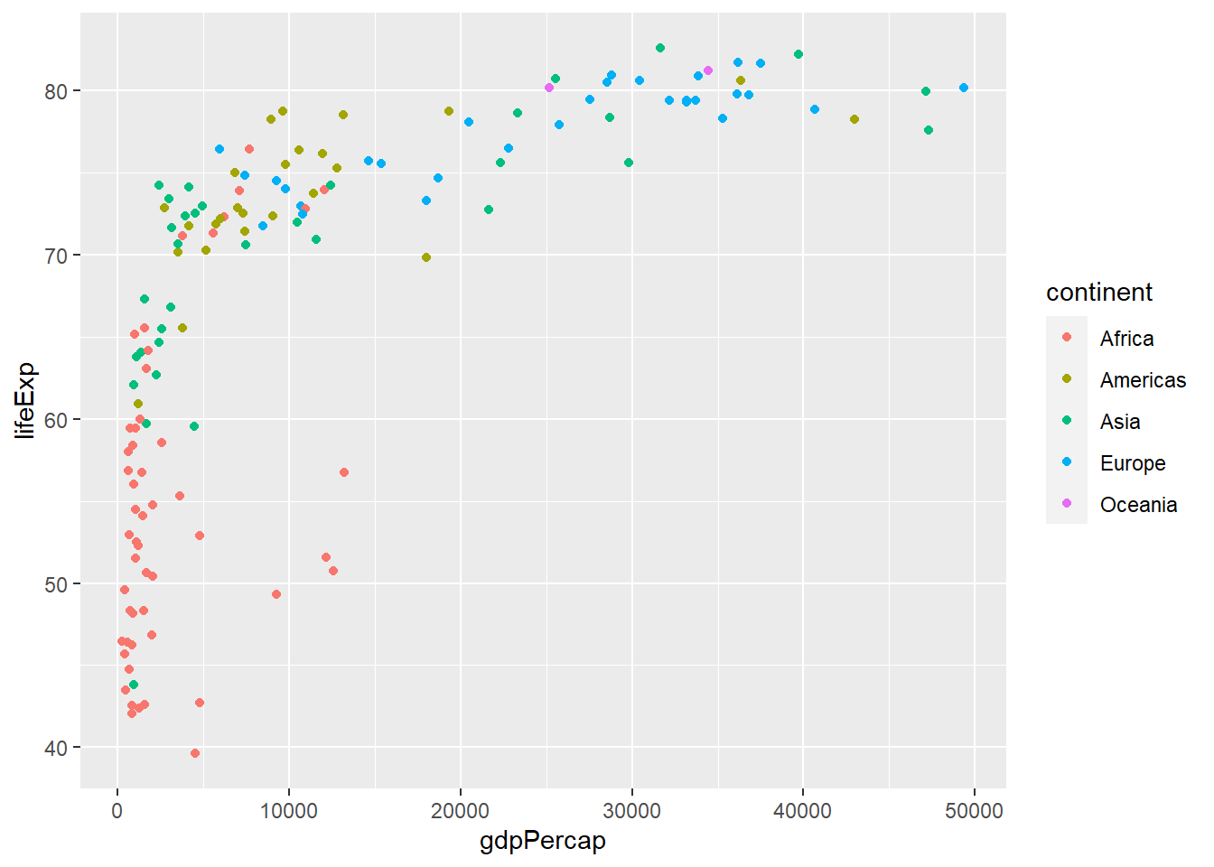
To make this line up even better with the original, we can color the points based on their continental groups:

ggplot(data=gm2007,aes(x=gdpPercap,y=lifeExp,color=continent))+
  geom_point()

Modifying labels

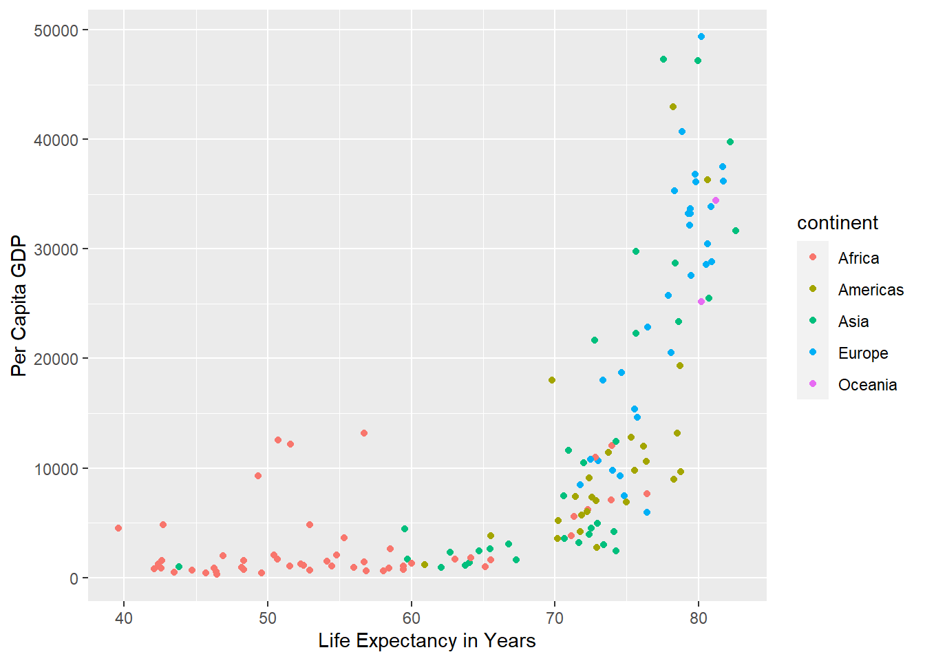
Finally, if we wanted to modify, we can add these as additional layers, using terms we remember from Base R:

ggplot(data=gm2007,aes(x=lifeExp,y=gdpPercap,color=continent))+
  geom_point() +
  xlab("Life Expectancy in Years") +
  ylab("Per Capita GDP") 

There’s a lot more to be done with ggplot2, but hopefully by now you’re starting to see how it all works in terms of a series of layers. If you’re feeling a bit overwhelmed, don’t stress! This is still early days in our journey. We’ll come back to these concepts several more times over the remainder of the course.

Try it yourself!

Try plotting some of the numerical relationships among the penguin data using scatterplots. Things you might try are:

  • Flipper length and body mass

  • Bill length and body mass

  • Bill length and bill depth, colored by species

Once you’re ready, head over to the Lab Exercise…