3  Histograms

library(tidyverse)
── Attaching core tidyverse packages ──────────────────────── tidyverse 2.0.0 ──
✔ dplyr     1.1.2     ✔ readr     2.1.4
✔ forcats   1.0.0     ✔ stringr   1.5.0
✔ ggplot2   3.4.3     ✔ tibble    3.2.1
✔ lubridate 1.9.2     ✔ tidyr     1.3.0
✔ purrr     1.0.2     
── Conflicts ────────────────────────────────────────── tidyverse_conflicts() ──
✖ dplyr::filter() masks stats::filter()
✖ dplyr::lag()    masks stats::lag()
ℹ Use the conflicted package (<http://conflicted.r-lib.org/>) to force all conflicts to become errors
library(palmerpenguins)
library(gapminder)
gm2007<-gapminder[gapminder$year==2007,]

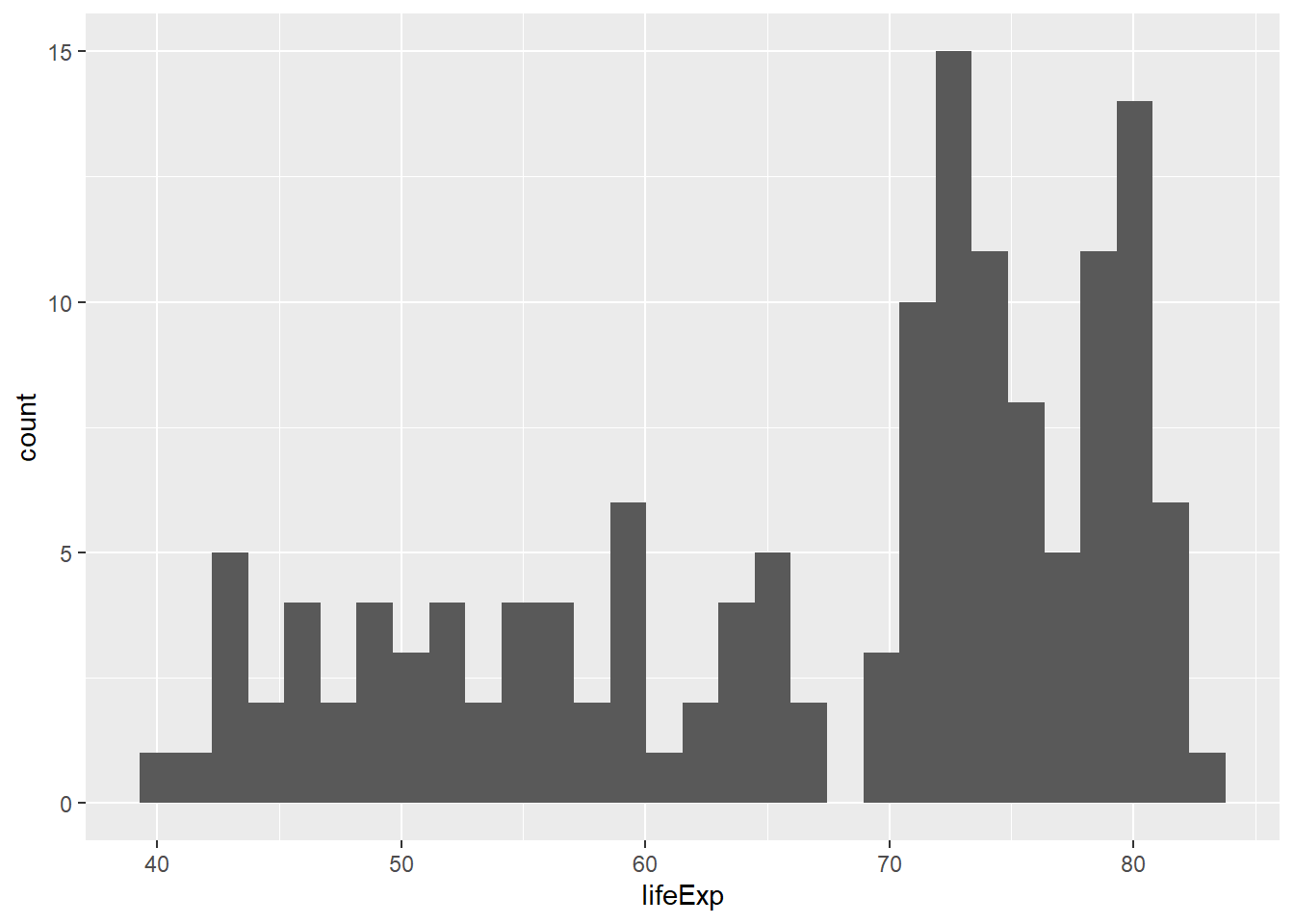
Let’s say that instead of categories, we wanted to look at the distribution of a set of numerical values. We’ve already explored these using histograms, and we can access histograms by using the geom_histogram function:

ggplot(data=gm2007,aes(x=lifeExp)) +
  geom_histogram()
`stat_bin()` using `bins = 30`. Pick better value with `binwidth`.

You may have noted that we dropped the mapping= here. As long as you’re using aes, it’s not needed. You may have also noted there’s an error we get from running this command that relates to bin size. We can handle this with another argument, but for now don’t worry about it.
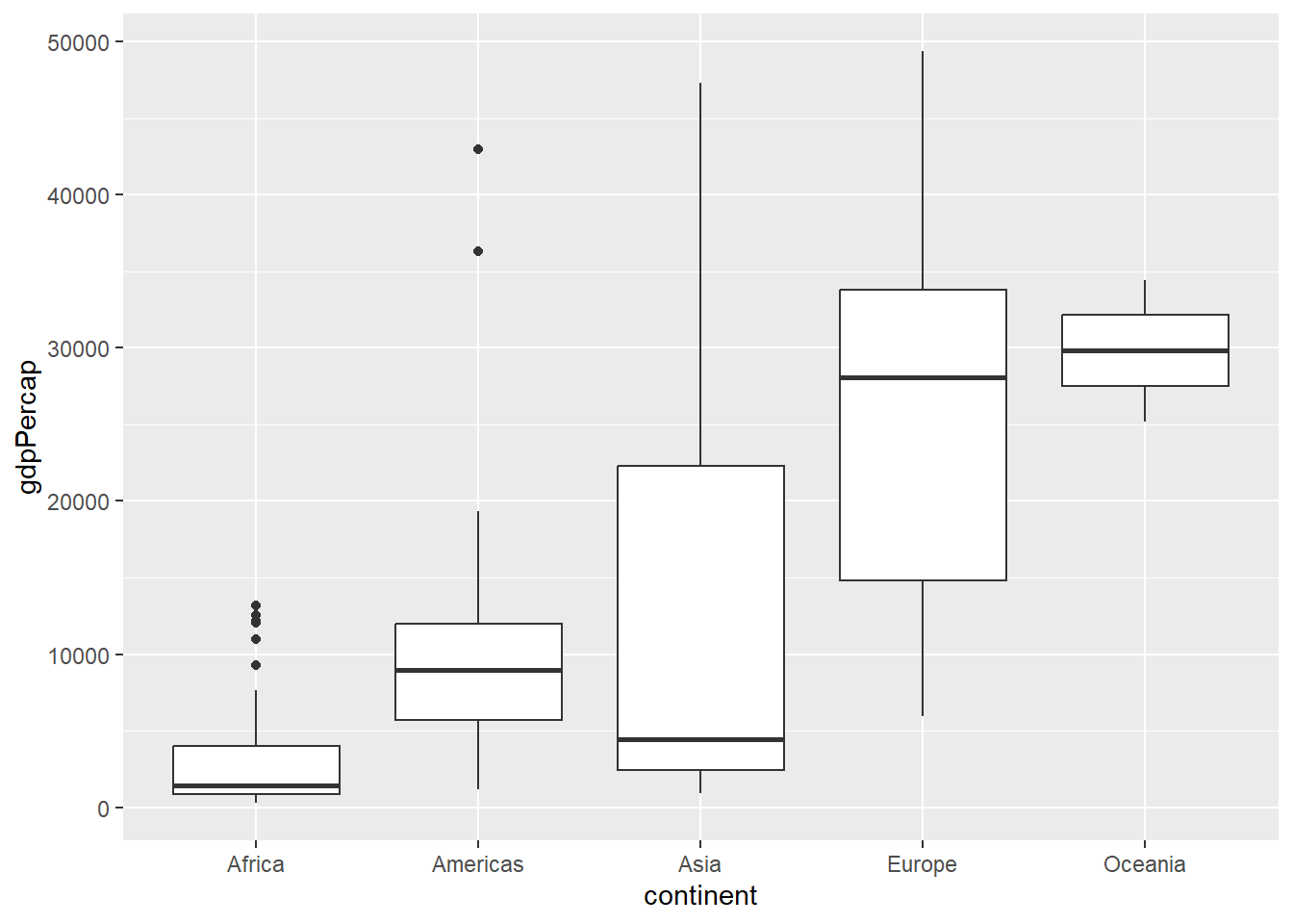
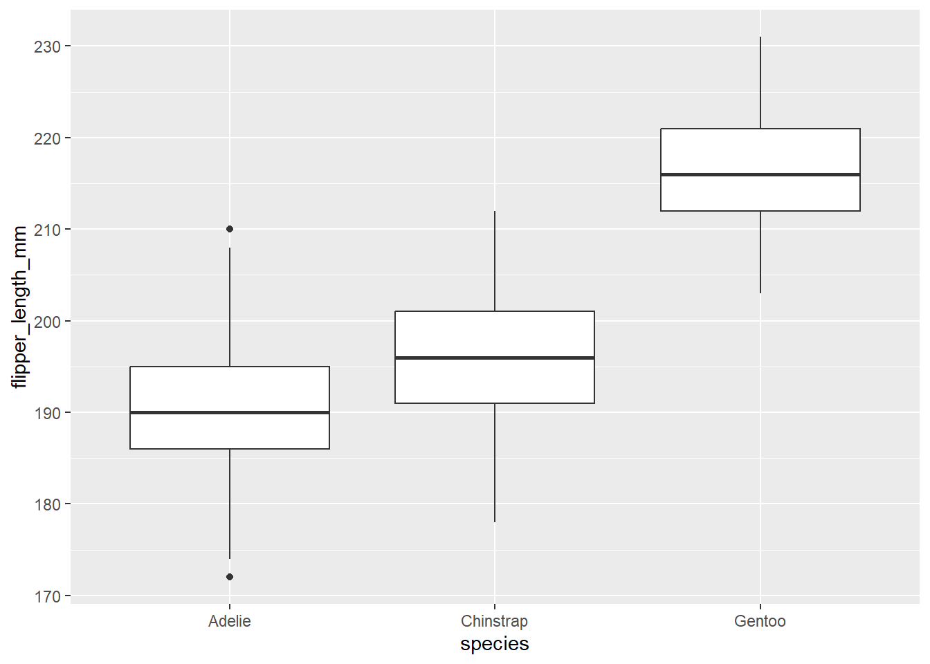
The boxplot

Oftentimes, we may be interested in showing distributions across multiple categories. We can view multiple distributions using a box plot:

ggplot(data=gm2007,aes(x=continent,y=gdpPercap)) +
  geom_boxplot()

The box plot (or box-and-whisker plot) shows the distribution of values in terms of the interquartile range, where the box represents the space between the 25% and 75% and the whiskers represent the rest. These are useful when you want to compare across multiple categories. For example:

ggplot(data=penguins,aes(x=species,y=flipper_length_mm)) +
  geom_boxplot()
Warning: Removed 2 rows containing non-finite values (`stat_boxplot()`).

Note the error here: there are two instances where data are not available, and R is letting you know it can’t plot these.

Try it yourself!

Hopefully now you’re seeing how these ggplot2 functions work. Try the following:

  • Make a histogram of penguin bill lengths

  • Make a boxplot of life expectancy by continental grouping